
Recomendados
Mais conteúdo relacionado
Mais procurados
Mais procurados (20)
Destaque
Destaque (20)
Semelhante a Evaluation
Semelhante a Evaluation (20)
Mais de AS Media Column D
Mais de AS Media Column D (20)
Último
Último (20)
Evaluation
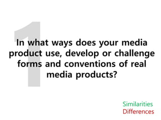
- 1. In what ways does your media product use, develop or challenge forms and conventions of real media products? Similarities Differences
- 2. Placement of cover lines Model partially covering the masthead Direct address Barcode at the bottom Layout, e.g. the placement of the main image and main cover line My background has a pattern, compared to a plain background Less cover lines My masthead goes across the top, compared to being only in the corner Shot type
- 3. How I followed Codes and Conventions The masthead of my magazine is placed across the top of the magazine cover, as conventionally only the top part of a magazine is shown when it is displayed in a shop. This follows codes and conventions as all magazines have their masthead at the top of the cover. In addition, my model is looking at the camera, giving direct address to the audience, as this draws the audience in and makes the magazine feel more personal. By doing this I have also followed codes and conventions as most magazines include direct address within the front cover. Another way that I have followed codes and conventions is by creating a bigger and bolder main cover line and other cover lines that are smaller and off to the side of the cover. By doing this it makes it very clear what the main article is within the magazine, meaning that the audience isn’t overwhelmed with information, but still is able to see what other articles the magazine contains. The barcode on my magazine is in the bottom corner, which it typical for a magazine, as it ensures that it doesn’t interfere with any other information on the cover.
- 4. How I developed/challenged Codes and Conventions I developed and challenged codes and conventions in my magazine by using a medium shot instead of a medium close up shot of my model. I did this to show more of what she is wearing, as her clothing connotes the indie genre, and would help the audience to understand the genre of the magazine. In addition, by only using sans serif fonts I challenged codes and conventions, as most magazines use a mix of serif and san serif fonts on the cover. I did this because I felt that serif fonts would distract to much from the actual text and the audience wouldn’t engage fully with the content of the magazine.
- 5. Comparison to Drawn Draft Whilst I did have to make some alterations to my draft I think that overall my final cover is quite similar. I kept the masthead, the positioning of the main cover line and the other cover lines, the main image and the direct address within the main image, the position of my model, and the positioning of the barcode the same, as I was able to easily transfer these aspects of my design onto my final cover. However, I didn’t keep the secondary image because I needed more space to spread out my cover lines. I also added more cover lines along the right hand side to fill up the white space. In addition, I changed the font of the main cover line because it was too thin and didn’t show up well enough to be seen from a distance.
- 6. Layout of the lines and images SubheadingsMix of direct and non direct address I have an editor’s letter My contents masthead is bigger than the name of the magazine Artist names over pictures My magazine has social media information
- 7. How I followed Codes and Conventions The masthead of my contents page is placed in the top right hand corner of the page, as conventionally this is where most magazines position it. This is because the mast head on the cover is placed in the top left hand corner, so by changing the side that it appears on, the contents page won’t look identical to the front cover. Another way that I have followed codes and conventions is by listing the page numbers of articles and activities. This makes it clear to the audience what the magazine contains and what pages to turn to. I have also included secondary images on the contents page, which is quite common in magazines. These images anchor some of the article titles, meaning that they will stand out more to the audience. I followed codes and conventions by adding an editor’s note. I did this because it is the first edition of my magazine, and therefore I wanted the audience to understand what my magazine is about.
- 8. How I developed/challenged Codes and Conventions I challenged conventions by adding social media usernames, as most magazines don’t include social media links. I did this because my target audience is 16 to 19 year olds, and they will have social media accounts of their own, meaning that this would be an effective way to attract and expand an audience. In addition, four out of five of the images contain direct address, which is uncommon for a contents page, as it draws the attention away from the information, which is the most important part of the contents page. However, I think that by including direct address on the contents age the audience will feel that the articles are aimed towards them and the magazine will feel more friendly and personal.
- 9. Comparison to Drawn Draft Though I did make some alterations to my draft I think that overall my final contents page is quite similar. I kept the masthead, the images, and the general layout the same, as I was able to easily transfer these aspects of my design onto my final contents page. However, I did change the draft by adding the social media usernames in place of the play and pause signs. I thought that this would fit better within the space and also give the audience more information about the magazine. In addition, I also added backgrounds to the images and editor’s letter. I did this because the page looked quite jumbled, so by adding rectangular backgrounds it structured the page better and also linked the images.
- 10. Direct address from model Artist name as title Drop cap at start of article Pull quote in different font and colour Standfirst larger and in a different font to article General layout, with the main image on the left and article on the right Byline in different colour to standfirst My magazine article has three columns, compared to two My main image is only on one page, compared to going across two My title goes across both pages
- 11. How I followed Codes and Conventions The headline on my double page spread is very large, which follows conventions, as this is meant to grab the readers attention. Another way that I have followed codes and conventions is by having columns and a drop cap within my article. This makes it easier for the audience to read the article, as it splits up a large chunk of text and also clearly shows where the article starts. In addition, I added a pull quote, which makes the audience more intrigued by what’s written in the article, encouraging them to read it. The page numbers are in the bottom outside corners, which follows conventions, as it makes it easier for the audience to find the correct page. I also followed conventions by not including the background of my main image and adding on a background. I did this to make the image seem more dream like, reflecting how the artist described her music.
- 12. How I developed/challenged Codes and Conventions I challenged conventions by using a full shot of my model sat down. Most double page spreads will include a close up of an artist, and even if they do include the whole of the artist, it’s usually of them standing up. I chose to use an image of her sat down to make her seem more relatable, friendly and approachable, meaning that the audience isn’t intimidated by her before they read about who she is. In addition, I also challenged conventions by not having a plain background. A lot of magazines will use a plain background so that they don’t distract from the main image and article itself. However, I wanted to use a cloud background to again reiterate her ‘dream like’ music sound and to relate to the headline ‘the rise of’.
- 13. Comparison to Drawn Draft Whilst I did make quite a few changes to my draft I think that the overall look of my final double page spread is quite similar. I kept the blue strip, the three columns, the background, and positioning of my main image and artist name. However, I did change the headline and positioned it over two pages, to link the pages together. I also took out the album cover because my article wouldn’t have all fit in with an image interspersed between it. I also moved the pull quote for the same reason, and to fill in the white space around my models head.