The document summarizes key elements of a magazine contents page layout and design. It highlights how various design choices, such as the use of color, images, and text, help attract the reader's attention and convey information about the types of articles featured. These design elements are meant to intrigue readers and promote a sense of connection to the magazine's content and community.
Nara Chandrababu Naidu's Visionary Policies For Andhra Pradesh's Development
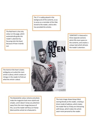
Main magazine research contents 1
1. The ‘V’ is subtly placed in the
background of the contents, so as
to serve as a reminder of the Vibe
brand to the reader, and to who
has provided the articles.
The Red heart is the only
colour on the page, which
‘CONTENTS’ is featured in
automatically grabs the
three separate sections
reader’s attention by
which fills more space on
focusing onto the heart
the contents, and creates a
because of how it stands
unique look which attracts
out.
the reader’s attention.
The hand on the heart creates
ambiguity as to what the main
article is about, which creates an
intrigue in the reader to find out
what the article is about
The black/white colour scheme and photo
The main image shows Kanye West
make the magazine look more stylish and
staring directly at the reader, creating a
simpler, and it doesn’t draw any attention
direct mode of address, which makes
away from the main image because of
the reader feel as if they are interacting
this, so as the reader will focus on Kanye
with Kanye, which makes the article
West and the article he is featured in.
seem more personal to the reader.
2. The use of red in the magazine helps make certain
features of the contents stand out on the primarily
black/white colour scheme, and draws the reader to
them. It also seems to reflect the appearance of
blood which helps cater to the magazine’s niche
audience by featuring things that they associate
themselves with, i.e. gory/violent music.
Instead of article titles,
the subheadings for
articles are the band
names featured. This
helps the reader see The image features face
which bands they will paint associated with many
be interested in, but metal bands, helping to
also makes it easier to signify the type of music
find the specific featured in the magazine.
content they are Also the editor is flashing
looking for in the the devil horns, a key
magazine. signifier to metal/rock
music, and he looking
directly to the reader
creates the impression he is
raising the horns to them,
which creates an exclusive
relationship between metal
fans, and the reader/editor.
The contents page, features images of a couple of
articles in the magazine, which helps the reader see
what will interest them most, but also what other
content the magazine features, so it helps to
potentially interest the reader in something they may
not have thought would interest them.
3. The main image takes up most of the contents page, showing that is part
of the main feature of the magazine and suggests that the men featured
on it are important to the article. The men are shown to be young and
wearing clothing associated with indie/rock musicians, so as to appeal to
the magazines target audience, and showing the band in clothing similar
to what the audience may wear helps connect them to each other, and
this can prove to interest the readers more by seeing people who look
similar to them making music, and may interest them to find out how they
did it
The ‘Oasis Special’ is
featured in a gold colour
different from the usual
red colour of text on the
magazine, making it seem
even more of an exclusive
feature than anything else
in the magazine. The gold
colour also adds the
connotation that the
contents is worth the
reader’s time and is of
high importance.
The Q Review section has the
subheading ‘The world’s biggest and
best music guide’. The use of buzzwords
like ‘Biggest’ and ‘best’ makes it feel
better than anything any other
magazine can offer the reader, which
creates a unique selling point for the
magazine.
4. The magazine features
images from the
different pages in the
magazine, showing the
different articles
inside. These pages
being featured on the
contents page show
that these are the
articles the magazine
wants to feature. It
The use of the subheading also helps make it
‘this week’ helps emphasise much easier to find
the fact everything in the what article the reader
magazine is new, and make may be looking for
it seem like the information specifically.
featured in it is more
exclusive, creating a need
for the reader to want it.
The magazine features an advert for
their subscription featured in a bright
A note from the editor is featured in the
red box, so as to make it more
magazine, which is directly addressing the
noticeable to the reader. Also by using
audience, showing that those working on
the word ‘just’ in describing the price of
the magazine care and connect with their
their magazine, it creates the
audience, which creates a need for the
impression that the price of the
reader to be loyal to the magazine, due to
subscription is a bargain, and further
the loyalty the editor has shown them.
influences the reader in subscribing.
5. →
‘NME THIS WEEK’ shows that the NME is
similar to what is featured on the cover page,
and again stands out on the primarily black and
white page, especially due to the bright tone of
The use of a band index helps the colour.
the reader find what interests
them and look for it straight
away, and allows them to skip
articles about bands that may The use of an image
not interest them at all. It also from the gig helps to
makes the magazine seem establish a better
more personal to the reader, visual effect of what
as it feels like the magazine the gig was like and
has done them a favour by helps to further the
categorizing the contents of connection that the
the magazine. reader feels to the
article and making it
seem as if they were
part of the gig.
The main article feature,
mentions ‘Everyone’ creating
a more personal connection to
the reader and making it seem
like they are part of the article
featured. The use of this
buzzword also helps establish
a relationship between the
loyal readers and the The contents feature a subscription
magazine itself. advertisement on it, so as to lure the
audience in and sign up. The text stands out
on the black background, due to its yellow
colour, which makes it appear very bright.
Also the fact that it is the only text on the
page to use yellow colour makes it stand out
further on the contents page.