
Recomendados
Recomendados
Mais conteúdo relacionado
Mais procurados
Mais procurados (20)
Destaque
Destaque (8)
Semelhante a Double page spread analysis music magazine
Semelhante a Double page spread analysis music magazine (20)
Último
Último (20)
Double page spread analysis music magazine
- 1. Double Page Spread Analysis. Poppy Thompson
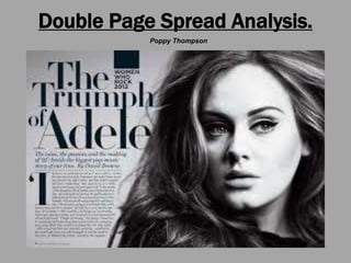
- 2. Adele’s Double Page Spread This double page spread features the massively famous Pop Music Singer Adele. The black and white effect makes the whole article as well as Adele herself look classy and sophisticated this is a positive representation of Adele and the magazine.
- 3. The Iconic Sign… The iconic sign would definitely be the black and whit colour scheme, because it is normally seen as an old fashioned and therefore seen as classy this represents Billboard as a magazine because Billboard has a reputation of being professional and sophisticated magazine. It is very important for them to keep up their professionalism throughout the magazine because that is what the readers expect. The preferred reading for this double page spread would be a good and classy representation of the magazine and Adele, however the oppositional reading could be that Adele looks overly edited and almost fake.
- 4. The Symbolic Sign… The use of the Serif font makes the double page spread look a lot more formal and symbolically this kind of font is often used to make an article look more important and this presents the magazine in a way that looks like it has value for money and it is professional, this would be the preferred reading of the article and the oppositional reading could be that the double page is over edited and that Adele looks fake
- 5. The Indexical Sign… The fact that Adele’s photo and hair take up almost all of the page and that there is not much writing could represent the fact that she more about her appearance and the way that her fans view her than actual knowledge about her personality. This would be a negative thing so would most probably be the oppositional reading that those who aren’t fans of Adele would take, her fans would take the more positive preferred reading which would most likely be the fact that she is a radiant beauty.
- 6. In Conclusion… This double page spread aims to represent Adele in a glamorous and positive way, I think that the magazine has done this well because of the lighting, colour scheme and font type they have achieved a professional yet feminine look to the article. I have taken the preferred reading however the magazine could also be seen as “looks obsessed” because there isn’t much writing or content just a rather large photo of the featured celebrity Adele which could make her look self obsessed and careless of her actual personality.
- 7. Double Page Spread Analysis. Poppy Thompson
- 8. Nicki Minaj’s Double Page Spread This double page spread features the massively famous Pop Music Singer and Rapped Nicki Minaj. The bright colours within the article show Nicki Minaj’s personality and the fact that she is famous for being quirky and crazy and they represent her as an artist.
- 9. The Iconic Sign… The bright colours and odd photograph of Nicki Minaj herself will appeal to her admirers and fans because they will be used to and like her “out-there” style however this will put a lot of other people off the article because she is so controversial so many people have strong negative opinions of her. The fact that she is controversial and that the article is in an interview format will be off-putting to some however even if they don’t like her as an artist she may be interest them. She sees her self as a major Pop Star and is very self confident and her fans like that so the ring that she is wearing that says “ICON” and her confident pose in the photo are an iconic sign.
- 10. The Symbolic Sign… The mix of both Sans Serif and Serif font makes the article a lot more informal and “crazy” which fully symbolizes Nicki Minaj’s style and what her fans (those who take the preferred reading) relate to. However the oppositional reading, which will be taken by the people that don’t like her particularly or don’t like the magazine, this will most probably be that they see the article as very messy like Nicki Minaj’s style and music.
- 11. The Indexical Sign… Nicki Minaj’s photo and her name in bold font are the main focus of this article, they takes up most of the of the double page spread and this represents her need for attention, this would be the way that the oppositional readers see her and the article. The preferred reading would be the opposite of this because although the picture and her name are the biggest and main things on the page there is also a lot of writing this shows her as an interesting person because there is a lot to read about her. The preferred readers will definitely see her in a good light through this article, because she is the main attention and they will enjoy this because they like her.
- 12. In Conclusion… This double page spread represents Nicki Minaj as a confident and risky, because of the layout she is made out to be massive sensational pop star which her fans will definitely appreciate. However the confident woman portrayed by the magazine could be taken as Nicki being cocky and over-baring, the article will have two very different effects on different types of people, however they will both be strong opinionated effects.
- 13. Comparison… These magazines are completely different to each other, Adele’s magazine is attempting to represent her as a very classy and sophisticated, and as an established artist. The fonts show her as very feminine whereas Nicki Minaj’s article shows her as “whacky” and off-the-wall which would only attract certain audiences in a positive way. The varied colour schemes are the main difference between the two articles, and this is what changes the representation of both women.