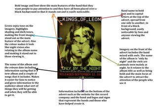
1. Bold image and font show the main features of the band that they
want people to pay attention to and they have all been placed over a
black background so that it stands out and is easily noticeable.
Green sepia tone on the
imagery, highlights
shading and dark tones,
making the front image
stand out as the main
feature of the advert. Also
the colour makes it look
like night vision also
relating to the album name
and making it stand out to
those viewing it.
The name of the album and
the release date including
information saying that is a
new album and a couple of
songs that it includes. Makes
it easier for fans to notice
and gives information to the
audience about what sort of
things they will be getting
and when they will be able
to get it.
Band name in bold
font and in capital
letters at the top of the
advert, spread from
one side to another, in
front of a black
background, easily
noticeable by fans and
anyone viewing the
advert.
Imagery on the front of the
advert includes the band
mixed with owls. The name
of the album is “only by
night” and the owls are
animals seen mainly at
night. So it relates to the
album title as well as being
bold and the main focus of
the advert to attract the
attention of the people who
see it
Information included on the bottom of the
advert such as the website for the record
company and the band and logos and signs
that represent the bands and those who
have helped create it.