SlideShare uma empresa Scribd logo
1 de 11
Colour Scheme: The majority of music magazines, and magazines overall, incorporate a colour theme usually based on or around the colour(s) of the masthead…   … even though this is true for most magazines, sometimes the colour theme is not relative to the colours of the masthead (left), in this case the lack of colour makes the masthead stand out, therefore buyers look straight at the magazine name when on the shelf and in competition with others … the colour theme helps make the magazine to look professional…
Audience:  Based on the colour theme alone, the audience could either be male or female orientated. It also depends on the genre of the magazine, the person(s) used for the main image and the leading story.  The colour theme isn’t based on the masthead which makes it stand out. The magazine is aimed more at females as it uses the dominant, stereotypical, ‘girly’ colour pink as well as using two females for the main feature In this magazine a colour theme is apparent and in my opinion, by opting to use a colour theme ‘Shortlist’ is successful in making their magazine look professional  Looking at the colours present, the contents and the main feature it is easy to see that this magazine is targeting the male audience
Mast head: Contents: Left third shows the most interesting articles/features which act as a lure to potential buyers Language: The use of informal language makes the readers feel comfortable. This makes them want to carry on reading the magazine due to the fact that they are able to understand and relate to the language used  Images used to accompany the magazine content, makes the magazine even more appealing to the buyers Strapline: It normally summarises what the magazine is about and it’s usually in the form of a slogan e.g. NME: New Musical Express  Pug: In the majority of magazines the Barcode contains the pug e.g. (shown right) The pug informs readers of the magazines price, issue no, release date and, in specific pugs, the magazines website
Mast head   : It’s in a bold font making the name of the magazine clear to buyers, the prominent colours (red and white) contributes to the clarity of the name   In some well known magazines, the main image covers a part the masthead, which shows that the magazine is popular enough that  it dosen’t have to continually show the full magazine name on every issue Contents: Contents of the magazine   shown in the left third uses a standard font in the colour white, on a black part of the background so that it’s clear to read as it’s the first thing (excluding the main attraction, in this case, Madonna) that’s seen when on the store shelves Strap line: E.g. Q: Britain’s Biggest Music
Main Image: The image is relative to the headline enabling the readers to make the connection between the headline and main image. It’s the first thing that’s seen, therefore it has to be the most interesting Headline: It uses the biggest and boldest font as it is promoting the leading story.  Top & bottom strips: They commonly consist of extras such as: - Music reviews - ‘Specials…’ As well as, competitions, popular acts (celebrities) and other offers that might appeal to the magazines target audience, such as a  Tip On  (freebie) related to the magazine. For instance, as NME is  a music magazine a CD would be appropriate part of the entire cover. The central image is usually of a well known/popular person such as a celebrity or act. For example, Kings of Leon (above)
This page is not instantly recognisable as a contents page as it doesn’t have a ‘Contents’ title to introduce it as a contents like most other magazines. However, we are able to identify it as a contents mainly, because of the list of page numbers as well as the images that give the readers a ‘taste’ of what’s in the magazine  The ‘loud’ colour pink captures the readers attention The bottom strip, similar to the bottom strip of front covers, makes known the offer(s) The outsized article used for page one indicates that the article is of importance, probably of an act that are deemed popular and are of interest to a large number of people, therefore attracting more readers  that would most appeal to the readers.  The font is the largest on the page making the offer stand out most  The consistent colour palette makes this page flow and as a whole look more effective  The blue strip highlights a certain page indicating that the content of that page is of significance within the issue
Some contents pages incorporate a continuation of colour theme from  the front cover (shown by  ) The majority of contents pages include a  ‘contents’ title, making it clear to the reader what the page the are looking at contains   The main image is big enough to show the importance of the feature yet it is balanced out by the rest of the magazine content and also covered by other images, indicating that it isn’t the most important article but important nonetheless  The different sections of the magazine are separated e.g. ‘every month’ helping to break the magazine up. The colours used to do this usually make the section stand out more, appealing to readers
The simplicity of the colour scheme makes it  easy to follow and as a result of the layout, straightforward   The lack of images allows the reader to focus on the  few available Judging by the amount of space taken up by images, compared to the amount of text, the magazine is probably aimed at a younger audience as younger people tend to lose interest quickly  The size and amount of images create anticipation within the reader, making them want to read on  The themed colours link in with the genre of the magazine e.g. red, white and black would link in with a rock/ gothic magazine. Also, by using a colour theme the magazine has made their contents clear to read and easy on the eye of the reader
Double page spread isn’t dedicated to one main article due to the fact that: +  The magazines audience is not interested in reading a lot as they lose interest easily  +  Appearance wise, a lot of text can look intimidating or +  The band is relatively new and no one knows who they are or what to expect from them  Column of short articles with different topics help keep the attention of the readers   The use of white text on black backing makes the wording clear to read and makes the page look interesting as it contrasts with the opposing article in the sense that, ‘The Teenagers’ article has black text on white backing whereas the column of short articles has white text on   black backing. Same use of colours makes everything look like it’s connected and also draws the attention of the reader straight to the key areas on the page Information about the band allows the readers to relate to them on a personal level (even if they’re not well known) The quote is strategically placed around the centre of the page and is the first thing the reader sees therefore, it catches the audiences attention, forcing them to read the quote, in a way, before they lose interest in the article or turn the page
Exclusive: A particular story that no other magazine has which makes the reader feel like they’re reading something no one else knows Caption: The caption uses a funny comment,(shown right), aimed to make the reader smile What it says : Gerard:“Oh no! I’ve forgotten to lock the bloody front door…” (Sorry for the blurriness of the picture quality) The colour palette chosen for these pages has been used cleverly as they link in with the bands type of music and image. The colours seen are black, red and white, colours usually associated with genres such as emo, goth etc- and  automatically the reader is able to identify that the article is about an artist(s) in relation to those genres Both double page spreads have more pictures compared to the amount of text, by doing this, it allows the reader to become engrossed in the article making them want to read on, resulting in them visiting the magazines website   A quote replaces the heading and the words ‘THE BEST MCR’ is in a bigger font and a different colour to the rest of the heading, which creates a focus on these words, intriguing readers to read further and inviting fans of the band to find out the information behind the quote
These covers don’t look like the music magazines analysed previously, this is because, both covers do not follow the codes and conventions of a magazine and therefore they’re not instantly identifiable as one, otherwise they would look similar to the school magazine shown at the bottom left corner Both covers contain promotional pictures to appeal to their audience, mainly consisting of the students themselves, the parents and the governing board  The colours in the school logo run throughout the magazines cover and cleverly separates the different pictures. Also, the logo is placed at the top of the left third therefore, it is one of the first thing the reader sees  Both individuals used for the central image maintain eye contact with the buyer whilst smiling, inviting them to buy the magazine and be ‘happy’ like them and also trigger questions such as: + What has made them that happy?   + By reading this magazine can I (the consumer) be that happy? Example of a school magazine that follows the typical codes and conventions of a magazine

Mais conteúdo relacionado

Destaque

Successful Poster Design
Successful Poster DesignSuccessful Poster Design
Successful Poster DesignHedren Sum
 
Woven Fabric Design: Colour in Fabric Design
Woven Fabric Design: Colour in Fabric DesignWoven Fabric Design: Colour in Fabric Design
Woven Fabric Design: Colour in Fabric DesignMohd Pahmi
 
Colour theory - Understanding the psychology of colours
Colour theory - Understanding the psychology of coloursColour theory - Understanding the psychology of colours
Colour theory - Understanding the psychology of coloursKim Whitney
 
Colour psychology in logo design
Colour psychology in logo designColour psychology in logo design
Colour psychology in logo designTrailukya Dutta
 
NID Entrance Sample Papers, NID Previous Year Question Paper with Answer or S...
NID Entrance Sample Papers, NID Previous Year Question Paper with Answer or S...NID Entrance Sample Papers, NID Previous Year Question Paper with Answer or S...
NID Entrance Sample Papers, NID Previous Year Question Paper with Answer or S...Takshshila
 
Meanings of Colours
Meanings of ColoursMeanings of Colours
Meanings of Colourscircewine
 
The Power Of Colors And Their Meanings
The Power Of Colors And Their MeaningsThe Power Of Colors And Their Meanings
The Power Of Colors And Their MeaningsAmmar Tahir
 
Creative Workshop on Poster Design
Creative Workshop on Poster DesignCreative Workshop on Poster Design
Creative Workshop on Poster DesignSamsuddoha Safayat
 
The Visual Elements
The Visual ElementsThe Visual Elements
The Visual ElementsGary Freeman
 

Destaque (15)

Poster Design
Poster DesignPoster Design
Poster Design
 
Nid past test paper 2014 m.des
Nid past test paper 2014 m.desNid past test paper 2014 m.des
Nid past test paper 2014 m.des
 
Successful Poster Design
Successful Poster DesignSuccessful Poster Design
Successful Poster Design
 
Woven Fabric Design: Colour in Fabric Design
Woven Fabric Design: Colour in Fabric DesignWoven Fabric Design: Colour in Fabric Design
Woven Fabric Design: Colour in Fabric Design
 
Nid pg solved question papers
Nid pg solved question papersNid pg solved question papers
Nid pg solved question papers
 
Colour theory - Understanding the psychology of colours
Colour theory - Understanding the psychology of coloursColour theory - Understanding the psychology of colours
Colour theory - Understanding the psychology of colours
 
Colour psychology in logo design
Colour psychology in logo designColour psychology in logo design
Colour psychology in logo design
 
Designing Posters
Designing PostersDesigning Posters
Designing Posters
 
NIFT study material creative ability test
NIFT study material creative ability testNIFT study material creative ability test
NIFT study material creative ability test
 
Nid solved dat question paper
Nid solved dat question paperNid solved dat question paper
Nid solved dat question paper
 
NID Entrance Sample Papers, NID Previous Year Question Paper with Answer or S...
NID Entrance Sample Papers, NID Previous Year Question Paper with Answer or S...NID Entrance Sample Papers, NID Previous Year Question Paper with Answer or S...
NID Entrance Sample Papers, NID Previous Year Question Paper with Answer or S...
 
Meanings of Colours
Meanings of ColoursMeanings of Colours
Meanings of Colours
 
The Power Of Colors And Their Meanings
The Power Of Colors And Their MeaningsThe Power Of Colors And Their Meanings
The Power Of Colors And Their Meanings
 
Creative Workshop on Poster Design
Creative Workshop on Poster DesignCreative Workshop on Poster Design
Creative Workshop on Poster Design
 
The Visual Elements
The Visual ElementsThe Visual Elements
The Visual Elements
 

Mais de rebecca

Equpment
EqupmentEqupment
Equpmentrebecca
 
Music institutions
Music institutionsMusic institutions
Music institutionsrebecca
 
Codes and conventions
Codes and conventionsCodes and conventions
Codes and conventionsrebecca
 
Analysis
AnalysisAnalysis
Analysisrebecca
 
Codes and Conventions:
Codes and Conventions:Codes and Conventions:
Codes and Conventions:rebecca
 
[Other Elements] Analysis:
[Other Elements] Analysis:[Other Elements] Analysis:
[Other Elements] Analysis:rebecca
 
Plastic Pop:
Plastic Pop:Plastic Pop:
Plastic Pop:rebecca
 
Music Institutions:
Music Institutions:Music Institutions:
Music Institutions:rebecca
 
Equipment and Programmes:
Equipment and Programmes:Equipment and Programmes:
Equipment and Programmes:rebecca
 
Mystery Jets - Young Love
Mystery Jets - Young LoveMystery Jets - Young Love
Mystery Jets - Young Loverebecca
 
Questionairre Results:
Questionairre Results:Questionairre Results:
Questionairre Results:rebecca
 
Audience Feedback:
Audience Feedback:Audience Feedback:
Audience Feedback:rebecca
 
Audience Profile:
Audience Profile:Audience Profile:
Audience Profile:rebecca
 
Evaluation: [Music Magazine]
Evaluation: [Music Magazine]Evaluation: [Music Magazine]
Evaluation: [Music Magazine]rebecca
 
[Music] Magazine: Unused Images
[Music] Magazine: Unused Images[Music] Magazine: Unused Images
[Music] Magazine: Unused Imagesrebecca
 
[School] Magazine: Unused Images
[School] Magazine: Unused Images[School] Magazine: Unused Images
[School] Magazine: Unused Imagesrebecca
 
Construction:
Construction:Construction:
Construction:rebecca
 
Questionnaire Results:
Questionnaire Results:Questionnaire Results:
Questionnaire Results:rebecca
 
Evaluation: [School Magazine]
Evaluation: [School Magazine]Evaluation: [School Magazine]
Evaluation: [School Magazine]rebecca
 
Research: Audience
Research: AudienceResearch: Audience
Research: Audiencerebecca
 

Mais de rebecca (20)

Equpment
EqupmentEqupment
Equpment
 
Music institutions
Music institutionsMusic institutions
Music institutions
 
Codes and conventions
Codes and conventionsCodes and conventions
Codes and conventions
 
Analysis
AnalysisAnalysis
Analysis
 
Codes and Conventions:
Codes and Conventions:Codes and Conventions:
Codes and Conventions:
 
[Other Elements] Analysis:
[Other Elements] Analysis:[Other Elements] Analysis:
[Other Elements] Analysis:
 
Plastic Pop:
Plastic Pop:Plastic Pop:
Plastic Pop:
 
Music Institutions:
Music Institutions:Music Institutions:
Music Institutions:
 
Equipment and Programmes:
Equipment and Programmes:Equipment and Programmes:
Equipment and Programmes:
 
Mystery Jets - Young Love
Mystery Jets - Young LoveMystery Jets - Young Love
Mystery Jets - Young Love
 
Questionairre Results:
Questionairre Results:Questionairre Results:
Questionairre Results:
 
Audience Feedback:
Audience Feedback:Audience Feedback:
Audience Feedback:
 
Audience Profile:
Audience Profile:Audience Profile:
Audience Profile:
 
Evaluation: [Music Magazine]
Evaluation: [Music Magazine]Evaluation: [Music Magazine]
Evaluation: [Music Magazine]
 
[Music] Magazine: Unused Images
[Music] Magazine: Unused Images[Music] Magazine: Unused Images
[Music] Magazine: Unused Images
 
[School] Magazine: Unused Images
[School] Magazine: Unused Images[School] Magazine: Unused Images
[School] Magazine: Unused Images
 
Construction:
Construction:Construction:
Construction:
 
Questionnaire Results:
Questionnaire Results:Questionnaire Results:
Questionnaire Results:
 
Evaluation: [School Magazine]
Evaluation: [School Magazine]Evaluation: [School Magazine]
Evaluation: [School Magazine]
 
Research: Audience
Research: AudienceResearch: Audience
Research: Audience
 

Último

Measures of Central Tendency: Mean, Median and Mode
Measures of Central Tendency: Mean, Median and ModeMeasures of Central Tendency: Mean, Median and Mode
Measures of Central Tendency: Mean, Median and ModeThiyagu K
 
APM Welcome, APM North West Network Conference, Synergies Across Sectors
APM Welcome, APM North West Network Conference, Synergies Across SectorsAPM Welcome, APM North West Network Conference, Synergies Across Sectors
APM Welcome, APM North West Network Conference, Synergies Across SectorsAssociation for Project Management
 
A Critique of the Proposed National Education Policy Reform
A Critique of the Proposed National Education Policy ReformA Critique of the Proposed National Education Policy Reform
A Critique of the Proposed National Education Policy ReformChameera Dedduwage
 
Arihant handbook biology for class 11 .pdf
Arihant handbook biology for class 11 .pdfArihant handbook biology for class 11 .pdf
Arihant handbook biology for class 11 .pdfchloefrazer622
 
Call Girls in Dwarka Mor Delhi Contact Us 9654467111
Call Girls in Dwarka Mor Delhi Contact Us 9654467111Call Girls in Dwarka Mor Delhi Contact Us 9654467111
Call Girls in Dwarka Mor Delhi Contact Us 9654467111Sapana Sha
 
The Most Excellent Way | 1 Corinthians 13
The Most Excellent Way | 1 Corinthians 13The Most Excellent Way | 1 Corinthians 13
The Most Excellent Way | 1 Corinthians 13Steve Thomason
 
Measures of Dispersion and Variability: Range, QD, AD and SD
Measures of Dispersion and Variability: Range, QD, AD and SDMeasures of Dispersion and Variability: Range, QD, AD and SD
Measures of Dispersion and Variability: Range, QD, AD and SDThiyagu K
 
Organic Name Reactions for the students and aspirants of Chemistry12th.pptx
Organic Name Reactions  for the students and aspirants of Chemistry12th.pptxOrganic Name Reactions  for the students and aspirants of Chemistry12th.pptx
Organic Name Reactions for the students and aspirants of Chemistry12th.pptxVS Mahajan Coaching Centre
 
JAPAN: ORGANISATION OF PMDA, PHARMACEUTICAL LAWS & REGULATIONS, TYPES OF REGI...
JAPAN: ORGANISATION OF PMDA, PHARMACEUTICAL LAWS & REGULATIONS, TYPES OF REGI...JAPAN: ORGANISATION OF PMDA, PHARMACEUTICAL LAWS & REGULATIONS, TYPES OF REGI...
JAPAN: ORGANISATION OF PMDA, PHARMACEUTICAL LAWS & REGULATIONS, TYPES OF REGI...anjaliyadav012327
 
Presentation by Andreas Schleicher Tackling the School Absenteeism Crisis 30 ...
Presentation by Andreas Schleicher Tackling the School Absenteeism Crisis 30 ...Presentation by Andreas Schleicher Tackling the School Absenteeism Crisis 30 ...
Presentation by Andreas Schleicher Tackling the School Absenteeism Crisis 30 ...EduSkills OECD
 
microwave assisted reaction. General introduction
microwave assisted reaction. General introductionmicrowave assisted reaction. General introduction
microwave assisted reaction. General introductionMaksud Ahmed
 
Software Engineering Methodologies (overview)
Software Engineering Methodologies (overview)Software Engineering Methodologies (overview)
Software Engineering Methodologies (overview)eniolaolutunde
 
Sports & Fitness Value Added Course FY..
Sports & Fitness Value Added Course FY..Sports & Fitness Value Added Course FY..
Sports & Fitness Value Added Course FY..Disha Kariya
 
Web & Social Media Analytics Previous Year Question Paper.pdf
Web & Social Media Analytics Previous Year Question Paper.pdfWeb & Social Media Analytics Previous Year Question Paper.pdf
Web & Social Media Analytics Previous Year Question Paper.pdfJayanti Pande
 
social pharmacy d-pharm 1st year by Pragati K. Mahajan
social pharmacy d-pharm 1st year by Pragati K. Mahajansocial pharmacy d-pharm 1st year by Pragati K. Mahajan
social pharmacy d-pharm 1st year by Pragati K. Mahajanpragatimahajan3
 
POINT- BIOCHEMISTRY SEM 2 ENZYMES UNIT 5.pptx
POINT- BIOCHEMISTRY SEM 2 ENZYMES UNIT 5.pptxPOINT- BIOCHEMISTRY SEM 2 ENZYMES UNIT 5.pptx
POINT- BIOCHEMISTRY SEM 2 ENZYMES UNIT 5.pptxSayali Powar
 
Nutritional Needs Presentation - HLTH 104
Nutritional Needs Presentation - HLTH 104Nutritional Needs Presentation - HLTH 104
Nutritional Needs Presentation - HLTH 104misteraugie
 

Último (20)

Measures of Central Tendency: Mean, Median and Mode
Measures of Central Tendency: Mean, Median and ModeMeasures of Central Tendency: Mean, Median and Mode
Measures of Central Tendency: Mean, Median and Mode
 
Mattingly "AI & Prompt Design: Structured Data, Assistants, & RAG"
Mattingly "AI & Prompt Design: Structured Data, Assistants, & RAG"Mattingly "AI & Prompt Design: Structured Data, Assistants, & RAG"
Mattingly "AI & Prompt Design: Structured Data, Assistants, & RAG"
 
APM Welcome, APM North West Network Conference, Synergies Across Sectors
APM Welcome, APM North West Network Conference, Synergies Across SectorsAPM Welcome, APM North West Network Conference, Synergies Across Sectors
APM Welcome, APM North West Network Conference, Synergies Across Sectors
 
A Critique of the Proposed National Education Policy Reform
A Critique of the Proposed National Education Policy ReformA Critique of the Proposed National Education Policy Reform
A Critique of the Proposed National Education Policy Reform
 
Arihant handbook biology for class 11 .pdf
Arihant handbook biology for class 11 .pdfArihant handbook biology for class 11 .pdf
Arihant handbook biology for class 11 .pdf
 
Call Girls in Dwarka Mor Delhi Contact Us 9654467111
Call Girls in Dwarka Mor Delhi Contact Us 9654467111Call Girls in Dwarka Mor Delhi Contact Us 9654467111
Call Girls in Dwarka Mor Delhi Contact Us 9654467111
 
The Most Excellent Way | 1 Corinthians 13
The Most Excellent Way | 1 Corinthians 13The Most Excellent Way | 1 Corinthians 13
The Most Excellent Way | 1 Corinthians 13
 
Measures of Dispersion and Variability: Range, QD, AD and SD
Measures of Dispersion and Variability: Range, QD, AD and SDMeasures of Dispersion and Variability: Range, QD, AD and SD
Measures of Dispersion and Variability: Range, QD, AD and SD
 
Organic Name Reactions for the students and aspirants of Chemistry12th.pptx
Organic Name Reactions  for the students and aspirants of Chemistry12th.pptxOrganic Name Reactions  for the students and aspirants of Chemistry12th.pptx
Organic Name Reactions for the students and aspirants of Chemistry12th.pptx
 
JAPAN: ORGANISATION OF PMDA, PHARMACEUTICAL LAWS & REGULATIONS, TYPES OF REGI...
JAPAN: ORGANISATION OF PMDA, PHARMACEUTICAL LAWS & REGULATIONS, TYPES OF REGI...JAPAN: ORGANISATION OF PMDA, PHARMACEUTICAL LAWS & REGULATIONS, TYPES OF REGI...
JAPAN: ORGANISATION OF PMDA, PHARMACEUTICAL LAWS & REGULATIONS, TYPES OF REGI...
 
INDIA QUIZ 2024 RLAC DELHI UNIVERSITY.pptx
INDIA QUIZ 2024 RLAC DELHI UNIVERSITY.pptxINDIA QUIZ 2024 RLAC DELHI UNIVERSITY.pptx
INDIA QUIZ 2024 RLAC DELHI UNIVERSITY.pptx
 
Presentation by Andreas Schleicher Tackling the School Absenteeism Crisis 30 ...
Presentation by Andreas Schleicher Tackling the School Absenteeism Crisis 30 ...Presentation by Andreas Schleicher Tackling the School Absenteeism Crisis 30 ...
Presentation by Andreas Schleicher Tackling the School Absenteeism Crisis 30 ...
 
microwave assisted reaction. General introduction
microwave assisted reaction. General introductionmicrowave assisted reaction. General introduction
microwave assisted reaction. General introduction
 
Código Creativo y Arte de Software | Unidad 1
Código Creativo y Arte de Software | Unidad 1Código Creativo y Arte de Software | Unidad 1
Código Creativo y Arte de Software | Unidad 1
 
Software Engineering Methodologies (overview)
Software Engineering Methodologies (overview)Software Engineering Methodologies (overview)
Software Engineering Methodologies (overview)
 
Sports & Fitness Value Added Course FY..
Sports & Fitness Value Added Course FY..Sports & Fitness Value Added Course FY..
Sports & Fitness Value Added Course FY..
 
Web & Social Media Analytics Previous Year Question Paper.pdf
Web & Social Media Analytics Previous Year Question Paper.pdfWeb & Social Media Analytics Previous Year Question Paper.pdf
Web & Social Media Analytics Previous Year Question Paper.pdf
 
social pharmacy d-pharm 1st year by Pragati K. Mahajan
social pharmacy d-pharm 1st year by Pragati K. Mahajansocial pharmacy d-pharm 1st year by Pragati K. Mahajan
social pharmacy d-pharm 1st year by Pragati K. Mahajan
 
POINT- BIOCHEMISTRY SEM 2 ENZYMES UNIT 5.pptx
POINT- BIOCHEMISTRY SEM 2 ENZYMES UNIT 5.pptxPOINT- BIOCHEMISTRY SEM 2 ENZYMES UNIT 5.pptx
POINT- BIOCHEMISTRY SEM 2 ENZYMES UNIT 5.pptx
 
Nutritional Needs Presentation - HLTH 104
Nutritional Needs Presentation - HLTH 104Nutritional Needs Presentation - HLTH 104
Nutritional Needs Presentation - HLTH 104
 

[Music+School]Magazine Analysis:BEFORE

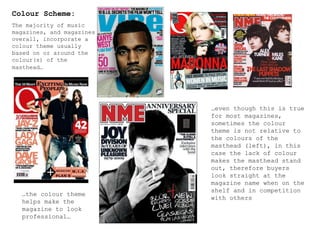
  • 1. Colour Scheme: The majority of music magazines, and magazines overall, incorporate a colour theme usually based on or around the colour(s) of the masthead… … even though this is true for most magazines, sometimes the colour theme is not relative to the colours of the masthead (left), in this case the lack of colour makes the masthead stand out, therefore buyers look straight at the magazine name when on the shelf and in competition with others … the colour theme helps make the magazine to look professional…
  • 2. Audience: Based on the colour theme alone, the audience could either be male or female orientated. It also depends on the genre of the magazine, the person(s) used for the main image and the leading story. The colour theme isn’t based on the masthead which makes it stand out. The magazine is aimed more at females as it uses the dominant, stereotypical, ‘girly’ colour pink as well as using two females for the main feature In this magazine a colour theme is apparent and in my opinion, by opting to use a colour theme ‘Shortlist’ is successful in making their magazine look professional Looking at the colours present, the contents and the main feature it is easy to see that this magazine is targeting the male audience
  • 3. Mast head: Contents: Left third shows the most interesting articles/features which act as a lure to potential buyers Language: The use of informal language makes the readers feel comfortable. This makes them want to carry on reading the magazine due to the fact that they are able to understand and relate to the language used Images used to accompany the magazine content, makes the magazine even more appealing to the buyers Strapline: It normally summarises what the magazine is about and it’s usually in the form of a slogan e.g. NME: New Musical Express Pug: In the majority of magazines the Barcode contains the pug e.g. (shown right) The pug informs readers of the magazines price, issue no, release date and, in specific pugs, the magazines website
  • 4. Mast head : It’s in a bold font making the name of the magazine clear to buyers, the prominent colours (red and white) contributes to the clarity of the name In some well known magazines, the main image covers a part the masthead, which shows that the magazine is popular enough that it dosen’t have to continually show the full magazine name on every issue Contents: Contents of the magazine shown in the left third uses a standard font in the colour white, on a black part of the background so that it’s clear to read as it’s the first thing (excluding the main attraction, in this case, Madonna) that’s seen when on the store shelves Strap line: E.g. Q: Britain’s Biggest Music
  • 5. Main Image: The image is relative to the headline enabling the readers to make the connection between the headline and main image. It’s the first thing that’s seen, therefore it has to be the most interesting Headline: It uses the biggest and boldest font as it is promoting the leading story. Top & bottom strips: They commonly consist of extras such as: - Music reviews - ‘Specials…’ As well as, competitions, popular acts (celebrities) and other offers that might appeal to the magazines target audience, such as a Tip On (freebie) related to the magazine. For instance, as NME is a music magazine a CD would be appropriate part of the entire cover. The central image is usually of a well known/popular person such as a celebrity or act. For example, Kings of Leon (above)
  • 6. This page is not instantly recognisable as a contents page as it doesn’t have a ‘Contents’ title to introduce it as a contents like most other magazines. However, we are able to identify it as a contents mainly, because of the list of page numbers as well as the images that give the readers a ‘taste’ of what’s in the magazine The ‘loud’ colour pink captures the readers attention The bottom strip, similar to the bottom strip of front covers, makes known the offer(s) The outsized article used for page one indicates that the article is of importance, probably of an act that are deemed popular and are of interest to a large number of people, therefore attracting more readers that would most appeal to the readers. The font is the largest on the page making the offer stand out most The consistent colour palette makes this page flow and as a whole look more effective The blue strip highlights a certain page indicating that the content of that page is of significance within the issue
  • 7. Some contents pages incorporate a continuation of colour theme from the front cover (shown by ) The majority of contents pages include a ‘contents’ title, making it clear to the reader what the page the are looking at contains The main image is big enough to show the importance of the feature yet it is balanced out by the rest of the magazine content and also covered by other images, indicating that it isn’t the most important article but important nonetheless The different sections of the magazine are separated e.g. ‘every month’ helping to break the magazine up. The colours used to do this usually make the section stand out more, appealing to readers
  • 8. The simplicity of the colour scheme makes it easy to follow and as a result of the layout, straightforward The lack of images allows the reader to focus on the few available Judging by the amount of space taken up by images, compared to the amount of text, the magazine is probably aimed at a younger audience as younger people tend to lose interest quickly The size and amount of images create anticipation within the reader, making them want to read on The themed colours link in with the genre of the magazine e.g. red, white and black would link in with a rock/ gothic magazine. Also, by using a colour theme the magazine has made their contents clear to read and easy on the eye of the reader
  • 9. Double page spread isn’t dedicated to one main article due to the fact that: + The magazines audience is not interested in reading a lot as they lose interest easily + Appearance wise, a lot of text can look intimidating or + The band is relatively new and no one knows who they are or what to expect from them Column of short articles with different topics help keep the attention of the readers The use of white text on black backing makes the wording clear to read and makes the page look interesting as it contrasts with the opposing article in the sense that, ‘The Teenagers’ article has black text on white backing whereas the column of short articles has white text on black backing. Same use of colours makes everything look like it’s connected and also draws the attention of the reader straight to the key areas on the page Information about the band allows the readers to relate to them on a personal level (even if they’re not well known) The quote is strategically placed around the centre of the page and is the first thing the reader sees therefore, it catches the audiences attention, forcing them to read the quote, in a way, before they lose interest in the article or turn the page
  • 10. Exclusive: A particular story that no other magazine has which makes the reader feel like they’re reading something no one else knows Caption: The caption uses a funny comment,(shown right), aimed to make the reader smile What it says : Gerard:“Oh no! I’ve forgotten to lock the bloody front door…” (Sorry for the blurriness of the picture quality) The colour palette chosen for these pages has been used cleverly as they link in with the bands type of music and image. The colours seen are black, red and white, colours usually associated with genres such as emo, goth etc- and automatically the reader is able to identify that the article is about an artist(s) in relation to those genres Both double page spreads have more pictures compared to the amount of text, by doing this, it allows the reader to become engrossed in the article making them want to read on, resulting in them visiting the magazines website A quote replaces the heading and the words ‘THE BEST MCR’ is in a bigger font and a different colour to the rest of the heading, which creates a focus on these words, intriguing readers to read further and inviting fans of the band to find out the information behind the quote
  • 11. These covers don’t look like the music magazines analysed previously, this is because, both covers do not follow the codes and conventions of a magazine and therefore they’re not instantly identifiable as one, otherwise they would look similar to the school magazine shown at the bottom left corner Both covers contain promotional pictures to appeal to their audience, mainly consisting of the students themselves, the parents and the governing board The colours in the school logo run throughout the magazines cover and cleverly separates the different pictures. Also, the logo is placed at the top of the left third therefore, it is one of the first thing the reader sees Both individuals used for the central image maintain eye contact with the buyer whilst smiling, inviting them to buy the magazine and be ‘happy’ like them and also trigger questions such as: + What has made them that happy? + By reading this magazine can I (the consumer) be that happy? Example of a school magazine that follows the typical codes and conventions of a magazine