
Recomendados
Mais conteúdo relacionado
Mais procurados
Mais procurados (18)
Destaque
Semelhante a Evaluating my indie music magazine
Semelhante a Evaluating my indie music magazine (20)
Último
Último (20)
Evaluating my indie music magazine
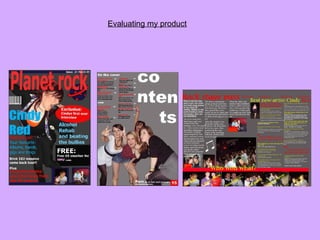
- 2. Conventions are typical things readers expect to see when looking at a music magazine. For example, the conventions of a music magazine is that the name would be in bold letters across the top of the page, with the magazines logo accompanying it. My magazine uses and challenges many of these conventions. Planet Rock is written in large letters at the top of the magazine , underneath a header, along with a small planet logo. A conventional magazine has a barcode and price some where on the front cover. I too made sure these two features were easy to spot as I found, when doing my questionnaire, the cheap price of a magazine is what attracts a buyer to purchase it. I found that typical indie magazines use dark colours, with alot of bold writing on the cover, along with an image taking up alot of the page with smaller feature boxes around it. My magazine is similar to this. I have used a large image in the centre of the page, accompanied by bold, reversed-out text on a dark background. Alot of the indie/rock magazines I looked at tended to be filled with alot of images and texts. However, I wanted to keep my contents page simple, so it was easy to skim read quickly. The text is in columns and the image takes up over half of the page. A conventional double page spread would have a heading in the left hand corner along with a subheading underneath, a main image across both pages with smaller images dotted around, accompanied by columns of text. I chose to stick to this convention as I feel the double page spread looks professional and is simple and easy to read. In what ways does your media product use, develop or challenge forms and conventions of real media products ?
- 3. How does your media product represent particular social groups? I decided to focus on the stereotype of an “indie” , and this is reflected through the magazines images, layout, language and features. The people used in the photos are all of the same age and style to the target audience. The layout is easy to read, looks exciting on the page and stands out because of the use of bright and bold text. The language used is similar to how ‘indie’ teenagers would speak. For example the word “Awesome” is used alot through the interview on the double page spread. Finally, the features are all connected to what young ‘rock’ kids would enjoy reading about, including gigs, up and coming bands, festivals and style. These particular features help in representing teenagers as being out going and enjoying a good social life.
- 4. What kind of media institution might distribute your media product and why? The most obvious place where my magazine would be sold is in newsagents, along with other magazines it would be competing with. This is because it is the most common place where magazines are sold and readers would know where to purchase one from. Because my target audience is aged between 16 and 21 Its important to distribute the magazine in places were this age range will certainly be, this could include, bar/lounges, gigs/festivals, secondary schools and student unions . Another place where ‘Planet Rock’ could be dispersed is in music or clothes stores related to the indie/rock theme, as this is were many of the target audience would be. Another way to distribute my magazine could be by digitally publishing online, meaning easier to access and reaching a wider range of readers. As 17% of all magazines are published on the internet it would be a popular way to distribute the product. This also means the magazine could be subscribed too, leading to bigger and better profits.
- 5. Who would be the audience for your media product? My magazine is specifically aimed at teenagers and young adolescence both male and female, into rock/indie music. The artist on the front of the cover is a girl roughly the same age and wearing the same style clothing as the target audience. Male readers may find her attractive and females may feel she is somebody they inspire to be. Although ‘Planet Rock’ is aimed at both sexes, girls may appeal to it more because of the gossip articles mentioned in the contents page. On the front cover of the magazine, it quotes “her drugs alcohol and beating the bullies” Females may be more attracted to spending time reading gossip about celebrities compared to boys. However, there are no bright or girly colours on the front cover of the magazine, and every background is a dark grey colour, associating to the more boyish readers. I think my magazine represents girls as not being ‘girly’ but at the same time representing both sexes as being interested in their music skills but also taking time to enjoy reading about the latest celebrity gossip. I think it also shows them taking an interest in others opinions, and how they reflect their own. I think many of the teenage readers would be interested in style and fashion and would inspire to be like many of the artists written about in the magazines contents. The older generation of readers may find they don’t have much in common with the magazine and the images and language styles are associated with younger teenagers. The HMV voucher is related to the target audience because they clearly enjoy music and HMV is a shop where many teenagers would purchase things from. The contents page is filled with one main image with a small amount of text, similar to the double page spread. This also suggests the magazine is aimed at the younger generation who do not want to read alot of paragraphs and do not have much spare time to read alot of information.
- 6. How did you attract/ address the audience? To attract my audience I designed a simple front cover with a large bold name and logo, indentifying the magazine. The famous artist on the front cover is a teenage girl, dressed similarly to the target audience, and a girl who boys may find attractive and young teenage girls may inspire too be. The artists name is underneath her photo, in an eye catching and bold font, attracting the readers attention. Once the readers attention has been caught by the main images on the magazine, they are drawn to the feature boxes and smaller texts. Different colours, sizes and fonts are used to attract the audiences attention. There is never too much text that it reveals to much, and even when the headings are summarised on the contents page there is still an element of mystery. I have used cropped images linking to articles inside the magazine, perhaps swaying the reader into wanting to read more. The idea of a free gift entices readers into buying the magazine. The free voucher is in the centre of page, with the words in reversed- out text as well as the HMV logo. The free gift is related to the genre of the magazine and would appeal to the target audience. I have used the word ‘exclusive’ suggesting this is the only magazine you can read this exclusive gossip from. The word is in reversed-out text, making it stand out more to the reader. The contents page is a simple layout with a main image taking up most of the page. The text is clear and easy to read with the word ‘contents’ written spaced out making it more exciting and appealing to look at. The background on each page is a dark grey colour suggesting the magazine isn’t appealing towards ‘girly girls’ and more towards girls and boys interested in rock. On the double page, the use of a drop capital emphasises the first word, making the text more attractive to read and less formal. The more exciting words are pulled out from the text giving the audience an example of what the interview is about with out giving too much away and ensuring they will want to read more. The people in the photos are a similar age and style to the target audience, and there are more bright colours and photos than text, another way to perhaps attract a younger generation who do not want to read alot of paragraphs.
- 7. What have you learnt about technologies from the process of constructing this product? I had already had prior experience of using a digital camera, however I learnt how to use different features on my camera that I have not needed to use before, such as the timer. After constructing my project I learnt how to upload photos on the computer. This has helped me a lot in the development of my product and will also be useful in the future I was then able to edit and manipulate the photographs on adobe Photoshop. This meant learning from the beginning how to use the programme. When my magazine was complete, I was then taught to print onto A3 paper and photograph paper.
- 8. looking back at your preliminary task, what do you feel you have learnt in the progression from it to the full product? Looking back at my preliminary task, I feel that I have learnt a lot in the progression to the full product. I have learnt how important the target audience is and how without them, I would not get the best results from my magazine. By doing my questionnaire I was able to see what features were liked and disliked. I learnt how important it is to understand the target audiences wishes and not carry out your own. By searching my target audience I was able to use the right features to attract the right audience e.g. colours and images. I also learnt about the music magazine industry by looking up many magazines on the internet as well as buying my own. I have learnt what a big market it is and how important it is to attract the right buyers with the right features. By searching the music magazine industry I have learnt about the typical conventions. I have challenged and carried out some of these conventions. The main thing I feel I have progressed on is my technology skills. I have improved on my camera skills by learning different features for example how to turn photos into different colours and put the camera on timer. I've secondly learned to use adobe photo shop which helped me manipulate the photos and layer different images. Thirdly, I have managed to use slideshare.net which helped me to upload my power point onto the computer which I was not able to do before starting my preliminary task.