
Recomendados
Mais conteúdo relacionado
Último
Último (20)
Destaque
Destaque (20)
Front cover linked to research
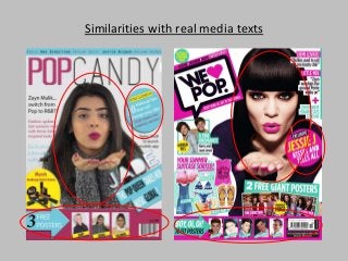
- 1. Similarities with real media texts
- 2. Here you can see, I’ve used the convention from a we love pop magazine. To recreate a similar look fro my artists name I used the same font as ‘pop’ on my masthead. I didn’t delete the inner white sections and then I added a pink and blue drop shadow. Features I have adapted into my front cover
- 3. I used the top rectangle graphic to include some artists names similarly used in the ‘we love pop’ magazine. I also included lots of graphics which is all over real media texts (pop magazines). The graphics I used were the arrow, rectangles and circles. Features I have adapted into my front cover