An Introduction to Responsive Web Design
•
0 gostou•379 visualizações

In this presentation, Shanna Kurpe introduces students to the basics of responsive web design, and provides them with a list of resources for learning more.

Recomendados
Recomendados
Mais conteúdo relacionado
Semelhante a An Introduction to Responsive Web Design
Semelhante a An Introduction to Responsive Web Design (20)
Mais de Shanna Kurpe
Mais de Shanna Kurpe (20)
Último
Último (20)
An Introduction to Responsive Web Design
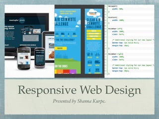
- 1. Responsive Web Design Presented by Shanna Kurpe
- 2. DISCLAIMER: I am not a designer or developer.
- 3. MY GOAL: Introduce you to new industry techniques so you can study them on your own.
- 4. Agenda Introduction to Responsive Web Design Definition Pros and Cons Examples Resources
- 5. What is Responsive Web Design? The technique used to design a website that adapts to different layout environments Personal Computer eReaders and Tablets Mobile Phones
- 6. IN OTHER WORDS: One Website for all Devices
- 7. How is it done? W3C CSS3 Media Queries Fluid Proportion Based Grids Adaptive Content
- 8. Media Queries Writing CSS that detects the Capability of a device and displays the best layout based on: Browser width and height Device width and height Orientation Resolution
- 9. Fluid Proportion Based Grids Mock-Up Preferred Fix- Width Layout Convert them into Percentages
- 10. Fluid Proportion Based Grids Mock-Up Preferred Fix- Width Layout Convert them into Percentages
- 11. Adaptive Content Custom Layout Adjustments 1024 x 1280 800 x 1024 600 x 800 640 x 800 320 x 640 240 x 320 240 and below Hiding and Revealing Portion of Images Foreground Images that Scale with layout Creating Sliding Composite Images
- 12. FOR EXAMPLE
- 16. RESOURCES
- 17. Resources A List Apart Magazine at www.alistapart.com Tree House at www.teamtreehouse.com Flexible Web Design: Creating Liquid and Elastic Layouts with CSS by Zoe Mickley Gillenwater
- 18. Photo Credits Chapman, Cameron. Choosing the Best CSS Framework: A Complete Guide. DevSnippets. Web. Accessed 11 April 2012. DesignShock.com. Responsive Web Design, Most Complete Guide. 13 September 2011. Web. Accessed 10 April 2012. @johnpolacek. What the Heck is Responsive Web Design. Web. Accessed 10 April 2012. Knight, Kayla. Adaptive CSS-Layouts: New Era in Fluid Layouts? Smashing.Magazine. Web. 9 July 2009. Accessed 11 April 2012. Knight, Kayla. Responsive Web Design: What it is and How to Use it/ Smashing.Magazine. Web. 12 January 2011. Accessed 11 April 2012.
Notas do Editor
- \n
- \n
- \n
- \n
- \n
- \n
- \n
- \n
- \n
- \n
- \n
- \n
- \n
- \n
- \n
- \n
- \n
- \n