
Recomendados
Mais conteúdo relacionado
Mais de LizRose2012
Mais de LizRose2012 (20)
Último
Último (20)
Front cover analysis essay and labelled analysis
- 1. Front Cover Analysis essay and labelled analysis
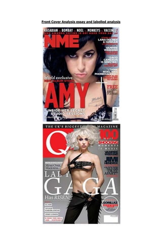
- 2. The NME magazine has a specific target audience. The audience age would be between 15 and 30 and the magazine targets both men and women. The music genre of this magazine which is Indie/Rock is enjoyed by both genders. The colours are also neutral. The main colours used on this cover are red, black and white. The uses of plain colours like black and white make the red font stand out even more. The colour red is used as it has connations of drama, and power. This gives the audience the idea that the magazines content will be interesting to read, and stand out. The red also has connations of anger, and danger, the artist Amy Whinehouse is used on the front of this cover, this relates to some of her music but also how she is perceived as an artist. The outfit she is wearing is shown slightly on the cover even though it is a close up image, and we see animal print on her clothes, this again suggests the artist has a wild background and links into the lively colour of red. The Guttenberg Design Principle is used on the front cover. This is done to put the main features of the magazine where the audience will naturally look first. The title of the magazine and the eyes of the artist, which are using direct eye contact with the audience, are in the primary optical area. This will catch the audience’s attention and make it stand out against other magazines. The barcode and a website related to the magazine are placed in the terminal area. This is because these are not as important and do not need to be seen by the audience. All of the cover lines are placed in the strong fallow area. This is done so the audience can see what articles and stories are going to be in the magazine, main quotes and artist’s names are put in white to make these stand out against the rest of the font so the audience can take in all the key information first. The main article on the cover artist has been put in the weak fallow area. To make up for being in the weaker area the name of the artist is the biggest font on the cover, even bigger than the title, and the font is bright red. This will draw the audience’s attention here even though it is a weaker fallow area. The main image shows Amy Whinehouse staring out directly into the camera. She isn’t smiling she is giving the audience an intense look, she looks powerful and dangerous.