
Recomendados
Mais conteúdo relacionado
Mais procurados
Mais procurados (17)
Destaque
Destaque (14)
Último
Último (20)
Masthead Research
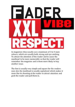
- 1. In magazines they usually use a maximum of 3 to 4 main colours, which are usually bold, strong and eye catching To attract the attention of the reader and to cause the masthead to be more memorable so that the reader will remember the magazine and is them more likely to buy another issue. The font is usually very simple and square for the readers ease also the masthead is usually capitalized which makes it seem like its shouting at the reader to attract attention and grab the reader and pull them in.