BESegal's Data Visualization Best Practices
•
1 gostou•3,245 visualizações

Learn basic data visualization best practices and get a list of additional data viz resources.

Recomendados
Recomendados
Mais conteúdo relacionado
Último
Último (20)
Destaque
Destaque (20)
BESegal's Data Visualization Best Practices
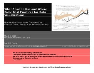
- 1. What Chart to Use and When: Basic Best Practices for Data Visualizations How to find your inner Stephen Few, Edward Tufte, Ben Fry, & Avinash Kaushik Bruce E. Segal For Philadelphia Tableau User Group July 2011 Meeting To make your data visualizations sing, email BruceESegal@gmail.com © Bruce E. Segal, 2012 All Rights Reserved We are overwhelmed by information …. Computers speed the process of handling information, but they don't tell us what the information means or how to communicate its meaning to decision makers –Steven Few Want to make your data visualizations sing? Email BruceESegal@gmail.com
- 2. Introduction What Chart to Use and When–Basic Data Visualization Best Practices Goals for this Presentation: What I Want You to Remember When You Leave The Room: 1.Tell A Story. This means we have to think about the data and look at different charts and graphs. 2.Information Dense Presentations... Lead Viewers to Ask Questions (but wait my viewers want answers) 3.Use a Hammer with Nails. So Use a Line Graph with Time Data… When to use line charts, bar charts, pie charts, heat maps & scatter plots. 4.Be the Hero. Show the Zero. (Use the full Y axis.) 5.Always Add Internal and External Benchmarks. They add context and validation. Want to make your data visualizations sing? Email BruceESegal@gmail.com
- 3. The Archetypes. The Touch Stones For Data Visualization Menard’s Napoleon’s March across Europe Tells Story. Clear + Dense Info. Data Integrity. 1.Look at financial pages – Edward Tufte tip. Those folks use density to solve the problem of conveying lots of information, clearly, and in small space. Want to make your data visualizations sing? Email BruceESegal@gmail.com
- 4. What to Use and When First look at ALL the data. It’s easy to think selecting part of it is more focused or simpler. Instead it blinds you into making wrong decisions. Get the tooth, the hole tooth and nutting but the two. “‘Three blind analysts and a data warehouse.’ Business people struggle every day to make sense of data, stumbling blindly, touching only small parts of the information, and coming away with a narrow and fragmented understanding of what it means. Conventional BI tools make it unnecessarily difficult to explore data from multiple perspectives, so analysts tend to pursue only a limited set of predetermined questions. It is simply too time consuming to explore the data thoroughly, allowing fresh discoveries to lead them to comprehensive and free-flowing exploration. Without the ability to examine data from multiple perspectives simultaneously, many of the meaningful relationships that exist in our data will remain hidden.” –Stephen Few http://www.perceptualedge.com/articles/Whitepapers/Three_Blind_Men.pdf Want to make your data visualizations sing? Email BruceESegal@gmail.com
- 5. What to Use and When Line Graphs to show trends and changes over time. Cycle Graphs special form of line graph to evaluate seasonality over time. Bar Graphs to compare across types. Bar Graphs to show distribution. Pie charts to show distribution – in only one instance. 99% and 1& Scatter Plots to show relationship or lack of relationship between two numbers. And many others not covered here. Juice Analytics Chart Chooser http://labs.juiceanalytics.com/chartchooser.html Line graphs for time series Spark lines (sizzle lines)–Tufte’s invention Bar graphs for comparisons Want to make your data visualizations sing? Email BruceESegal@gmail.com
- 6. Cycle Charts: http://www.exceluser.com/dash/cycleplot1.htm Want to make your data visualizations sing? Email BruceESegal@gmail.com
- 7. Scatter Plots for Relationships and Trend Lines!! Go to scatter plot example of Search Phrase on conversion rate. Failure to use a trend line in a scatter plot contributed to the Shuttle Challenger fuel tank explosion. http://www.datavis.ca/gallery/missed.php Want to make your data visualizations sing? Email BruceESegal@gmail.com
- 8. Histograms – Distro Curves – Bell curves and why they matter a few years after high school http://www.isixsigma.com/tools-templates/normality/tips-recognizing-andtransforming-non-normal-data/ Before: Raw Data After: Fitting the Raw Data to a Normal Curve (Many steps omitted.) Want to make your data visualizations sing? Email BruceESegal@gmail.com
- 9. Want to make your data visualizations sing? Email BruceESegal@gmail.com
- 10. External Benchmarks: An example Use grey for benchmark. Note use of conclusion in title. Note use of financial combo of line over bar graph. Note pane lines in center graphs. I might create confusion w 2 diff’t color scales for %. If audience wants, put .tbw on screen to show how to set pane lines. Want to make your data visualizations sing? Email BruceESegal@gmail.com
- 11. Bad Graphs Examples & Why: Graphs Gone Wild, Chart Porn, Chart Junk. Dishonest Graphs (Not to zero. Double axis – hides the reality of the data) Klout’s line graphs: When does a 5 point drop on a scale of 100 look huge? When Klout misleads you? Want to make your data visualizations sing? Email BruceESegal@gmail.com
- 12. Resources: The Touch Stones Plus Some Others Stephen Few: http://www.perceptualedge.com/ His discussion forum http://www.perceptualedge.com/discussion.htm Edward Tufte http://www.edwardtufte.com/tufte/index Avinash Kaushik: Book, Blog – Occum’s Razor http://www.kaushik.net/avinash/digital-marketing-analytics-crimesagainst-humanity/ Jakob Nielsen Naomi Robbins http://www.nbr-graphs.com/examples Great example of charts used to tell stories Okay Cupid Blog: http://blog.okcupid.com/ http://blog.okcupid.com/index.php/your-race-affects-whether-peoplewrite-you-back/ Uber: Used crime data to predict when to send cabs into a service area. http://blog.uber.com/2011/04/11/uberdata-the-hidden-cost-of-cabs/ Want to make your data visualizations sing? Email BruceESegal@gmail.com
- 13. Extreme Presentation Method: http://www.extremepresentation.com/ Data Visualization Sources Examples of bad graphs http://www.datavis.ca/gallery/missed.php Why Infographics are misleading Dis-InfoGraphics or http://www.informationisbeautiful.net/ How to do infographics right as per Stephen Few. You can present information and data that’s engaging, informative and beautiful. Few do. http://biblogg.no/2012/02/15/data-blooms-in-beauty-and-truth/ What Charts To Use When and Why Alan Smithee, great examples of charts to use and when http://www.alansmitheepresents.org/ Great info about which graph to use and when. Juice Analytics http://chartchooser.juiceanalytics.com/ More great info on which chart to use when: http://www.add-knowledge.com/ Want to make your data visualizations sing? Email BruceESegal@gmail.com
- 14. Tableau’s what graph to use when .pdf http://www.tableausoftware.com/learn/whitepapers/which-chart-or-graphis-right-for-you Miller Samuel, the NYT chart company http://www.millersamuel.com/ Sparklines, Beanlines and more oh my http://sparklines-excel.blogspot.com/ An example of Cohort Analysis: http://www.mininglabs.com Use Histograms and data transformation to id the true outliers http://www.isixsigma.com/tools-templates/normality/tips-recognizingand-transforming-non-normal-data/ Want to make your data visualizations sing? Email BruceESegal@gmail.com