Asian American Pacific Islander Month DDSD 2024.pptx
Conventions of my product
1. In what ways does your media product use, develop or challenge forms and
conventions of real media products?
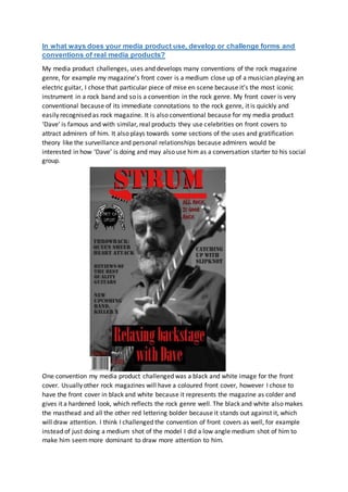
My media product challenges, uses and develops many conventions of the rock magazine
genre, for example my magazine’s front cover is a medium close up of a musician playing an
electric guitar, I chose that particular piece of mise en scene because it’s the most iconic
instrument in a rock band and so is a convention in the rock genre. My front cover is very
conventional because of its immediate connotations to the rock genre, it is quickly and
easily recognised as rock magazine. It is also conventional because for my media product
‘Dave’ is famous and with similar, real products they use celebrities on front covers to
attract admirers of him. It also plays towards some sections of the uses and gratification
theory like the surveillance and personal relationships because admirers would be
interested in how ‘Dave’ is doing and may also use him as a conversation starter to his social
group.
One convention my media product challenged was a black and white image for the front
cover. Usually other rock magazines will have a coloured front cover, however I chose to
have the front cover in black and white because it represents the magazine as colder and
gives it a hardened look, which reflects the rock genre well. The black and white also makes
the masthead and all the other red lettering bolder because it stands out against it, which
will draw attention. I think I challenged the convention of front covers as well, for example
instead of just doing a medium shot of the model I did a low angle medium shot of him to
make him seemmore dominant to draw more attention to him.
2. I made the colour scheme throughout my magazine red because it has connotations like
blood or danger, this fits in with the attitude of rock music, and it is a bit dark and maybe
violent. Also red on black and white is very good at attracting attention to the magazine.
One other convention I have used on my double page spread is a pull quote, this is used in
all kinds of magazines and done to cut up the paragraphs and to draw the reader into my
interview by displaying an inspirational quote from the interview. I also think I challenged
the convention of doing one big image on double page spread, instead I put two images of
the model to make the article more varied and interesting.
3. My contents page is generally quite conventional in its design. For example I have split off
each story in the contents page with boxes with a page number and a title that overviews
the article. I have also added some text in the box that gives a bit more information about
the article.