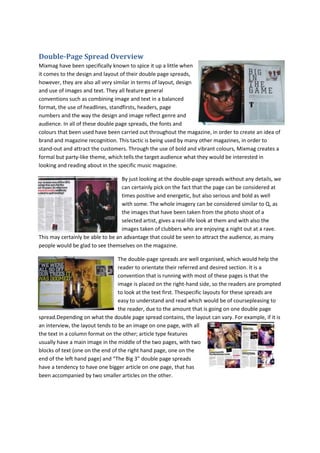
1. Double-Page Spread Overview
Mixmag have been specifically known to spice it up a little when
it comes to the design and layout of their double page spreads,
however, they are also all very similar in terms of layout, design
and use of images and text. They all feature general
conventions such as combining image and text in a balanced
format, the use of headlines, standfirsts, headers, page
numbers and the way the design and image reflect genre and
audience. In all of these double page spreads, the fonts and
colours that been used have been carried out throughout the magazine, in order to create an idea of
brand and magazine recognition. This tactic is being used by many other magazines, in order to
stand-out and attract the customers. Through the use of bold and vibrant colours, Mixmag creates a
formal but party-like theme, which tells the target audience what they would be interested in
looking and reading about in the specific music magazine.
By just looking at the double-page spreads without any details, we
can certainly pick on the fact that the page can be considered at
times positive and energetic, but also serious and bold as well
with some. The whole imagery can be considered similar to Q, as
the images that have been taken from the photo shoot of a
selected artist, gives a real-life look at them and with also the
images taken of clubbers who are enjoying a night out at a rave.
This may certainly be able to be an advantage that could be seen to attract the audience, as many
people would be glad to see themselves on the magazine.
The double-page spreads are well organised, which would help the
reader to orientate their referred and desired section. It is a
convention that is running with most of these pages is that the
image is placed on the right-hand side, so the readers are prompted
to look at the text first. Thespecific layouts for these spreads are
easy to understand and read which would be of coursepleasing to
the reader, due to the amount that is going on one double page
spread.Depending on what the double page spread contains, the layout can vary. For example, if it is
an interview, the layout tends to be an image on one page, with all
the text in a column format on the other; article type features
usually have a main image in the middle of the two pages, with two
blocks of text (one on the end of the right hand page, one on the
end of the left hand page) and “The Big 3” double page spreads
have a tendency to have one bigger article on one page, that has
been accompanied by two smaller articles on the other.
2. There is also much repeated use of mise-en-scene, for example, the costume of the people
appearing in the double page spreads is generally the same with females being slightly more dressed
up, whereas males tend to look very casually dressed. This could suggest male dominance; since
males tend to dominate the world of Electronic Dance Music, with more male DJs than female,
whilst females are often shown to be the partygoers.