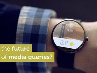
The future of media queries?
•
61 gostaram•48,475 visualizações

A brief exploration of proposed Level 4 Media Queries and some thoughts about the future of the web. Presented at Responsive Day Out in Brighton on June 27 2014.

Recomendados
Recomendados
Mais conteúdo relacionado
Mais procurados
Mais procurados (20)
Destaque
Destaque (20)
Semelhante a The future of media queries?
Semelhante a The future of media queries? (20)
Mais de yiibu
Último
Último (20)
The future of media queries?
- 1. the future of media queries?
- 2. A brief chat (and my personal thoughts) on Level 4 Media Queries (etc…) ! (W3C First Public Working Draft, 3 June 2014)
- 4. The scripting media query enables us to apply a style based on the presence/absence of JavaScript. what it does @media (scripting) value: none | initial-only | enabled the user agent either doesn’t support a scripting language, or the support isn’t active for the current document scripting is enabled during the initial page load, but not supported afterwards e.g. printed pages, proxy browsers user agent supports scripting of the page and that support is active for the current document
- 5. The ability to apply new styles when scripting is enabled feels like a stop-gap or (even worse) a false promise. If you haven’t taken the time to build an application that functions without JavaScript, and/or progressively layer functionality based on feature-detection, applying a few last minute styles using a media query won’t save you. thoughts...
- 6. Besides, on modern browsers, lack of JavaScript “support” is rarely the problem. ! Far more common are factors such as this... • Scripts that don’t load due to poor connectivity. • Scripts that execute much later or slower than expected. • Scripts that fail due to differences in support level. thoughts...
- 8. The light-level media query enables us to apply styles to suit one of three luminosity levels. what it does @media (light-level) value: dim | normal | washed used in a dim environment, where excessive contrast and brightness would be distracting or uncomfortable e.g. night time light level is in the ideal range for the screen, and doesn’t require adjustment exceptionally bright environment, causing the screen to be washed out and difficult to read. e.g. bright daylight
- 9. The specification intentionally refrains from defining the 3 levels in terms of a measurement in lux, for several reasons: ! • Devices equipped with a light sensor usually adjust the brightness of the screen automatically ! • Different screen technologies wash out at different ambient light levels. e.g. e-ink vs. liquid crystal ! • Many light sensors are inaccurately calibrated. more... “
- 10. • Automatically adapting styles based on luminosity feels as if it could often do more harm than good. ! • Testing the impact of styles may also be difficult given the device diversity, and the fact that each device/browser may have different adaptation thresholds. e.g. How quickly they adapt to changes in luminosity and what amount of change will trigger an adaptation. thoughts...
- 11. For the time being, this specification might best be reserved as a trigger to prompt a manual change in theme or reading mode. We notice it’s getting a bit dark in here. Would you like to switch to night mode? No thanks! Yes please! Don’t show this again. thoughts...
- 12. @media (pointer)
- 13. the primary input mechanism of the device includes an accurate pointing device the primary input mechanism of the device DOES NOT include a pointing device the primary input mechanism of the device includes a pointing device of limited accuracy what it does @media (pointer) value: none | coarse | fine touchscreen, Nintendo Wii controller, Kinect, Google Glass stylus-based devices, mouse, touch pad accurately positioned cursor accurate pointer awkward cursor gesture finger your head proxies the awkward cursor accurately positioned cursor TV, printer The pointer media query is used to query the presence and accuracy of a pointing device.
- 14. more... “ unless i’ve misunderstood...it’s now the browser’s job to understand the pointing device “opportunity space” of each and every device on the planet... If a device has multiple input mechanisms, the pointer media feature must reflect the characteristics of the “primary” input mechanism, as determined by the user agent.
- 15. “ which won’t change the media feature’s value As the UA may enable the user to zoom, OR as secondary pointing devices may have a different accuracy… more...
- 16. “As the UA may enable the user to zoom, OR as secondary pointing devices may have a different accuracy, the user may be able to perform accurate clicks even if the value of this media feature is “coarse”... more... …and vice versa
- 17. Unless the API enables the UA to dynamically adapt in real-time to detect the true primary device we really won’t know how much accuracy the user has at any given time... (…and dynamically adapting a UI in real time as a user switches from mouse, to touch, and back to mouse would drive them mad regardless.) thoughts...
- 18. There’s possibly already too much diversity for this specification to be useful beyond the context of speciality apps, or the application of non-critical tweaks to multi-context UIs. ! e.g. ensure everything works with and without a mouse, touch screen and keyboard, then apply non-destructive progressive enhancements as the context becomes clearer thoughts...
- 19. @media (hover)
- 20. The hover query the user’s ability to hover over elements on the page. what it does @media (pointer) value: none | on-demand | hover the primary pointing system CAN’T hover, or there is no pointing system. the primary pointing system CAN hover, but it requires a significant action on the user’s part. the primary pointing system CAN easily hover over parts of the page
- 21. more... “If a device has multiple input mechanisms, the hover media feature must reflect the characteristics of the “primary” input mechanism, as determined by the user agent. ! Authors should be careful not to assume that the ':hover' pseudo class will never match on device where 'hover:none' is true, and should design layouts that do not depend on hovering to be fully usable.
- 22. ...so once again, best not to rely on the accuracy of this context and only apply hover-based styles as progressive enhancements (…as we should already be doing). thoughts...
- 24. The update-frequency media query is used to query the ability of a device to modify the appearance of content once it has been rendered. what it does @media (update-frequency) value: none | slow | normal once it has been rendered, the layout can no longer be updated. e.g. documents printed on paper. the layout may change dynamically but the output device cannot render or display changes quick enough for users to perceive them as smooth animation e.g. e-ink, underpowered devices layout may change dynamically and the output device is not unusually constrained in speed e.g. computer screens
- 25. Could be useful as a means of triggering and/or disabling aspects of animation within a UI. Could be a bit tricky however to determine how to progressively enhance. ! e.g. given the state of modern devices, it seems counterintuitive that “none” (i.e. paper!) could be the baseline… :-) thoughts...
- 27. The overflow-block media query describes the behaviour of a device when content overflows the viewport in the block axis. what it does @media (overflow-block) value: none | scroll | optional-paged |paged no affordance for overflow in the block axis; any overflowing content is simply not displayed e.g. billboards overflowing content in the block axis is exposed by allowing users to scroll to it e.g. computer screen overflowing content in the block axis is exposed by allowing users to scroll to it but page breaks can be manually triggered e.g. slide-shows content is broken up into discrete pages; content that overflows one page in the block axis is displayed on the following page e.g. e- book readers, printers the vertical axis in horizontal writing modes
- 28. The overflow-inline media query describes the behaviour of a device when content overflows the viewport in the inline axis. what it does @media (overflow-inline) value: none | scroll no affordance for overflow in the inline axis; any overflowing content is simply not displayed e.g. billboards, Google Glass overflowing content in the block axis is exposed by allowing users to scroll to it e.g. most computer screens the horizontal axis in horizontal writing modes
- 29. …I don’t know about you, but this is starting to not feel quite right.
- 30. Part of me wants more media queries… though maybe not these exact ones.
- 31. For example: Something you can do pretty easily on Android is modify layout based on a user’s default language setting…
- 32. values-de You do this by grouping assets using the relevant qualifiers. ! At runtime, Android detects current device capabilities and load the most appropriate resources. color drawable res values logo.png icon.png drawable-zh logo.png icon.png only devices set to German will use what’s in this folder only devices set to Chinese will use what’s in this folder
- 33. This is super useful because 140 characters can hold up to 5x the amount of content when in Mandarin!
- 34. Why should Chinese users have to suffer through a UI designed for more verbose languages such as German or Russian?
- 35. Touch screen UI mode API level notouch stylus trackball finger car desk television appliance v1 v2 v3 Layout direction Language & region MCC & MNC ldrtl ldltr en fr en-rUS fr-rFR mcc310 loosely maps to platform version e.g. Gingerbread, Jelly Bean country code mnc004 docked with a... no display!! network code e.g. AT&T, T-Mobile right to left As a matter of fact on Android you can qualify and adapt layout based on tons of factors… (these are just some of the more interesting ones...) For a full list see Providing resources
- 36. …and layout is just one thing that you can adapt. You can use these qualifier to specify raster graphics, colour palettes, UI labels content and strings and collections of numeric values… <abcd/> <200dp> layouts density-independent values and dimensions
- 37. You can also combine qualifiers to increase context specificity. values-en-rUS-land-hdpi language region orientation pixel density
- 38. …but on the other hand, I worry about stuff like this becoming the norm. (heir-in lies the road to madness) layout-en-rUS-land-car-hdpi-night-qwerty-trackball-...
- 39. (…no comment)
- 40. A few years ago, in a presentation called Reset the Web I floated the following idea… possibly crazy
- 42. could map to “native” versions of all of these…? Home News Reviews Photos Video Magazine Podcast Topics Apple Gives Share- holders More Input; Will Facebook Get the Message? At its annual shareholders meeting on Thursday, Apple’s management bowed to pressure from key inves- tors and agreed to allow shareholders to elect board directors by a simple major- ity vote. Now any new or current director standing for election who fails to receive support from a majority of share- holders must resign his By Tim Carmody February 24, 2012 | 4:26 pm At its annual shareholders meeting on Thursday, Apple’s management bowed to pressure from key in- vestors and agreed to allow shareholders to elect board directors by a simple majority vote. Now any new or current director standing for election who fails to receive support from a majority of share- holders must resign his his or her position. At next year By Tim Carmody February 24, 2012 | 4:26 pm Apple Gives Shareholders More Input; Will Facebook Get the Message?Home News Reviews Photos Video Magazine Podcast Topics Home News Reviews Photos Video Magazine Podcast Topics MENU Home News Reviews Photos Home News Reviews Photos <nav is=”native”> <ul> <li>Home</li> <li>News</li> <li>Reviews</li> </ul> </nav> what if this…. (banish the hamburger icon and just trigger a native “menu” component”
- 43. …in many ways no different than writing one select menu, and relying on the platform to deliver the best combination of interface, behaviour and interaction…. desktop Android iOS
- 44. A bunch of intelligent, responsive, platform- appropriate yet adaptable default components...
- 45. Which once again makes me think of some of the lovelier bits about designing for Android…
- 46. Take an agreed upon construct, declare the UI, and the device renders it in the most appropriate way… …in this case using XML…a component
- 47. notification behaviour: LED flash, audio, vibration on a phone… action action contenticon/image
- 48. RetweetReply RT@jhagel: The Internet of the next billion - great presentation on the globalization of innovation spawned by the Web http://t.co/ rNMOBxslQm Bryan Rieger Favourite wearable device vibrates to notify of incoming message user swipes to reveal actions, and taps to trigger them. a watch…
- 49. Google Glass: notifies user with an audible chime user taps, or... performs a “head wake” gesture user taps... ...views card actions user performs a voice reply …and so on
- 50. I’ll be the first to admit that this implementing this more widely could make for a VERY different web. But then again…we now live in a very different world.
- 51. …[Bob] connects his phone to the car, and can now use the familiar car controls, steering wheel buttons, console dials, touch screens to control it. It looks and feels as if it's part of the car,…it also means that he has a personalised experience, that he can bring with him into any compatible car. “ - Google I/O 2014 keynote yep…silos are still a big risk, but today’s web is at risk as well
- 52. To a certain degree, we’re already developing technologies that align with this thinking…
- 53. (…or at least have the potential to do so.) (throw in element query style encapsulation behaviours, and we really have something!)
- 54. Developing new technologies is the easy part. Understanding which ones we truly need, and for what is far harder, but will be even more important going forward if we wish to build a stronger and more future-friendly web.
- 55. “Everything is best for something and worst for something else. The trick is knowing what is what, for what, when, for whom and most importantly, why” - Bill Buxton (in a great many contexts) https://www.flickr.com/photos/dcoetzee/3885789043
- 56. http://www.flickr.com/photos/tinou/453593446 thank you many thanks to the amazing photographers on http://creativecommons.org/licenses/by/2.5 @yiibu hello@yiibu.com contact us at Presentation deck available @ http://www.slideshare.net/yiibu