Pune Airport ( Call Girls ) Pune 6297143586 Hot Model With Sexy Bhabi Ready...
Hot Desking for Ancillary Products
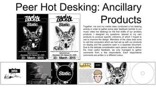
1. Peer Hot Desking: Ancillary
ProductsTogether, me and my media class conducted a hot desking
activity in order to gather some peer feedback (similar to our
music video hot desking) on the first drafts of our ancillary
products. I designed my questions, tailored to my own
products to produce specific criticisms of which I hoped to
use to improve the design. Members of the class took turns
to visit the computers which we had set up with our products
on display and the questions open in a separate document.
Due to the delicate consideration each person took to deliver
the most useful feedback, we only managed to gather
comments from a few respondents. Each respondents
comments are written in a different colour.
2. Question One
At your first glance of these ancillary products, was it clear to you that the name of
the artist is Jackal and the name of the album is Static? And what characteristics
gave you this impression?
It’s clear from the album cover that the name of the album is
Static, however since the image of the jackal is completely
obscured it’s not that obvious what it is. The graffiti font saying
‘Jackal’ on the back is quite hard to read, but the effect is good,
so maybe consider using a slightly more legible graffiti font.
The advertisement makes it clear that the artist’s name is Jackal
due to the logo used at the top, and it is also clear that the
album’s name is Static due to the slightly smaller font. Perhaps
including the artist’s logo somewhere on the front cover would
make it more apparent on the digipak.
Yes it was clear that the artists name was jackal, possibly with
the more experimental use of font rather than the simple font of
the album name.
I thought it important to find out how distinguishable the album name is from the
artist’s name because these are the most vital details on the advert which means
they need to be clear. I had also made a conscience effort whilst designing the
products, to make the album name and artists name recognisable and
distinguishable. I did this by making the word Jackal larger and higher on the
advert than the word Static, thereby illustrating their hierarchy of importance (this
was a convention which I found in my research into similar products).
Fortunately, the consensus in the feedback was that it is clear that the artist’s
name is Jackal and the name of the album is Static. This tells me that the efforts I
made and my consideration of conventions when designing the products were
worthwhile. More importantly it tells me that the artists name and album name will
be easily distinguishable in a magazine.
Question Two Do these products suggest a particular music genre to you?
Hip hop/rap
Dance, due to the minimalistic colour scheme and the front cover
of the digipak
Dance/ hip hop, mainly noticeable with the spray paint design of
the artists logo
In my research into similar products I found that the conventions of magazine
adverts and digipaks can differ depending on genre. It is for this reason that I
asked this question; I wanted to see if I had gotten the genre specific conventions
right. It appears that the apparent genre is either hip hop or dance. As the correct
genre, electronic dance music (EDM), comes in the dance category, I can
conclude that I have successfully conveyed the essence of the genre. The hip hop
confusion can be explained by the fact that the two genres have similar
conventions that are based around iconography and image.
3. Question ThreeDo you think the use of colour is appropriate? Is there too much or too little?
And over all do you prefer the mostly black or white colour schemes?
Yes it is appropriate. The mostly black colours on the album cover
work well, but the mostly white colour scheme looks best for the
advert.
It looks appropriate and minimalist in design, though I would consider
featuring the artist’s name somewhere on the digipak. I think the
advertisement with the white background works better than the
inverse design.
I think the colour scheme is good, simple black and white being
bolder. I prefer the first advert with the white background because the
image is more visible and text is clearer.
As the design of my ancillary products is quite monochrome, I was concerned
that this would cause a negative or uninterested response in the audience.
However, my colleagues seemed to recognise and could appreciate my
minimal style intentions which is reassuring because this is my favoured
design style. Also ,the comments in the feedback, along with a few informal
comments, have told me that the preferred magazine advert it the mainly
white one. This is helpful because I was torn in which to choose colour
scheme to choose.
Question Four What are your opinions of the overall layout of these products? Is there too
much going on? Are they missing anything?
No, there’s definitely not too much going on, it looks good. The only thing I
think you need to change is the about the artist panel and also erase the
white background behind the text ‘jackal’ and the release date on the
poster? It cuts into the black frame and looks like it’s just been tacked on.
There’s not too much going on throughout the design, there is a clear
brand identity carried across from your front cover of your digipak to the
advertisement.
No I think the design works as it is, and design is bold and attractive in both
digipak and first advert.
This question was inspired by the famous from Antoine de Saint-Exupery, ‘A
designer knows s/he has achieved perfection not when there is nothing left to
add, but when there is nothing left to take away.’ This basically means that I
must attain the right balance of information and elegance by making sure that
the design never looks overcrowded. By the responses that I received it
seems like I am en route to achieving this these desired design
characteristics. I am pleased that the blue commenter recognised the brand
identity, as I had paid careful attention to insuring that this would be
noticeable. The constructive comment from the pink response has alerted me
to an issue. There is intact no white background behind the text on the
advert, but the way the boarder is place makes is seem like there is. I will be
sure to resolve this for the final draft.
4. Question Six Do these products convey any particular brand identity/star iconography? If
so what do you think it may be?
There’s a clear brand identity conveyed by the products, they link in
with each other very well.
The brand identity of these products is clearly conveyed through the
typeface used and the use of the jackal image.
I think a clear brand identity can be identified, through imagery and
band logo,that work well together.
As I had taken delicate planning to construct a brand identity, which is based
on Jackal’s existing star iconography, I thought it necessary to investigate the
effects. To my delight, all the comments suggested that my attempts to
create an identity for the album were prosperous. It is especially satisfying
that the techniques of using particular typefaces and carefully selecting
images is what gave the reader this impression.
Question Five Based on your knowledge of the conventions of digipaks and magazine
adverts, are there any changes that you could suggest to make the products
look more professional (and less like a student project)?
The digipak looks very professional, apart from the panel with the
artist information. The cartoon face looks good, I think it’s the font
and colours that could be improved? So perhaps invert the colours
so it’s a black background with white text? You could also try putting
the carton image in the middle and having the text wrap around it.
The record label image could also be made a lot smaller.
The record label could be smaller and the cartoon image could be
replaced with an edited image of the artist.
I think the whole product looks professional except the panel with the
face. I think a variation of font and images could improve this page,
as it appears to stand out against the other panels. Maybe even
decrease the size of the record company logo, as they only really
need to be small like they would normally be on a back cover of the
album.
This question is more general, designed to harness the capital that my media
student colleagues have gained in their time studying promotional packages.
Thankfully the main point of focus was on the artist information panel of the
digipak. I felt that this was a particularly weak aspect in the design of these
products so I wished for constructive criticism. From the comments I can see
that I need to reduce the size of the record company logos (maybe even
move them to the back of the digipak); I need to make the panel look more
attractive, perhaps by inverting the colours of the background and text. The
result of this question has proved useful because at least it has confirmed my
concerns with the weakest facet of the design, and at most it has given me
advise on which to move forward.