![Outline ,[object Object],[object Object],[object Object],[object Object],[object Object]](data:image/gif;base64,R0lGODlhAQABAIAAAAAAAP///yH5BAEAAAAALAAAAAABAAEAAAIBRAA7)
Recommended
Recommended
More Related Content
More from tmra
More from tmra (20)
Recently uploaded
Recently uploaded (20)
GTMalpha - Towards a Graphical Notation for Topic Maps
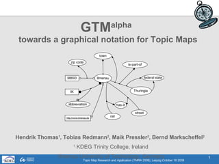
- 1. GTM alpha towards a graphical notation for Topic Maps Hendrik Thomas 1 , Tobias Redmann 2 , Maik Pressler 2 , Bernd Markscheffel 2 1 KDEG Trinity College, Ireland 2 Ilmenau University of Technology, Germany
- 5. 3. General GTM Design (1 of 2) 1.) Which basic layout? 2D-graph layout with many different elements (topic, types, occ, etc.) 2.) How to separate the different elements? different colors topic scope type occ different geometric shapes topic scope type topic type topic type BUT: topics can be types AND instances
- 7. 4. GTM alpha tutorial – Topics and Types (1 of 2)
- 8. 4. GTM alpha tutorial – Topics and Types (2 of 2)
- 9. 4. GTM alpha tutorial – Topic Names (1 of 3)
- 10. 4. GTM alpha tutorial – Topic Names (2 of 3)
- 11. EQUAL 4. GTM alpha tutorial – Topic Names (3 of 3)
- 12. 4. GTM alpha tutorial – Subject Identity
- 13. 4. GTM alpha tutorial – Occurrences (1 of 2)
- 14. 4. GTM alpha tutorial – Occurrences (2 of 2)
- 15. 4. GTM alpha tutorial – Associations
- 16. 4. GTM alpha tutorial – Views (1 of 2)
- 17. 4. GTMalpha tutorial – Views (2 of 2)
- 20. 4. GTM alpha tutorial – Reification
Editor's Notes
- Hello everybody ! my name Is hendrik thomas, I am a phd student of the technical university of ilmenau. In my research I work on the question “how topic maps can be used to enhance the subject indexing in digital libraries” In this context of digital libraries I talk quite often to librarians and it is quite easy to explain the advantages of topic map in representing knowledge to them. However, when it comes to visualization of this knowledge to the enduser, most librarians prefer a simple list or table. In my opinion a graphical visualization of the knowledge network can be a helpful - and now comes the tricky part - I can simple not show any real live example where an existing topic map visualisation can really help the user to solve a retrieval or navigation problem. This Problem haunted me for some time and today I want to explain you, why traditional visualization approach for Topic Map is unsufficiently and and how a creativ design approach can improve the helpfulness . Therefore I want to present tmchartis - a prototypically tool set for designing multiple problem oriented topic map visualisations