7 Best Practices of Responsive Web Design
•Download as PPT, PDF•
2 likes•865 views

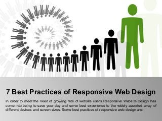
In order to meet the need of growing rate of website users Responsive Website Design has come into being to save your day and serve best experience to the widely assorted array of different devices and screen sizes. http://www.sonitek.ca

Recommended
Recommended
More Related Content
Recently uploaded
Recently uploaded (20)
Featured
Featured (20)
7 Best Practices of Responsive Web Design
- 1. 7 Best Practices of Responsive Web Design In order to meet the need of growing rate of website users Responsive Website Design has come into being to save your day and serve best experience to the widely assorted array of different devices and screen sizes. Some best practices of responsive web design are:
- 2. Mobile Users Deserve the Same Quality of Browsing Experience • Responsive Website Design gives pleasant and same quality of browsing experience to mobile users as well desktop users. Now days the professionals need not to change the content or the images of the website due to the different devices and screen sizes. Responsive design fits to all screen sizes and devices and brings best experience to users.
- 3. Design your Site with Responsive in Mind • It is important to design the site by keeping responsive concept in mind. Thus, expert needs to know what are those elements that are needed to avoid. Some of them are fancy Javascript, useless absolute positioning, flash elements, complex divs etc as it can complicate the adjustment on the whole.
- 4. Pay Attention to your Breakpoints • Resolutions can be set in different breakpoints, but several sizes that one should keep in mind are as follows: • 480px (it applies to older, smaller smartphone screen sizes) • <768px, it is ideal for larger smartphones and smaller tablets • >768px, it applies for everything bigger such as large tablet screens and desktops screens • Also, these can be used too if you’ve got the energy and time: • <320px, it is great for older small, low res phones • >1024px stylesheet for wide screens on desktops
- 5. Images and Flexibility • While selecting the images for the website makes sure it is flexible or not. Professionals must select the appropriate and quality images that suits well on all kinds of screen sizes.
- 6. Compression of Elements and Content • Responsive Website Design gives pleasant and same quality of browsing experience to mobile users as well desktop users. Now days the professionals need not to change the content or the images of the website due to the different devices and screen sizes. Responsive design fits to all screen sizes and devices and brings best experience to users.
- 7. Eliminate Non Essential Content • To bring best user experience to the users, it is important to eliminate all non-essential content as it will eventually bring meaningful content, information, images, detail and many more to the user. It makes the website easily and quickly accessible.
- 8. Well Organized Design • What to remove and what to add are mentioned as above, but it is also important to make it perform efficiently. Well organized design will help the user to enjoy the simple navigation and smooth functioning of the website.
- 9. Thank You Contact Us:- Sonitek International 255, Duncan Mill Road, Unit # 212, Toronto, Ontario M3B 3H9 Call Us: 1-416-385-9949 , 1-877-335-7664 Email Us: webmail@sonitek.ca Website: http://www.sonitek.ca
- 10. Thank You Contact Us:- Sonitek International 255, Duncan Mill Road, Unit # 212, Toronto, Ontario M3B 3H9 Call Us: 1-416-385-9949 , 1-877-335-7664 Email Us: webmail@sonitek.ca Website: http://www.sonitek.ca