
Recomendados
Mais conteúdo relacionado
Mais procurados
Mais procurados (11)
Semelhante a Chart presentation
Semelhante a Chart presentation (20)
Último
Último (20)
Chart presentation
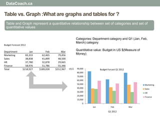
- 1. DataCoach.ca Table vs. Graph :What are graphs and tables for ? Table and Graph represent a quantitative relationship between set of categories and set of quantitative values Categories: Department category and Q1 (Jan, Feb, March) category Budget Forecast 2012 Quantitative value: Budget in US $(Measure of Department Jan Feb Mar Marketing 83,333 62,465 79,456 Money) Sales 38,838 41,899 48,500 HR 37,780 32,878 29,665 Finance 58,976 51,786 55,346 Total $218,927 $189,028 $212,967 US.$ 90,000 Budget Forcast Q1 2012 80,000 70,000 60,000 50,000 Marketing 40,000 Sales 30,000 HR 20,000 Finance 10,000 0 Jan Feb Mar Q1 2012
- 2. DataCoach.ca Table vs. Graph : which one communicate your message better? Apply graph when Apply table when The message contained in The display will be used to look shape of values like up individual values patterns, trends or exceptions Graph can display large amount It will be used to compare of data that can be readily individual values perceived and understood Both detail and summary values need to be included
- 3. DataCoach.ca Table vs. Graph : Examples of Graph or Table Jan Feb Mar Apr May Jun Jul Aug Sep Oct Nov Dec Total Product 01 93,816.87 99,330.17 97,964.58 91,356.44 90,706.87 94,130.90 97,449.62 92,400.25 94,642.58 97,362.82 95,610.46 97,214.17 1,141,985.72 Product 02 61,544.86 62,620.00 60,980.35 64,156.34 64,546.47 65,644.51 63,653.62 67,168.96 67,551.90 66,088.71 69,123.37 64,160.96 777,240.05 Product 03 70,489.50 72,292.01 74,470.37 74,068.47 76,763.80 71,854.27 78,119.35 75,512.98 77,279.64 76,664.56 78,745.54 74,780.17 901,040.66 Product 04 31,181.15 56,173.19 50,350.72 54,069.25 54,903.16 56,013.38 58,355.25 51,377.39 51,220.79 50,468.00 52,907.65 57,834.99 624,854.94 Product 05 54,308.43 52,513.25 55,085.31 54,393.36 51,017.44 56,982.99 52,053.24 50,160.16 50,541.53 59,262.03 51,442.67 56,684.94 644,445.37 Product 06 45,806.17 41,336.60 42,219.14 42,250.34 42,010.01 43,358.85 49,227.33 49,472.11 42,762.00 42,946.64 42,211.66 44,419.87 528,020.72 Product 07 87,060.12 85,826.87 87,491.86 81,843.27 85,363.72 82,761.22 86,571.80 89,550.80 84,381.91 87,349.18 88,166.28 88,488.13 1,034,855.16 Product 08 16,785.86 11,512.28 14,249.97 13,349.83 11,047.10 16,537.92 15,122.03 12,413.50 10,845.32 14,183.00 15,780.88 19,738.02 171,565.71 Product 09 25,487.77 24,718.00 25,440.27 21,653.58 29,588.19 20,087.97 23,387.63 24,322.17 21,766.06 21,100.43 27,347.62 24,304.74 289,204.44 Table1- table for comparison and look up 120,000.00 100,000.00 80,000.00 60,000.00 Product 01 Product 02 40,000.00 20,000.00 0.00 Graph 1- graph for trend and pattern
- 4. DataCoach.ca Table Design: What quantitative relationship table can display? Relation between single Relation between one set Relation between one set set of quantitative value of quantitative values and of quantitative value and and one set of the intersection of the intersection of categorical items multiple categories hierarchical categories Sales 2011 2012 Rank Produt (US $) Region Q1 Q2 Q3 Q4 Q1 Q2 1 Product E 1,862 North 632 986 309 343 822 237 2 Product I 1,702 East 314 279 911 456 949 999 3 Product B 1,490 South 641 303 498 620 918 967 4 Product F 1,422 West 235 830 239 512 742 929 5 Product H 1,356 Total 1,822 2,399 1,956 1,931 3,431 3,133 6 Product A 1,277 7 Product C 1,268 8 Product J 1,256 9 Product D 1,081 Region 10 Product G 1,072 Year Qtr North East South West Total 2011 1 632 314 641 235 1,822 2 986 279 303 830 2,399 3 309 911 498 239 1,956 4 343 456 620 512 1,931 2012 1 822 949 918 742 3,431 2 237 999 967 929 3,133
- 5. DataCoach.ca Table Design : What is the best structure for your table? Region prodcut Unit Sold Product North East South West North product 01 184 Product01 184 170 131 138 product 02 182 Product02 182 170 162 162 product 03 136 Product03 136 103 117 198 product 04 138 Product04 138 120 129 192 product 05 145 Product05 145 153 155 131 product 06 161 Product06 161 138 143 150 product 07 112 Product07 112 147 189 121 product 08 188 Product08 188 130 172 135 product 09 141 Product09 141 113 153 101 product 10 193 Product10 193 149 130 150 product 11 181 Product11 181 143 105 184 product 12 124 product 13 189 Product12 124 109 189 156 product 14 199 Product13 189 105 168 188 product 15 182 Product14 199 154 118 168 East product 01 170 Product15 182 160 170 196 product 02 170 product 03 103
- 6. DataCoach.ca Table Design: How to capture hierarchies in your table? Category Product Jan Feb Mar Apr May Jun Jul Aug Sep Oct Nov Dec Total Beauty Supply Product02 66 88 63 84 64 51 26 76 22 70 50 78 738 Product03 90 82 62 81 32 34 71 94 28 65 10 48 697 Product04 78 51 21 76 90 56 34 69 40 84 38 15 652 Product06 23 11 99 36 15 96 12 50 91 99 55 7 595 Product01 30 68 49 63 15 25 75 55 83 7 26 13 508 Product05 68 31 48 11 31 42 22 37 68 17 43 0 418 Product07 6 87 14 11 3 67 46 43 3 2 5 31 317 360 418 354 362 250 371 287 425 336 345 227 192 3926 Pharmaceutical Product15 413 299 256 286 395 513 409 501 357 394 207 359 4391 Product14 39 58 17 60 67 87 81 15 56 84 20 32 615 Product13 79 41 72 30 41 76 27 45 86 16 96 76 685 Product12 68 2 28 38 89 82 100 66 14 76 2 12 578 Product11 84 36 19 22 16 56 92 99 66 12 43 73 616 Product10 61 99 6 22 33 59 21 83 37 33 3 52 508 Product09 38 21 23 43 73 64 36 100 26 90 27 20 560 Product08 45 42 93 72 77 89 53 93 71 83 16 94 829 360 418 354 362 250 371 287 425 336 345 227 192 3926
- 7. DataCoach.ca Table Design: What column sequence is right for your table? • Column that need comparison • Derived Column next to column that has need to be next to each other been calculated from Last Year This year % of Total Fcst Product Unit Sold Revenue Revenue Product Unit Sold Actual Revenue Revenue Revenue Product 01 3,546 127,330 34,332 Product 01 1,067 155,824 29% 10,964 Product 02 57 42,090 170,500 Product 02 2,042 25,527 5% 8,755 Product 03 3,526 159,948 83,847 Product 03 225 94,894 17% 66,772 Product 04 2,515 84,484 11,536 Product 04 688 105,196 19% 70,524 Product 05 127 35,986 50,315 Product 05 602 162,389 30% 66,129 Total 9,771 449,838 350,531 Total 4,624 543,830 100% 223,145
- 8. DataCoach.ca Table Design: Where and how use formatters in your table? • Percentage Format • Number Format 6.56% 6.56% 4,860 81.8% 81.80% (3,298) 59% 58.67% 6,150 36.48% 36.48% 8,059 35.3% 35.31% 8,123 39.9% 39.93% (9,448) 23.39% 23.39% 2,408 47% 47.14% 3,828 86% 86.00% (1,561) 64.43% 64.43% 5,248 (8,563) Percentage Column with same vs. different decimal Places
- 9. DataCoach.ca Table Design : What table columns you should sort by? • Numbers and dates both have natural order that can be sorted ascending or descending • Other data, such as the name of things (e.g., products, customers, and countries) use alphabetical order which is useful for lookup but is not meaningful otherwise • If items have a natural order that is meaningful , sort them in that order
- 10. DataCoach.ca Graph Design : What message graph can communicate? • Graph can encode quantitative values in form of :Points, Lines, Bars, Boxes, Shape with varying 2-D Area, Shape with color intensity • Quantitative relationship in graph :Time Series, Ranking, Nominal Comparison, Part-to-Whole, Deviation (single and Multiple), Correlation, Geospatial
- 11. DataCoach.ca Graph Design : What is time series and how graph can display it? • Values display how something changed through the time(Yearly, monthly, etc.) • X axis of the graph usually provides time interval scale • Use lines when you have value for every interval of time Jan Feb Mar Apr May Jun Jul Aug Sep Oct Nov Dec 161,896 174,444 78,358 129,610 122,186 96,912 139,536 36,456 172,353 170,134 166,081 168,224 200000 180000 160000 140000 120000 100000 80000 60000 40000 20000 0 Jan Feb Mar Apr May Jun Jul Aug Sep Oct Nov Dec
- 12. DataCoach.ca Graph Selection: What is a time series relationship and what graphs can display it? • Use points when you don`t have value for every interval of time Jan Apr May Jul Aug Oct Nov Dec 161,896 129,610 129,610 139,536 36,456 170,134 166,081 168,224 180000 160000 140000 120000 100000 80000 60000 40000 20000 0 Jan Apr May Jul Aug Oct Nov Dec
- 13. DataCoach.ca Graph Selection : What is a ranking relationship and what graphs can display it? • Ranking display how quantitative values relate to one another sequentially ,sorted by size from lowest to highest or vice versa • One axis of graph display categories labels and the other display quantitative values • Bars are natural choice for display Ranking unless quantitative scale dose not begin at zero, In this case Points are better choice 350 Order Management 300 Sales 250 200 Marketing 150 Manufacturing 100 50 Technology 0 Human Resource Finance Engineering 0 50 100 150 200 250 300 350
- 14. DataCoach.ca Graph Selection : What is a part-to-whole relationship and what graphs can display it? • Display how individual values that make up whole of something (e.g. total sales) • Pie charts and stacked bars can display part-to-whole relationship East West North South 6% 11% 80 East 44% West North South 70 39% 20 10 1
- 15. DataCoach.ca Graph Selection : What is a deviation relationship and what graphs can display it? • A deviation graph displays the degree to which one or more set of quantitative values differ in relation to a primary set of values • Bars (vertical and horizontal) can display deviation relationship Actual Plan Sales 89.57% Sales 36.15 346.69 Marketing -7.21% Marketing 298.22 278.17 Operations -32.54% Operations 159.05 120.00 Engineering 36.68% Engineering 214.89 339.36 Finance -43.27% Finance 389.13 271.60 Head Count 2012 Head Count 2012 - Variance from plan Actual Plan 100.00% 450.00 80.00% 400.00 60.00% 350.00 300.00 40.00% 250.00 20.00% 200.00 0.00% 150.00 -20.00% 100.00 50.00 -40.00% 0.00 -60.00% Sales Marketing Operations Engineering Finance Sales Marketing Operations Engineering Finance
- 16. DataCoach.ca Graph Selection : What is a correlation relationship and what graphs can display it? • Correlation graphs display the relationship between two paired sets of quantitative to demonstrate whether or not they are related, and, if so, the direction of the relationship (is positive or negative) 100000 90000 80000 Salary in US $ 70000 60000 50000 40000 30000 20000 55 60 65 70 75 80 85 Height in inches
- 17. DataCoach.ca Graph Selection : What is a geospatial display and how to display it on a map? • Geospatial displays feature the geographical location of values on a map • Points of different size and color intensity can be used to capture values
- 18. DataCoach.ca Graph Selection : What is a geospatial display and how to display it on a map? • Points of different size and color intensity can be used to capture values
- 19. DataCoach.ca What is overall strategy? • Should the message be presented in the form of a table or a graph? • If a table, which kind of relationship should it display? • Between single set of quantitative values and a single set of categorical subdivision • Between single set of quantitative values and the intersection of multiple categories • Between single set of quantitative values and the intersection of hierarchal categories • If a graph, which kind of relationship it display? • Time Series • Ranking • Part-to-whole • Deviation • Correlation • Geospatial • If a graph, which object or combination of objects for encoding the quantitative value work best? • Points • Lines • Bars • Boxes