Top 10 Facebook Timeline Implementations by Airlines and Airports
•
5 likes•895 views

As brands jump onto the new Facebook Timeline bandwagon, here are the Top 10 implementations by Airline and Airports. If you work in an airline or airport organisation and wish to download the slides, please email contact@simpliflying.com

Recommended
Recommended
More Related Content
More from SimpliFlying
More from SimpliFlying (20)
Recently uploaded
Recently uploaded (20)
Top 10 Facebook Timeline Implementations by Airlines and Airports
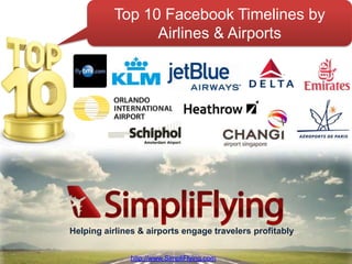
- 1. Top 10 Facebook Timelines by Featuring: Airlines & Airports Helping airlines & airports engage travelers profitably http://www.SimpliFlying.com http://www.SimpliFlying.com
- 2. Case-study 1 BMI
- 3. Embracing the “timeline” concept One of the airlines that surprised us the most was the British airline BMI that, even though it had been recently been put on sale with little hope of preserving its brand, created one of the best airline pages on Facebook. The airline embraced the “timeline” concept in full starting from its cover image that shows the evolution of the airline’s brand and aircrafts in one neatly designed image. www.SimpliFlying.com
- 4. Highlighting what’s important to the customer Furthermore it also created a complete timeline that goes back to the late 1930s and made excellent use of the starring function to highlight relevant posts like the approval by the EU competition authority of its sale to the IAG group. www.SimpliFlying.com
- 5. Case-study 2 KLM
- 6. Early adopters Unlike many airlines who waited until the last minute, KLM uploaded its first cover image on the 1st of March, at the very beginning of the 30 days period provided by facebook, and used the “adjustment” period to make constant improvements to its page. www.SimpliFlying.com
- 7. Welcoming user generated content As well as having one of the few cover images that complete the profile picture, and a timeline that goes back to the 1920s, the most remarkable aspect of this page is the usage of starred posts to highlight not only the usual corporate images but also content posted by its followers like the image below: www.SimpliFlying.com
- 8. Case-study 3 JetBlue
- 9. Holistic design Jet Blue one of the usual suspects when it comes to being proactive on social media and we have included it here for two main reasons. The first is the way in which it has customized the icons in its app/tab bar, giving them a clean and extremely visual design that appeals to the users and fits perfectly within the general page design. www.SimpliFlying.com
- 10. Smart milestone usage The second reason, however, is perhaps the most interesting one. In our previous articles we mentioned briefly that airlines could use milestones to highlight their new destinations and including images that might inspire people to travel. JetBlue seems to have embraced the idea and went a step further by using the recent addition of a new destination to neatly place a route map right in the middle of its Facebook page www.SimpliFlying.com
- 12. The cover image of tomorrow Although facebook makes it clear that the cover image is not to be used for advertising purposes and cannot contain calls to action, web addresses etc… it does not say that it can’t be use for campaigns or, for example, to say hello. Here’s what Emirates did: www.SimpliFlying.com
- 13. An image of brand values But it doesn’t end there. We suggested in the previous article that the cover image should be used to transmit the essence of the brand – this is exactly what Emirates was able to do by giving an image of an airline that looks to the future, and at the same time inspires people to travel asking its users to dream about future travels. www.SimpliFlying.com
- 14. Changing every day Moreover, the airline also found a way to infuse life into its cover page and appears to be changing the cover image daily, thus giving its users more reasons to visit the page. The image on the previous slide appeared on the 2nd day of the campaign. The one shown here was seen a few days later www.SimpliFlying.com
- 15. Case-study 5 Delta
- 16. A different interpretation of cover images Rather than choosing to use a slogan, an image of its aircraft or one of its destinations, the airline decided to use a picture of an old sign that, judging from the comments made by users, appears to have both a historical connection with the brand and an emotional one with its most faithful followers. www.SimpliFlying.com
- 17. A visual experience Furthermore the airline seems to have made an effort to make sure that the background of the logo on the profile picture matched the one on the cover page and created custom images for all its tabs, thus creating a smooth visual experience for the viewer. www.SimpliFlying.com
- 18. Click here to download. www.SimpliFlying.com
- 19. Case-study 6 Orlando International Airport (MCO)
- 20. The age of memes In marketing it is often said that one has to communicate in a way that is appropriate to the channel. On Facebook one of the most popular and viral elements are the so called “memes” and MCO’s idea of using it as a cover image makes for one of the most creative and effective covers in the airport industry www.SimpliFlying.com
- 21. Vintage In another interesting, and very visual initiative the airport has exploited the recent vintage-images trend and shared with its followers several vintage airline ads www.SimpliFlying.com
- 22. Case-study 7 Aéroports de Paris
- 23. Aspirational destination One of the most interesting Airport pages we found was the one from Aéroports de Paris that featured an unique cover image centered on lifestyle and clearly design to promote Paris as a destination. www.SimpliFlying.com
- 24. Paris, Paris and more Paris The company has also been posting Paris- related content thus providing plenty of material for users to share www.SimpliFlying.com
- 25. Case-study 8 Amsterdam Schiphol Airport
- 26. Visual Highlighting Another way in which cover images can be used is to visually communicate a message or, as Schiphol Airport did, highlight the differentiating elements that form part of the brand’s proposition to its users. www.SimpliFlying.com
- 27. Thorough design In the process the airport also managed to produce a very neat design where the profile image works together with the cover image. The page also features a nice row of custom designed tabs that provide an excellent visual experience for the user. www.SimpliFlying.com
- 29. Positive images Changi Airport stood out from the crowd thanks to its unusual cover design that featured an eye-catching mosaic of images that appear to have been taken at the airport . These images help communicate positive feelings to the viewers, thus reinforcing the airport’s brand www.SimpliFlying.com
- 30. Highlighting what’s important The airport also made an excellent use of the “star” function to highlight important news and make them more visible to its fans. www.SimpliFlying.com
- 31. Case-study 10 London Heathrow Airport
- 32. Local audience Another airport that decided to leverage on emotions is Heathrow airport that featured an image of a couple meeting at the airport. Interestingly, unlike other airports it choose to focus on an encounter as opposed to a travel experience or a destination, instantly building an emotional connect with those landing on the page. www.SimpliFlying.com
- 33. Complete timeline Furthermore the page contained some user-generated content and had a timeline that went back to the days when the airport was founded using a dedicated design for the post. www.SimpliFlying.com
- 34. For more case-studies: www.SimpliFlying.com Helping airlines & airports engage travelers profitably http://www.SimpliFlying.com www.SimpliFlying.com