1. I chose this style of text because its
I put in this I made this text box colorful and big
fun and creative so it fits with the
red arrow because I want it to catch the
audience that I’m presenting to.
because I want audience’s attention. It is also the title
the audience to so I changed the font into a creative
focus on the font to make it interesting.
line since it’s
the
introduction to
the
presentation.
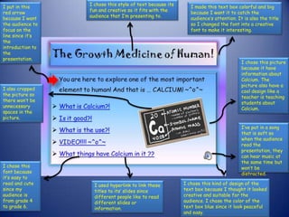
I chose this picture
because it have
information about
Calcium. The
picture also have a
I also cropped cool design like a
the picture so teacher is teaching
there won’t be students about
unnecessary Calcium.
spaces in the
picture.
I’ve put in a song
that is soft so
when the audience
read the
presentation, they
can hear music at
the same time but
I chose this won’t be
font because distracted.
it’s easy to
read and cute I used hyperlink to link these I chose this kind of design of the
since my titles to its’ slides since text box because I thought it looked
audience is different people like to read creative and suitable for the
from grade 4 different slides or audience. I chose the color of the
to grade 6. information. text box blue since it look peaceful
and easy.
2. I put borders and
change the shape
of the picture so
it would look more
creative and
catchy for the
audience.
I also kept the
fonts of the title
and body text
the same so it
won’t be
confusing and
look too
different from I brighten this
the previous picture so it
slides. would look more
colorful and it
would fit the
audience I’m
presenting to.
I use this style of
bullet points because
I thought it would
look creative, cool
and suitable for the I kept this background the same as
audience. the other slide because I want to
keep my presentation consistent so it
won’t be confusing for the audience.