SlideShare uma empresa Scribd logo
1 de 9
Similar Product Research Masthead-The masthead is an a big bold font to draw attention. It is also a quite cheeky, modern font to portray the genre of the music magazine. of the same age as they have also put bands like Radiohead, u2, Marc Almond, DevendraBanhart etc which will appeal to males as well. Sell line- The quote from Amy Winehouseis saying her music is where she tells all and this relates to her song ‘back to black’ where she talks about the truth of her life. Colour scheme- The main image, background and text are all in black, white and sepia, these are representative of the fact that the music she does is soul and this is quite relevant to 60s and 70s and this colour scheme is giving it an ‘old’ feel to it. Sell line- They have advertised a ‘Free stax CD’ this is to try to draw interest to the magazine and to hopefully get people to buy it.   Fonts-All the fonts apart from the masthead are in a old style font, again linking into the type of music Amy does. Sell line- ‘The Music Magazine’ this not only highlights what type of magazine it is but it comes across like they are best one out there as they are ‘the’ music magazine. Sell line- There is a sell line ‘Radiohead speak!’. Radiohead are a new, modern and groundbreaking band, this is highlighted through the use of a picture of Radiohead and this is the only colour thing on the page. This portrays there music is not ‘old style’ but fresh so there picture is in bright and vibrant colours. Sell line- There is a list of bands that will feature inside the magazine. This will draw people to buy the magazine if these are the bands that they are interested in. Other information-The magazine is a monthly one meaning it will include more content and have a slightly higher price than weekly magazines. It also has the website on the cover to advertise there website as this is part of the magazine. The primary target audience for this issue is girls aged late teens to late twenties as they have put Amy Winehouse on the front cover and this is her main target audience. Although the secondary target audience is males… Cover Image- The picture of Amy Winehouse in black and white to further the comparison with her music.
Sell line- The main sell line is of Lady Gaga, There is first a big eye catching picture of Lady Gaga meaning the main feature is the magazine is about her. There is then the sell line to do with Lady Gaga which any fans interested in buying the magazine will read and this includes something which they think will draw the reader in such as “why she doesn’t wear pants” this will shock the reader and make them want to find out more about this. Lady Gaga being on the front of the magazine makes clear which genre the magazine is Masthead-The masthead is big and has bright colours in it like blue and yellow these make the masthead stand out and portray the music genre of the magazine. Main Image- It is of Lady Gaga, she is the only thing on the page that is very bright this makes her stand out. Her hair is purple which highlights that lady gaga as being eccentric and bold. This is part of her iconography as she is known for having bold, strange and out of the ordinary makeup, clothes and hair but also in her personality and this is portrayed through this image. Other Information- It is a weekly magazine meaning it does not contain as much as a monthly magazine but is a lower price. It has the website as readers may ant to view that and it ties in with the magazine and the readers can get more information from the website.. The target audience for ‘Billboard’ are mainly girls as the artists they feature girls will be more interested in. Sell line- All of the sell lines on the cover are appropriate to the genre of the magazine and are appealing to the audience of the magazine. Colour scheme- Everything is in either black grey or purple this is to make the main image stand out. They have alternated the colours of the lines of the sell lines to make important things stand out at a glance. Fonts- The fonts are all bold and thick to make the sell lines stand out.
Masthead-The masthead is big and has bright colours in it like red and yellow these make the masthead stand out. It also in white which makes it stand out from the dark blue background. Main image- The main image is of Rihanna, her hair is bright red, her lipstick Is too and her eyes are a reddish shade as well, this makes her stand out. The clothes that she is wearing are quite revealing this is part of Rihannas iconography as she is known for wearing quite revealing outfits Sell line- The main big sell line is about Rihanna as she is also the cover image. The sell line is drawing the audience in to read it as it is appealing as they want to find out more about who Rihanna actually is and why she believes this Sell line- The sell lines include artist which will appeal to the target audience making them want to buy and they also include information about things they would be interested in. It has a sell line about a film and TV music conference as the readers will be interested in this as that is the genre of the magazine Colour scheme- The colour scheme is very out there, bold, bright and colourful this will draw attention, appeal to the target audience but it also reflects Rihanna as an artist and also the genre of magazine Other information- It is a weekly magazine so is cheaper than a monthly one and it will include less content. It has the website on the cover so that readers can go online and find more information about the artists and music industry on their website as this will interest them. Fonts- The font on the text “Rihanna” is quite cool and has a gradient this is reflective of the artist as Rihanna is quite cool. This is highlighted by her gun tattoo which portrays her in a cool, mysterious and edgy way which is also reinforced by the sell line of “My fans don’t really know who I am”
Main image- The focus on this contents page is on the main image of an artist. He relates to the genre of the magazine but also will appeal to the audience as this is what they are interested in. He has ruffled and messy hair which is a feature of the music genre that this magazine is about and also his style of dress is representative of the genre Colour scheme- Is quite dull and dark and boring apart from the main image this makes it stand out more and be the main part of the contents page. The darkness of the contents page is iconic of the genre as black as a colour is a big part of it Sell line- There is a little red box which says “celebrating the best music” this stands out quite clearly from the rest of the contents page as it is in red which is bright and the rest of the colours are quite dull. This will draw attention and will interest the readers as if they are reading a music magazine they will want to know about ‘the best music’ Contents- The contents all relate to the genre of the magazine and will interest the reader.  There are different headings for the ease of the reader so they can find things quicker. Also the heading are in different fonts to stand out. The page number and subheadings are in bold so as to stand out and again for the ease of the reader.  The way in which “contents” is written is different, funky and cool which is perception of the music genre of the magazine. The fonts also reflect this image as well Sell line- At the bottom there is information headed “here's the remix” this includes important information on the magazine for the reader to read.
Fonts- The main fonts are quite cool, funky and fun which will appeal to the audience and reflects the music genre of the magazine Sell line- At the side of the contents page there is a music chart compiled by the music magazine. This will appeal to the target audience as they want to know what music is popular, find out about new artists and songs and know if there favourite song or artist has reached the chart and at what place. Masthead- The masthead is featured again on this page to provide consistency. Contents- The information on the content is categorised for ease of the reader and to save them time. Colour has been used to highlight things that they think will most appeal to the audience and also the important information which may interest them. The magazine not only has information on artists but also on the music industry as a whole and this is part of the appeal for the target audience. Colour scheme- The colours are bright and stand out making the contents page interesting and fun and also represents the genre of the magazine as it quite cool and funky magazine. Sell line- On the contents page there are pictures of popular artist so readers will automatically recognise them and can easily see which page an article about them is on, this also highlights that they are popular artists and will appeal to the majority of their readership. Sell line- The contents furthers the information provided about the magazine website and lets the reader know lots about it.
Sell line- At the side of the contents page there is a music chart compiled by the magazine about many different types of genre. This will appeal to the target audience as they want to know what music is popular, find out about new artists and know if there favourite song or artist has reached the chart and at what place. Fonts-  Many different fun and cool fonts have been used on the contents page to make it look fun and interesting and also to keep the readers attention. Sell line- Artists have been featured on the contents page with only a picture portraying that they are very well known within their target audience and there name doesn't’t need to feature. They have also been put their as there audience will be interested in information about them and will want to read about them. Colour scheme- They have used lots of different colours to make the contents page more fun and interesting and these colours will appeal to the target audience of this magazine. Sell line- At the bottom of the contents page there is more information on the website as this is a good place where readers can go to get more information on the types of articles in the magazine for free and the website is part of the magazine brand so they are advertising themself. Contents- The content of the magazine has been split up into different headings to help the reader find thing easier. Articles of interest have been put in different colours to draw the readers attention to them. Masthead- The masthead is featured again on this page to provide consistency.
The main image of Amy Winehouse she has eye contact with the reader and she looks as though she is trying to tell them that “I’m not a horrible girl” and is almost sad about that image. In the image you can see her tattoos which are part of her ‘tough’ girl image and are part of her iconography. The image is quite dim lighted  this could be to signify the fact that the reader does not know much about her personal life and her so they are in the dark. Also , the darkness and reddish background signify he dark and dangerous life she lead. The colours on the picture are quite an old style reflecting her music style The image is from her 2007 back to black press campaign, in the song back to black, it signifies death and negativity and it is here to be symbolic of her death. This is the introductory pages before the interview highlighting that it is an important feature article of this issue as they have dedicated so many pages. The heading quite intriguing for the reader as it makes them wonder why she has said this and they will want to know more about it. It is in a very big font size to catch the readers eye and to draw their attention to it. The text saying Amy Winehouse is in a different colour, has a  shaded in a black colour and is in block capitals. This makes her name stand out portraying that her name is important and there audience will want to read this article as there is big interest in her as she died not long before this was released and people are interested in getting to know a little bit more about her and her life. The pages are bright and colourful as a mark of respect for Amy Winehouse after her death.  The text under the quote provides key information on the interview  to get the reader interested and to let them know a bit about the article. Is almost like the article is a tribute to Amy Winehouse after her death.
In the main image, Solange Knowles is in a strong position reflecting her character and she also has eye contact with the reader  creating a relationship and drawing your attention to her eyes, this is all to get the reader involved in the article. There are also many smaller back and white pictures of Solange Knowles that signify that sheis fun and funky way but it also reflects the genre of music that she is. The pull quote is to generate interest in the article and get to know about what is in it and to hopefully get the reader interested. It reveals a bit about her and creates interest. The colour scheme is quite plain and black and white apart from the text “Solange Knowles” which highlights that she is an important name and is key in the the genre of the magazine. It also makes clear to the reader that the article is about her. Furthermore, the main image is in bright colours signifying her as an artist and how she is out there, fresh and making a splash in the music industry,. The introduction to article is short and is in a bigger size. This gives the reader a little information about the article and the artist to create interest in the article.
The picture is of all the band but Will.I.am is in brighter colours and the rest of the members are in dulled colours this is portraying that he is the main member of the band, the most important and also the articles is going to be about him. Will.I.am is also quite a strong stance signifying his importance. The main heading is a play on Will.I.ams  name. The amuses the reader but also gives them a sense of what the article is going to be about. It is a question in big which draws the readers attention but as it is a question it makes them want to know more and more interested in the rest of the article as to what the question is about There is a pull quote is big and black so stand out on the page to attract the reader to something of interest, to make them want to read the rest of the interview to find out more about it. The colour scheme is quite plain apart from the heading and image to draw attention to these as Will.I.am is a recognisable face so people will instantly know the article is about him. There is some key information about the contents of the article under the title to give reader the opportunity to find out about to see if it interests them. This is an interlocutory double page spread for the rest of the article indicating that it is a long interview with Will.I.am.

Mais conteúdo relacionado

Mais procurados

Billboard Magazine Analysis
Billboard Magazine AnalysisBillboard Magazine Analysis
Billboard Magazine AnalysisAaliyah195
 
Musicmagazines+new
Musicmagazines+newMusicmagazines+new
Musicmagazines+newgozdetezcan
 
Analysing 3 Pop Music Magazines
Analysing 3 Pop Music MagazinesAnalysing 3 Pop Music Magazines
Analysing 3 Pop Music Magazinesnathanholmes0207
 
Media Evaluation
Media EvaluationMedia Evaluation
Media Evaluationannakings
 
Magazine front cover decon
Magazine front cover deconMagazine front cover decon
Magazine front cover deconzoya167
 
My magazine analysis
My magazine analysisMy magazine analysis
My magazine analysisguest74e80a
 
Magazine planning lorida
Magazine planning loridaMagazine planning lorida
Magazine planning loridaTrobson2
 
Evaluation presentation
Evaluation presentationEvaluation presentation
Evaluation presentationgracieglancy
 
Music magazine analysis
Music magazine analysisMusic magazine analysis
Music magazine analysistomgoodyear
 
Evaluation question improvement
Evaluation question  improvementEvaluation question  improvement
Evaluation question improvement14150934
 

Mais procurados (15)

Unit 13 - LO1
Unit 13 - LO1Unit 13 - LO1
Unit 13 - LO1
 
Billboard Magazine Analysis
Billboard Magazine AnalysisBillboard Magazine Analysis
Billboard Magazine Analysis
 
Musicmagazines+new
Musicmagazines+newMusicmagazines+new
Musicmagazines+new
 
Analysing 3 Pop Music Magazines
Analysing 3 Pop Music MagazinesAnalysing 3 Pop Music Magazines
Analysing 3 Pop Music Magazines
 
My Images
My ImagesMy Images
My Images
 
Media Evaluation
Media EvaluationMedia Evaluation
Media Evaluation
 
Evaluation
EvaluationEvaluation
Evaluation
 
Magazine front cover decon
Magazine front cover deconMagazine front cover decon
Magazine front cover decon
 
Overviews
OverviewsOverviews
Overviews
 
My magazine analysis
My magazine analysisMy magazine analysis
My magazine analysis
 
Magazine planning lorida
Magazine planning loridaMagazine planning lorida
Magazine planning lorida
 
Evaluation presentation
Evaluation presentationEvaluation presentation
Evaluation presentation
 
Evaluation
EvaluationEvaluation
Evaluation
 
Music magazine analysis
Music magazine analysisMusic magazine analysis
Music magazine analysis
 
Evaluation question improvement
Evaluation question  improvementEvaluation question  improvement
Evaluation question improvement
 

Destaque

P esquisa imn carnaval
P esquisa imn carnavalP esquisa imn carnaval
P esquisa imn carnavalPierre Lucena
 
Google Partners - Certification Analytics
Google Partners - Certification AnalyticsGoogle Partners - Certification Analytics
Google Partners - Certification AnalyticsPaul Fervoy
 
mentofGlaucomaSAFLUTANModule3v6
mentofGlaucomaSAFLUTANModule3v6mentofGlaucomaSAFLUTANModule3v6
mentofGlaucomaSAFLUTANModule3v6Dorothy L. Tengler
 
Informatics -2016-2017 (2)
Informatics -2016-2017 (2)Informatics -2016-2017 (2)
Informatics -2016-2017 (2)Tamara Emec
 
Emily Greville CV 1 (1)
Emily Greville CV 1 (1)Emily Greville CV 1 (1)
Emily Greville CV 1 (1)Emily Greville
 
Alamo Heights CCM Item #2 ppt announcements
Alamo Heights CCM Item #2   ppt announcementsAlamo Heights CCM Item #2   ppt announcements
Alamo Heights CCM Item #2 ppt announcementsMarian Vargas Mendoza
 
Monza. Nuovo Documento di Piano 2015
Monza. Nuovo Documento di Piano 2015Monza. Nuovo Documento di Piano 2015
Monza. Nuovo Documento di Piano 2015vorrei
 
Valori arti e impresa un progetto per monza brianza.
Valori arti e impresa  un progetto per monza brianza.Valori arti e impresa  un progetto per monza brianza.
Valori arti e impresa un progetto per monza brianza.vorrei
 
De Ademhaling
De AdemhalingDe Ademhaling
De AdemhalingJokeVL
 
Las tic y sus implicaciones educativas
Las tic y sus implicaciones educativasLas tic y sus implicaciones educativas
Las tic y sus implicaciones educativascristian vargas
 
Presentazione tesi comunicazione integrata
Presentazione tesi comunicazione integrataPresentazione tesi comunicazione integrata
Presentazione tesi comunicazione integrataMichela Mingione
 
Tipografia
TipografiaTipografia
Tipografiaoliviaap
 
Lv2 canon y proporciones
Lv2 canon y proporcionesLv2 canon y proporciones
Lv2 canon y proporcionesCoqui Podestá
 
Elementos del lenguaje visual 1º ciclo ESO
Elementos del lenguaje visual 1º ciclo ESOElementos del lenguaje visual 1º ciclo ESO
Elementos del lenguaje visual 1º ciclo ESOSonia A. Alzola
 

Destaque (20)

P esquisa imn carnaval
P esquisa imn carnavalP esquisa imn carnaval
P esquisa imn carnaval
 
NAM Nov13
NAM Nov13NAM Nov13
NAM Nov13
 
Google Partners - Certification Analytics
Google Partners - Certification AnalyticsGoogle Partners - Certification Analytics
Google Partners - Certification Analytics
 
Bee Creek Sewer Line
Bee Creek Sewer LineBee Creek Sewer Line
Bee Creek Sewer Line
 
Final Res...
Final Res...Final Res...
Final Res...
 
mentofGlaucomaSAFLUTANModule3v6
mentofGlaucomaSAFLUTANModule3v6mentofGlaucomaSAFLUTANModule3v6
mentofGlaucomaSAFLUTANModule3v6
 
Informatics -2016-2017 (2)
Informatics -2016-2017 (2)Informatics -2016-2017 (2)
Informatics -2016-2017 (2)
 
Emily Greville CV 1 (1)
Emily Greville CV 1 (1)Emily Greville CV 1 (1)
Emily Greville CV 1 (1)
 
Metodos de busqueda
Metodos de busquedaMetodos de busqueda
Metodos de busqueda
 
Alamo Heights CCM Item #2 ppt announcements
Alamo Heights CCM Item #2   ppt announcementsAlamo Heights CCM Item #2   ppt announcements
Alamo Heights CCM Item #2 ppt announcements
 
Monza. Nuovo Documento di Piano 2015
Monza. Nuovo Documento di Piano 2015Monza. Nuovo Documento di Piano 2015
Monza. Nuovo Documento di Piano 2015
 
Valori arti e impresa un progetto per monza brianza.
Valori arti e impresa  un progetto per monza brianza.Valori arti e impresa  un progetto per monza brianza.
Valori arti e impresa un progetto per monza brianza.
 
De Ademhaling
De AdemhalingDe Ademhaling
De Ademhaling
 
Prometric exam
Prometric examPrometric exam
Prometric exam
 
Prometric qatar
Prometric qatarPrometric qatar
Prometric qatar
 
Las tic y sus implicaciones educativas
Las tic y sus implicaciones educativasLas tic y sus implicaciones educativas
Las tic y sus implicaciones educativas
 
Presentazione tesi comunicazione integrata
Presentazione tesi comunicazione integrataPresentazione tesi comunicazione integrata
Presentazione tesi comunicazione integrata
 
Tipografia
TipografiaTipografia
Tipografia
 
Lv2 canon y proporciones
Lv2 canon y proporcionesLv2 canon y proporciones
Lv2 canon y proporciones
 
Elementos del lenguaje visual 1º ciclo ESO
Elementos del lenguaje visual 1º ciclo ESOElementos del lenguaje visual 1º ciclo ESO
Elementos del lenguaje visual 1º ciclo ESO
 

Semelhante a Planning

Music magazine analysis
Music magazine analysisMusic magazine analysis
Music magazine analysisFreddieTaylor
 
Billboard Magazine Analysis
Billboard Magazine AnalysisBillboard Magazine Analysis
Billboard Magazine AnalysisAaliyah195
 
Music magazine analysis
Music magazine analysisMusic magazine analysis
Music magazine analysisJamieAllen8
 
General questions about music magazines
General questions about music magazinesGeneral questions about music magazines
General questions about music magazinesdriss123
 
Similar product research contents pages
Similar product research contents pagesSimilar product research contents pages
Similar product research contents pageshollyetty123
 
Evaluation of blog
Evaluation of blogEvaluation of blog
Evaluation of blogSaskia Healy
 
As media research assignment for music magazines
As media research assignment for music magazinesAs media research assignment for music magazines
As media research assignment for music magazinesFazBegum
 
Research into existing music magazines
Research into existing music magazinesResearch into existing music magazines
Research into existing music magazinesjessicamaythorpe
 
Student textual analysis
Student textual analysisStudent textual analysis
Student textual analysisGudj
 
Magazine analysis
Magazine analysisMagazine analysis
Magazine analysisLoftusg1
 
codes and conventions - front cover
codes and conventions - front cover codes and conventions - front cover
codes and conventions - front cover maxinescott
 
Market research & analysis
Market research & analysisMarket research & analysis
Market research & analysisTordCarlin
 

Semelhante a Planning (20)

Music magazine analysis
Music magazine analysisMusic magazine analysis
Music magazine analysis
 
Billboard Magazine Analysis
Billboard Magazine AnalysisBillboard Magazine Analysis
Billboard Magazine Analysis
 
Music magazine analysis
Music magazine analysisMusic magazine analysis
Music magazine analysis
 
General questions about music magazines
General questions about music magazinesGeneral questions about music magazines
General questions about music magazines
 
Nme
NmeNme
Nme
 
Nme
NmeNme
Nme
 
Similar product research contents pages
Similar product research contents pagesSimilar product research contents pages
Similar product research contents pages
 
NME Analysis
NME AnalysisNME Analysis
NME Analysis
 
Evaluation of blog
Evaluation of blogEvaluation of blog
Evaluation of blog
 
As media research assignment for music magazines
As media research assignment for music magazinesAs media research assignment for music magazines
As media research assignment for music magazines
 
Radial Analysis
Radial AnalysisRadial Analysis
Radial Analysis
 
Contents
ContentsContents
Contents
 
Research into existing music magazines
Research into existing music magazinesResearch into existing music magazines
Research into existing music magazines
 
Student textual analysis
Student textual analysisStudent textual analysis
Student textual analysis
 
Magazines in the uk
Magazines in the uk Magazines in the uk
Magazines in the uk
 
Magazine analysis
Magazine analysisMagazine analysis
Magazine analysis
 
codes and conventions - front cover
codes and conventions - front cover codes and conventions - front cover
codes and conventions - front cover
 
Market research & analysis
Market research & analysisMarket research & analysis
Market research & analysis
 
Magazine Analysis
Magazine AnalysisMagazine Analysis
Magazine Analysis
 
Analyzing music magazine
Analyzing music magazine Analyzing music magazine
Analyzing music magazine
 

Mais de sarahdalglish

Mais de sarahdalglish (13)

Penguin Books
Penguin BooksPenguin Books
Penguin Books
 
Technical Difficulties
Technical Difficulties Technical Difficulties
Technical Difficulties
 
Research into the Artist you have chosen
Research into the Artist you have chosenResearch into the Artist you have chosen
Research into the Artist you have chosen
 
Risk assessment
Risk assessmentRisk assessment
Risk assessment
 
Props list
Props listProps list
Props list
 
Editing software
Editing softwareEditing software
Editing software
 
Proplist
ProplistProplist
Proplist
 
What is a digipak
What is a digipakWhat is a digipak
What is a digipak
 
Music channels
Music channelsMusic channels
Music channels
 
Baudrillard
BaudrillardBaudrillard
Baudrillard
 
Magazine Drafts
Magazine DraftsMagazine Drafts
Magazine Drafts
 
Mise en Scene
Mise en SceneMise en Scene
Mise en Scene
 
Article draft
Article draftArticle draft
Article draft
 

Último

12042024_First India Newspaper Jaipur.pdf
12042024_First India Newspaper Jaipur.pdf12042024_First India Newspaper Jaipur.pdf
12042024_First India Newspaper Jaipur.pdfFIRST INDIA
 
11042024_First India Newspaper Jaipur.pdf
11042024_First India Newspaper Jaipur.pdf11042024_First India Newspaper Jaipur.pdf
11042024_First India Newspaper Jaipur.pdfFIRST INDIA
 
13042024_First India Newspaper Jaipur.pdf
13042024_First India Newspaper Jaipur.pdf13042024_First India Newspaper Jaipur.pdf
13042024_First India Newspaper Jaipur.pdfFIRST INDIA
 
Power in International Relations (Pol 5)
Power in International Relations (Pol 5)Power in International Relations (Pol 5)
Power in International Relations (Pol 5)ssuser583c35
 
lok sabha Elections in india- 2024 .pptx
lok sabha Elections in india- 2024 .pptxlok sabha Elections in india- 2024 .pptx
lok sabha Elections in india- 2024 .pptxdigiyvbmrkt
 
16042024_First India Newspaper Jaipur.pdf
16042024_First India Newspaper Jaipur.pdf16042024_First India Newspaper Jaipur.pdf
16042024_First India Newspaper Jaipur.pdfFIRST INDIA
 
Geostrategic significance of South Asian countries.ppt
Geostrategic significance of South Asian countries.pptGeostrategic significance of South Asian countries.ppt
Geostrategic significance of South Asian countries.pptUsmanKaran
 
Mitochondrial Fusion Vital for Adult Brain Function and Disease Understanding...
Mitochondrial Fusion Vital for Adult Brain Function and Disease Understanding...Mitochondrial Fusion Vital for Adult Brain Function and Disease Understanding...
Mitochondrial Fusion Vital for Adult Brain Function and Disease Understanding...The Lifesciences Magazine
 
Political-Ideologies-and-The-Movements.pptx
Political-Ideologies-and-The-Movements.pptxPolitical-Ideologies-and-The-Movements.pptx
Political-Ideologies-and-The-Movements.pptxSasikiranMarri
 
15042024_First India Newspaper Jaipur.pdf
15042024_First India Newspaper Jaipur.pdf15042024_First India Newspaper Jaipur.pdf
15042024_First India Newspaper Jaipur.pdfFIRST INDIA
 
Emerging issues in migration policies.ppt
Emerging issues in migration policies.pptEmerging issues in migration policies.ppt
Emerging issues in migration policies.pptNandinituteja1
 

Último (12)

12042024_First India Newspaper Jaipur.pdf
12042024_First India Newspaper Jaipur.pdf12042024_First India Newspaper Jaipur.pdf
12042024_First India Newspaper Jaipur.pdf
 
11042024_First India Newspaper Jaipur.pdf
11042024_First India Newspaper Jaipur.pdf11042024_First India Newspaper Jaipur.pdf
11042024_First India Newspaper Jaipur.pdf
 
13042024_First India Newspaper Jaipur.pdf
13042024_First India Newspaper Jaipur.pdf13042024_First India Newspaper Jaipur.pdf
13042024_First India Newspaper Jaipur.pdf
 
Power in International Relations (Pol 5)
Power in International Relations (Pol 5)Power in International Relations (Pol 5)
Power in International Relations (Pol 5)
 
lok sabha Elections in india- 2024 .pptx
lok sabha Elections in india- 2024 .pptxlok sabha Elections in india- 2024 .pptx
lok sabha Elections in india- 2024 .pptx
 
16042024_First India Newspaper Jaipur.pdf
16042024_First India Newspaper Jaipur.pdf16042024_First India Newspaper Jaipur.pdf
16042024_First India Newspaper Jaipur.pdf
 
Geostrategic significance of South Asian countries.ppt
Geostrategic significance of South Asian countries.pptGeostrategic significance of South Asian countries.ppt
Geostrategic significance of South Asian countries.ppt
 
Mitochondrial Fusion Vital for Adult Brain Function and Disease Understanding...
Mitochondrial Fusion Vital for Adult Brain Function and Disease Understanding...Mitochondrial Fusion Vital for Adult Brain Function and Disease Understanding...
Mitochondrial Fusion Vital for Adult Brain Function and Disease Understanding...
 
Political-Ideologies-and-The-Movements.pptx
Political-Ideologies-and-The-Movements.pptxPolitical-Ideologies-and-The-Movements.pptx
Political-Ideologies-and-The-Movements.pptx
 
World Economic Forum : The Global Risks Report 2024
World Economic Forum : The Global Risks Report 2024World Economic Forum : The Global Risks Report 2024
World Economic Forum : The Global Risks Report 2024
 
15042024_First India Newspaper Jaipur.pdf
15042024_First India Newspaper Jaipur.pdf15042024_First India Newspaper Jaipur.pdf
15042024_First India Newspaper Jaipur.pdf
 
Emerging issues in migration policies.ppt
Emerging issues in migration policies.pptEmerging issues in migration policies.ppt
Emerging issues in migration policies.ppt
 

Planning

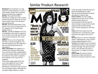
  • 1. Similar Product Research Masthead-The masthead is an a big bold font to draw attention. It is also a quite cheeky, modern font to portray the genre of the music magazine. of the same age as they have also put bands like Radiohead, u2, Marc Almond, DevendraBanhart etc which will appeal to males as well. Sell line- The quote from Amy Winehouseis saying her music is where she tells all and this relates to her song ‘back to black’ where she talks about the truth of her life. Colour scheme- The main image, background and text are all in black, white and sepia, these are representative of the fact that the music she does is soul and this is quite relevant to 60s and 70s and this colour scheme is giving it an ‘old’ feel to it. Sell line- They have advertised a ‘Free stax CD’ this is to try to draw interest to the magazine and to hopefully get people to buy it. Fonts-All the fonts apart from the masthead are in a old style font, again linking into the type of music Amy does. Sell line- ‘The Music Magazine’ this not only highlights what type of magazine it is but it comes across like they are best one out there as they are ‘the’ music magazine. Sell line- There is a sell line ‘Radiohead speak!’. Radiohead are a new, modern and groundbreaking band, this is highlighted through the use of a picture of Radiohead and this is the only colour thing on the page. This portrays there music is not ‘old style’ but fresh so there picture is in bright and vibrant colours. Sell line- There is a list of bands that will feature inside the magazine. This will draw people to buy the magazine if these are the bands that they are interested in. Other information-The magazine is a monthly one meaning it will include more content and have a slightly higher price than weekly magazines. It also has the website on the cover to advertise there website as this is part of the magazine. The primary target audience for this issue is girls aged late teens to late twenties as they have put Amy Winehouse on the front cover and this is her main target audience. Although the secondary target audience is males… Cover Image- The picture of Amy Winehouse in black and white to further the comparison with her music.
  • 2. Sell line- The main sell line is of Lady Gaga, There is first a big eye catching picture of Lady Gaga meaning the main feature is the magazine is about her. There is then the sell line to do with Lady Gaga which any fans interested in buying the magazine will read and this includes something which they think will draw the reader in such as “why she doesn’t wear pants” this will shock the reader and make them want to find out more about this. Lady Gaga being on the front of the magazine makes clear which genre the magazine is Masthead-The masthead is big and has bright colours in it like blue and yellow these make the masthead stand out and portray the music genre of the magazine. Main Image- It is of Lady Gaga, she is the only thing on the page that is very bright this makes her stand out. Her hair is purple which highlights that lady gaga as being eccentric and bold. This is part of her iconography as she is known for having bold, strange and out of the ordinary makeup, clothes and hair but also in her personality and this is portrayed through this image. Other Information- It is a weekly magazine meaning it does not contain as much as a monthly magazine but is a lower price. It has the website as readers may ant to view that and it ties in with the magazine and the readers can get more information from the website.. The target audience for ‘Billboard’ are mainly girls as the artists they feature girls will be more interested in. Sell line- All of the sell lines on the cover are appropriate to the genre of the magazine and are appealing to the audience of the magazine. Colour scheme- Everything is in either black grey or purple this is to make the main image stand out. They have alternated the colours of the lines of the sell lines to make important things stand out at a glance. Fonts- The fonts are all bold and thick to make the sell lines stand out.
  • 3. Masthead-The masthead is big and has bright colours in it like red and yellow these make the masthead stand out. It also in white which makes it stand out from the dark blue background. Main image- The main image is of Rihanna, her hair is bright red, her lipstick Is too and her eyes are a reddish shade as well, this makes her stand out. The clothes that she is wearing are quite revealing this is part of Rihannas iconography as she is known for wearing quite revealing outfits Sell line- The main big sell line is about Rihanna as she is also the cover image. The sell line is drawing the audience in to read it as it is appealing as they want to find out more about who Rihanna actually is and why she believes this Sell line- The sell lines include artist which will appeal to the target audience making them want to buy and they also include information about things they would be interested in. It has a sell line about a film and TV music conference as the readers will be interested in this as that is the genre of the magazine Colour scheme- The colour scheme is very out there, bold, bright and colourful this will draw attention, appeal to the target audience but it also reflects Rihanna as an artist and also the genre of magazine Other information- It is a weekly magazine so is cheaper than a monthly one and it will include less content. It has the website on the cover so that readers can go online and find more information about the artists and music industry on their website as this will interest them. Fonts- The font on the text “Rihanna” is quite cool and has a gradient this is reflective of the artist as Rihanna is quite cool. This is highlighted by her gun tattoo which portrays her in a cool, mysterious and edgy way which is also reinforced by the sell line of “My fans don’t really know who I am”
  • 4. Main image- The focus on this contents page is on the main image of an artist. He relates to the genre of the magazine but also will appeal to the audience as this is what they are interested in. He has ruffled and messy hair which is a feature of the music genre that this magazine is about and also his style of dress is representative of the genre Colour scheme- Is quite dull and dark and boring apart from the main image this makes it stand out more and be the main part of the contents page. The darkness of the contents page is iconic of the genre as black as a colour is a big part of it Sell line- There is a little red box which says “celebrating the best music” this stands out quite clearly from the rest of the contents page as it is in red which is bright and the rest of the colours are quite dull. This will draw attention and will interest the readers as if they are reading a music magazine they will want to know about ‘the best music’ Contents- The contents all relate to the genre of the magazine and will interest the reader. There are different headings for the ease of the reader so they can find things quicker. Also the heading are in different fonts to stand out. The page number and subheadings are in bold so as to stand out and again for the ease of the reader. The way in which “contents” is written is different, funky and cool which is perception of the music genre of the magazine. The fonts also reflect this image as well Sell line- At the bottom there is information headed “here's the remix” this includes important information on the magazine for the reader to read.
  • 5. Fonts- The main fonts are quite cool, funky and fun which will appeal to the audience and reflects the music genre of the magazine Sell line- At the side of the contents page there is a music chart compiled by the music magazine. This will appeal to the target audience as they want to know what music is popular, find out about new artists and songs and know if there favourite song or artist has reached the chart and at what place. Masthead- The masthead is featured again on this page to provide consistency. Contents- The information on the content is categorised for ease of the reader and to save them time. Colour has been used to highlight things that they think will most appeal to the audience and also the important information which may interest them. The magazine not only has information on artists but also on the music industry as a whole and this is part of the appeal for the target audience. Colour scheme- The colours are bright and stand out making the contents page interesting and fun and also represents the genre of the magazine as it quite cool and funky magazine. Sell line- On the contents page there are pictures of popular artist so readers will automatically recognise them and can easily see which page an article about them is on, this also highlights that they are popular artists and will appeal to the majority of their readership. Sell line- The contents furthers the information provided about the magazine website and lets the reader know lots about it.
  • 6. Sell line- At the side of the contents page there is a music chart compiled by the magazine about many different types of genre. This will appeal to the target audience as they want to know what music is popular, find out about new artists and know if there favourite song or artist has reached the chart and at what place. Fonts- Many different fun and cool fonts have been used on the contents page to make it look fun and interesting and also to keep the readers attention. Sell line- Artists have been featured on the contents page with only a picture portraying that they are very well known within their target audience and there name doesn't’t need to feature. They have also been put their as there audience will be interested in information about them and will want to read about them. Colour scheme- They have used lots of different colours to make the contents page more fun and interesting and these colours will appeal to the target audience of this magazine. Sell line- At the bottom of the contents page there is more information on the website as this is a good place where readers can go to get more information on the types of articles in the magazine for free and the website is part of the magazine brand so they are advertising themself. Contents- The content of the magazine has been split up into different headings to help the reader find thing easier. Articles of interest have been put in different colours to draw the readers attention to them. Masthead- The masthead is featured again on this page to provide consistency.
  • 7. The main image of Amy Winehouse she has eye contact with the reader and she looks as though she is trying to tell them that “I’m not a horrible girl” and is almost sad about that image. In the image you can see her tattoos which are part of her ‘tough’ girl image and are part of her iconography. The image is quite dim lighted this could be to signify the fact that the reader does not know much about her personal life and her so they are in the dark. Also , the darkness and reddish background signify he dark and dangerous life she lead. The colours on the picture are quite an old style reflecting her music style The image is from her 2007 back to black press campaign, in the song back to black, it signifies death and negativity and it is here to be symbolic of her death. This is the introductory pages before the interview highlighting that it is an important feature article of this issue as they have dedicated so many pages. The heading quite intriguing for the reader as it makes them wonder why she has said this and they will want to know more about it. It is in a very big font size to catch the readers eye and to draw their attention to it. The text saying Amy Winehouse is in a different colour, has a shaded in a black colour and is in block capitals. This makes her name stand out portraying that her name is important and there audience will want to read this article as there is big interest in her as she died not long before this was released and people are interested in getting to know a little bit more about her and her life. The pages are bright and colourful as a mark of respect for Amy Winehouse after her death. The text under the quote provides key information on the interview to get the reader interested and to let them know a bit about the article. Is almost like the article is a tribute to Amy Winehouse after her death.
  • 8. In the main image, Solange Knowles is in a strong position reflecting her character and she also has eye contact with the reader creating a relationship and drawing your attention to her eyes, this is all to get the reader involved in the article. There are also many smaller back and white pictures of Solange Knowles that signify that sheis fun and funky way but it also reflects the genre of music that she is. The pull quote is to generate interest in the article and get to know about what is in it and to hopefully get the reader interested. It reveals a bit about her and creates interest. The colour scheme is quite plain and black and white apart from the text “Solange Knowles” which highlights that she is an important name and is key in the the genre of the magazine. It also makes clear to the reader that the article is about her. Furthermore, the main image is in bright colours signifying her as an artist and how she is out there, fresh and making a splash in the music industry,. The introduction to article is short and is in a bigger size. This gives the reader a little information about the article and the artist to create interest in the article.
  • 9. The picture is of all the band but Will.I.am is in brighter colours and the rest of the members are in dulled colours this is portraying that he is the main member of the band, the most important and also the articles is going to be about him. Will.I.am is also quite a strong stance signifying his importance. The main heading is a play on Will.I.ams name. The amuses the reader but also gives them a sense of what the article is going to be about. It is a question in big which draws the readers attention but as it is a question it makes them want to know more and more interested in the rest of the article as to what the question is about There is a pull quote is big and black so stand out on the page to attract the reader to something of interest, to make them want to read the rest of the interview to find out more about it. The colour scheme is quite plain apart from the heading and image to draw attention to these as Will.I.am is a recognisable face so people will instantly know the article is about him. There is some key information about the contents of the article under the title to give reader the opportunity to find out about to see if it interests them. This is an interlocutory double page spread for the rest of the article indicating that it is a long interview with Will.I.am.