

Recomendados
Mais conteúdo relacionado
Mais procurados
Mais procurados (18)
Destaque
Semelhante a grow Thoughts Issue 5
Semelhante a grow Thoughts Issue 5 (20)
Mais de anthony ryman
Mais de anthony ryman (20)
Último
Último (20)
grow Thoughts Issue 5
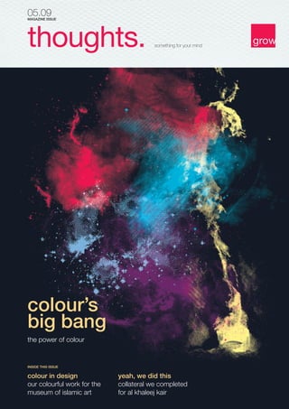
- 1. 05.09 MAGAZINE ISSUE thoughts. something for your mind colour’s big bang the power of colour INSIDE THIS ISSUE colour in design our colourful work for the museum of islamic art yeah, we did this collateral we completed for al khaleej kair
- 2. 2 thoughts. 05.09 05.09 thoughts. 3 credits BY ANTHONY RYMAN MANAGING DIRECTOR AT GROW Issue Writers Editors Design Directors Typesetting Anthony Ryman Michael Tucker Michael Tucker Lui Rogliano Rina Wood Lui Rogliano Lui Rogliano yeah, we did this! Photography Jason Anonuevo Flickr Members: Chaval Brasil Scott Wills Kiwi Aleksandr Slyadnev Photography Cover Artwork Flickr Members: Darwin Bell FunkYah’ EstiAmy Miller Orvaratli Natalia-P AJ Dimarucot colour makes a big bang. Colour is a powerful device. Advertisers use colour to reflect and reinforce a company’s brand and communications to create a point of differentiation by creating a brand personality. AL KHALEEJ KAIR Colour creates a perception. As consumers, our emotions are influenced by the use of colour in advertising and with the constant development of innovative advertising techniques, our world is being ‘coloured’ more. Light triggers hormone production. These hormones stimulate emotion causing us to develop a feeling or perception towards the colour or the object that colour is showcasing. Challenge Al Khaleej Insurance has enjoyed the privilege of being among the top 5 domestic insurers in Qatar for the past 20 years. However with the arrival of new entrants into the market, its position has changed. The company responded to changing market conditions by launching a Medical Assurance Division, which had been non-existent until now. Creative Response Central to the concept is the graphic of an umbrella, symbolising protection and security. The colours of the umbrella were drawn from the brand palette. The use of the umbrella was then extended to the sub-brands with colours changing for each product. The design was rolled across the ATL and BTL applications, with an integrated “look and feel” that worked in tandem with their strategy. Results A clear, coherent and consistent identity that worked across all collateral. In support, the advertising campaign carried the same look and feel and worked in synergy with the brand identity. Altogether, a distinctive package that separated Al Khaleej from its competitors. As designers, we understand the power and meaning of colour. For example, the colour red in China signifies joy, but in Europe it signifies danger or anger. Yellow is sacred to the Chinese but signifies sadness in Greece and jealousy in France. White, the fusion of all colours, signifies purity (e.g. wedding dress) in Europe but death in Chinese and South American culture. Our brains are hot-wired to recognise colour before words. According to the Institute of Colour Research, we make subconscious judgements about a new situation or item within 90 seconds of their initial viewing. Between 62% and 90% of that assessment is based on colour alone. Such is the power of colour.
- 3. 4 thoughts. 05.09 05.09 thoughts. 5 Red signifies passion and anger. It is associated with vitality and strength. It’s engaging and emotive and it tends to excite people and cause a release of adrenaline – don’t Ferrari’s look great in red? Red has high visibility. It brings text and images to the foreground. It stimulates purchase behaviour – note its preference for ‘Buy Now’ or ‘Click Here’ buttons on Internet banners and websites. Red is often used to evoke erotic feelings and is commonly associated with energy. Companies who use red include Coca Cola, HSBC, Virgin and Vodafone. Blue is the colour of the sea and the sky. It is cool and calming with a pacifying effect on the nervous system by slowing metabolism. It evokes thought, wisdom, enhancing communication and decision-making. It’s the most popular colour for both sexes so it lends itself to brands and companies that offer products and services to both. It has long been associated with royalty and is therefore linked to authority, prestige and power. It’s used extensively as a corporate colour, for example, royal blue. Light blue is young, fresh, clean and cool. Blue is used by IT companies, to suggest precision when promoting high-tech products. It’s also good for airlines, air conditioners, pool companies and travel agencies. Blue is an establishment colour and is used in over 60% of corporate identities. Personality: Courageous, confident, humanistic, strong-willed, spontaneous and extroverted. Personality: Loyal, tactful, incisive inspiring, inventive, cautious. Orange denotes vibrancy, energy, fun, enthusiasm and exuberance. Orange Telecom chose the colour and the name to appeal to a broad section of the general public. Orange can stimulate our appetite for life and learning. It is an emotional stimulant. It connects us to our senses and helps to remove inhibitions and makes us independent and social. Orange is used to advertise dance studios, a vitamin shop or food products to appeal to an audience seeking energy, warmth and excitement. Green signifies health, food, nature, freshness, hope, safety and the environment. It’s a calming colour, the most restful colour for the human eye, evoking feelings of peace. It’s a great colour for products, but especially good for anything characterising freshness, life and growth (note grow’s corporate colour!). Banks, financial advisors, nurseries, farmers and refreshingly creative advertising and design agencies use green to reinforce their positioning. Personality: Enthusiastic, happy, sociable, energetic, sporty and self-assured. Personality: Understanding, self-controlled, adaptable, sympathetic, compassionate, nature loving, fresh and romantic. Indigo and violet are not often used as corporate colours, although Cadbury’s uses a violet/purple – it has created a unique positioning using this colour. Purple combines the stability of blue and the energy of red. Children love the colour purple. Surveys suggest almost 75 percent of pre-adolescent children prefer purple to all other colours. More individualistic, these colours convey imagination, intuition, wisdom and truth. Whether a blue tinge (mystery) or a reddish shade (sensual), these colours are great for elaborate and distinctive establishments including nightclubs, photographers and jewellers. Black is the absence of colour. Often associated with death, fear and the unknown it also suggests seriousness, boldness, power and formality. It is used to communicate coolness, modernity, elegance and style. The fashion industry has adopted black as experts say it makes us look thinner. What is for sure, is that no selfrespecting lady would be without a little black “number”. Consumers purchase products that reflect their own personalities, either communicating who they are, or who they want to be. Brands should understand the power of colour to communicate personality and differentiation and use colour appropriately. Yellow represents brightness. It is the most visible colour in the spectrum, which is why it gets attention quicker. Yellow gives us clarity of thought, increases awareness, and stimulates curiosity. Yellow energy stimulates communication, enlightenment and spirituality. Bright, pure yellow is an attention getter, which is the reason taxis are painted this colour. However it should be used sparingly - tests have shown that people lose their temper and babies cry more in yellow rooms. Personality: Good-humoured, optimistic, confident, practical, and intellectual. There is more to a colour than liking it or not. In design, practitioners spend years understanding the meaning and power of colour and how they relate to each other. It’s important to trust your designer with the use of colour, its degree of saturation and luminosity. Their experience is objective, based on a deep understanding of the power of colour to form a strong personality. Appropriate use of colour can reinforce your brand’s positioning, create brand loyalty, lower customer acquisition costs and so increase profits. As we like to say, growing your brand is growing your business. Image Permissions www.flickr.com
- 4. 6 thoughts. 05.09 colour in our design work. 05.09 thoughts. 7 MUSEUM OF ISLAMIC ART Education Publications grow developed and designed 5 publications for MIA as well as a friendly mascot as a spokesperson to use across all of their publications. Each book took on a different creative approach for each age group but still established consistency across all publications, with an integrated “look and feel”. This successfully created a synergy in keeping with MIA’s communications strategy. Education Centre Collaterals grow developed an identity inspired by the reflection of the museum on water and rolled it across ATL and BTL applications, with an integrated “look and feel”. For the collaterals, we chose a design that was able to communicate across all audiences. We wanted to express the idea that learning is fun; hence we opted for bright lettering and infused it with different shades, making it appealing to all ages.
- 5. 8 thoughts. 05.09 grow 3rd Floor Thani Bin Abdullah Complex Ibn Seena Street, Doha, Qatar T +974 444 6222 F +974 431 4982 E grow@growqatar.com W www.growqatar.com © grow 2009. All rights reserved. No part of this publication may be reproduced without prior written permission of grow. The contents, layout and design are copyrighted and are protected by worldwide copyright laws and treaty provisions including Qatar Law No.9 of 2002 on the protection of copyrights and related rights.