
Recomendados
Mais conteúdo relacionado
Mais procurados
Mais procurados (19)
Destaque
Semelhante a How I Attracted My Target Audience Through Magazine Design
Semelhante a How I Attracted My Target Audience Through Magazine Design (20)
Último
Último (20)
How I Attracted My Target Audience Through Magazine Design
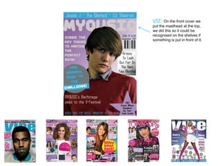
- 1. USE: On the front cover we put the masthead at the top, we did this so it could be recognised on the shelves if something is put in front of it.
- 2. USE: On the front cover we put the masthead at the top, we did this so it could be recognised on the shelves if something is put in front of it. USE: The main image has been placed in the centre of the page which is where most if not all of the magazines put the main image, also it is a mid-shot.
- 3. USE: I used 2 different fonts USE: On the front cover we 1 for the masthead and main put the masthead at the headlines and another for top, we did this so it could be the other features. recognised on the shelves if something is put in front of it. USE: The main image has been placed in the centre of the page which is where most if not all of the magazines put the main image, also it is a mid-shot.
- 4. USE: I used 2 different fonts USE: On the front cover we 1 for the masthead and main put the masthead at the headlines and another for top, we did this so it could be the other features. recognised on the shelves if something is put in front of it. USE: my magazine uses the same house style throughout, front cover, USE: The main image has contents and double page been placed in the centre of spread this is similar to what the page which is where other magazines would do. most if not all of the magazines put the main image, also it is a mid-shot.
- 5. USE: I used 2 different fonts USE: On the front cover we 1 for the masthead and main put the masthead at the headlines and another for top, we did this so it could be the other features. recognised on the shelves if something is put in front of it. USE: I used main words to stick out of the page to entice you to read the from page in this case challenge. USE: my magazine uses the same house style throughout, front USE: The main image has cover, contents and double been placed in the centre of page spread this is similar to the page which is where what other magazines would most if not all of the do. magazines put the main image, also it is a mid-shot.
- 6. DEVELOP: I chose to use different shapes to make it so people look at what is inside like inside the star it says free album download, people are more likely to look at something inside an interesting shape that just text in general.
- 7. CHALLENGE: my magazine challenges the typical magazine as I have placed some parts of my magazine in different places, for example the barcode, usually in the bottom right or left and then what I have placed in the button would usually be placed at the top where the artists names are.
- 8. USE: For this page I used the same masthead font on the top of the page and put it in the reasonably USE: The pictures I same position and the had I put them into a front cover masthead. circle to give it more of a exciting look linking it to our genre of pop. USE: The use of capital letters and larger font to make the main bits stand out from the rest of the text.
- 9. DEVELOP: I added the numbers in in a different font and in bold so people know where to turn to so they can read the story.
- 10. CHALLENGE: instead of having all of the content in one like or in one section I chose to split it down into 3 sections
- 11. USE: I used two different coloured fonts one colour for the questions and one colour for the answer.
- 12. USE: I used two images USE: I used two different one for each page, the coloured fonts one colour one on the left and one for the questions and one on the right looking up at colour for the answer. the other image.
- 13. USE: I used two images USE: I used two different one for each page, the coloured fonts one colour one on the left and one for the questions and one on the right looking up at colour for the answer. the other image. USE: I added the quote in the bottom corner but also linked his name into the quote I used.
- 14. DEVELOP: I have the link to the website to let them have the chance to ask them there own questions.
- 15. CHALLENGE: Not many double page spreads have colour in the background but I decided to add it as it works well with the pictures I added.
- 16. How I Attracted My Target Audience The fonts and colours that I used linked well to the target audience our magazine is based at. The fonts I used were plain and readable to give them a formal look but also at the same time I tried to make the text the same as what it would be in a music magazine. The main image I used was of someone i thought looked like a pop artist and would appeal to the audience of the magazine. The stories that included could link well to the audience as people who read the magazine are just starting to go and do what they want in life so tips like I included in my magazine like how to make your voice pitch perfect work well. It also doesn’t contain anything that wouldn’t be suitable for the audience like bad language.
- 17. Technologies I used PowerPoint to explain certain points that I made like for my The different types of technology I used are mainly evaluation I have used PowerPoint. different programs and software but also I used a few different pieces of hardware. I used word to create my article draft which I could then put onto my The types of software I used are; Photoshop, magazine. Blogger, Word, 1001 free fonts, PowerPoint. The types of hardware I used were the Digital Camera and the Video Recorder. Blogger is what I put everything about my blog onto including the preliminary tasks, the planning and the actual magazine. I used this to get the fonts in I used this to take my raw photos needed to fit into the genre for the magazine these would that I chose so the fonts suited then be edited and put onto the my magazine magazine I used Photoshop to edit the raw photos we used this for our audience that I had taken this is to give them a research, this included us going out more professional look by changing and finding out what people like and things like the brightness and cutting out what they would want in a magazine the unwanted background.
- 18. From the preliminary task I have seen that there are many things that you have to consider when making a magazine from simply just selecting fonts to having to edit the pictures but also positioning of photos and text. Some of the things that I have learnt are shown in the pictures below. I also found that splitting it into sections helps in the fact On this you can see that this is a that all of the text being in one very effective bar, it is as though it place then the images being in is separating this part from the another isn’t always the best rest of the magazine on the shelf way to position it. this part would be the main part as well as the masthead they will see The price is shown in a button, if the button has a filled background like making it blue it will stand out and people will see it easily on the page. The page that you have should always be filled there is no need for empty space something else can always be thought up to be put there.