Venture Capital Trends in US
•
3 likes•757 views

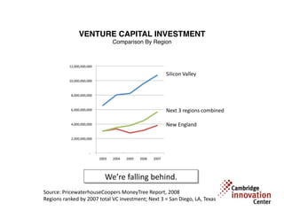
This chart shows the top five venture capital regions in the US, with the total venture capital investment in the period 2003-2007. Note that it compares Silicon Valley (just one of several California regions) with all of New England. If the analysis is narrowed to Massachusetts vs. Silicon Valley, the trend is the roughly same. The sums on the Y axis represent total venture capital in each region, for all industries at all stages. This chart was compiled in 2008 based on PricewaterhouseCoopers MoneyTree survey data. The raw data is available here: https://www.pwcmoneytree.com/MTPublic/ns/nav.jsp?page=historical A quick glass at the latest year's data appears to continue this trend.
Recommended

Recommended
More Related Content
Recently uploaded
Recently uploaded (20)
Featured
Featured (20)
Venture Capital Trends in US
- 1. VENTURE CAPITAL INVESTMENT Comparison By Region 12,000,000,000 Silicon Valley 10,000,000,000 8,000,000,000 6,000,000,000 Next 3 regions combined 4,000,000,000 New England 2,000,000,000 ‐ 2003 2004 2005 2006 2007 We’re falling behind. Source: PricewaterhouseCoopers MoneyTree Report, 2008 Regions ranked by 2007 total VC investment; Next 3 = San Diego, LA, Texas