Ray+Keshavan | The Brand Union – Sujata Keshavan
•
1 like•2,364 views

Sujata Keshavan on brand identity, research and pitches —In Conversation in The Economic Times
Recommended

Recommended
More Related Content
What's hot
What's hot (20)
Similar to Ray+Keshavan | The Brand Union – Sujata Keshavan
Similar to Ray+Keshavan | The Brand Union – Sujata Keshavan (20)
Recently uploaded
Recently uploaded (20)
Ray+Keshavan | The Brand Union – Sujata Keshavan
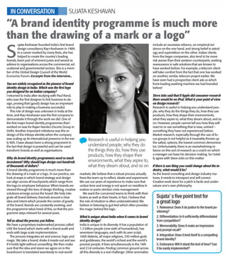
- 1. >> pg 03 WEDNESDAY, DECEMBER 12, 2012 If we look around, us logos have become the preferred language for most brands. They communicate much more than words. If your logo denotes either or all of these (style, stature, sophistication or substance), your brand has truly arrived. VIPUL THAKKAR Executive Creative Director, South, DDB Mudra Group BY ANKITA SHREERAM W hy is McDonald’s logo yellow and IBM’s logo blue? Wouldn’t any other colour do? Probably not, because nothing stimu- lates the appetite like yellow and blue is the colour of choice for inspiring au- thority, success and security. Omnipresent and discreetly influential, different colours impact our psyche in uniquely different ways. And marketers have long since used this phenome- non to their advantage. “The colours in logos are very con- sciously chosen. The colour that you select would depend on the purpose of the logo and the kind of product you would be marketing. For instance, cor- porate logos generally have staid colours. Software companies go for youthful and trendier colours. Exuberance is the key word for youth- oriented products as opposed to the conventionality of corporate logos,” says Adrian Mendonza, Creative Director, Rain 7. Microsoft has opted for a refreshingly colourful yet elegant logo after 25 long years. “We have modernised it, ensured it familiarises well with our product logos and used four colours that represent our her- itage,” says Shafalika Saxena, CMO, Microsoft India. She goes on to explain the rationale behind the logo, “Just as your genetic code creates similar physi- cal traits among your family members, Microsoft is the DNA that provides the connection across our family of offer- ings. Although our products, pro- grammes and services may differ, the Microsoft DNA ensures they work to- gether. The logo is a visual symbolism of that DNA.” The repeating motifs of certain colours in a particular brand category is actually quite noticeable. “Different colours come with different messages. Some of them are synonymous with brand categories. For instance, warm colours like orange, red and yellow are synonymous with food brands. Fashion brands use bolder colours in their lo- gos. Feminine brands would prefer pastel. If you need your brand to have a bold image, then red would help. So depending on the image you have in mind, you choose the colour,” advises Amit Akali, National Creative Director and Executive Vice President, Grey Worldwide. The orange in Nickelodeon is de- signed to appeal to kids and the pink in Barbie denotes delicate feminity. “Colour psychology is well recognised as a key marketing lever. Colours are imbued with rich connotation. Colour changes can imply brand transforma- tion,” agrees Saxena. Logos would cer- tainly not be as effective or as evocative without their consciously chosen colours. Colour me Pink! Logos wouldn’t be what they are without their artfully chosen colours S ujata Keshavan founded India’s first brand design consultancy Ray+Keshavan in 1989. In a career marked by many firsts, she has helped to create the country’s leading brands, been part of eminent juries and served as advisor to organisations across the commercial, ed- ucational and governmental sectors. She is a mem- ber of the Global Design Council of the World Economic Forum. Excerpts from the interview... You are widely recognised as the pioneer of brand identity design in India. Which was the first logo you designed for an Indian company? I returned to India after studying with Paul Rand, who was the first designer to link business to de- sign, proving that (good) design has an important role to play in making a business successful. This role of design was unknown in India at the time, and Ray+Keshavan was the first company to demonstrate it through the work we did. One of the first major brand identity programmes that I worked on was for Rajan Nanda's Escorts Group in Delhi. Another important milestone was the re- design of the Infosys identity when the company was scaling up its international presence in the ear- ly 90S. I have always been a strong proponent in the fact that design is powerful and can be used transform brands as well as organisations. Why do brand identity programmes need so much investment? Why should logo design cost hundreds of thousands of dollars? A brand identity programme is much more than the drawing of a mark or a logo. In our practice, we look at ways in which brand strategy and design can align across all touchpoints which range from the logo to employee behaviour. When brands are viewed through the lens of design thinking, creative solutions emerge across the board. We help inte- grate all brand delivery channels around a clear idea and intent which provide the centre of gravity of the brand. Brands are constantly evolving, and the programme takes heed of this, so that the pro- gramme stays relevant for several years. Tell us about the process you follow. We have a proprietary trademarked process called LIVE the brand which starts with a brand audit and ends with large scale implementation. The process integrates art and science, logic and magic. We take a brand, shake it inside-out and see if it holds tight without unravelling. We then make sure that the idea and vision we agree on in the boardroom is translated seamlessly to real-world markets. We believe that a robust process actually frees the team up to reflect, ideate and experiment. We use our years of experience to make sure that undue time and energy is not spent on needless it- eration or panic-stricken crisis management. We want the concerned teams to think with their brains as well as their hearts. In fact, I believe that the role of intuition is often underestimated. We believe in listening to gut-feel which often provides the magic behind the logic. What is unique about India when it comes to brand identity design? India is unique in its diversity. It has a population of 1.2 billion people (one sixth of humankind), has seventeen languages, each with its own script, 1600 dialects, all major religions, 330 million gods and goddesses, the world's richest and the world's poorest people. It lives simultaneously in the 16th and 21st centuries. Finding common ground across all this diversity is a real challenge. Other anomalies include an excessive reliance, on empirical evi- dence on the one hand, and strong belief in astrol- ogy and superstition on the other. Indian clients from the larger companies, also tend to be more risk averse than their western counterparts, seeking reassurance in safe solutions that are known to have worked before. For example, a telecom client will take comfort from the fact that one has worked on another, similar, telecom project earlier. We have even had a prospective client ask us which front-loading washing machine we had branded before! Steve Jobs said that if Apple did consumer research there would be no iPod. What is your point of view on design research? Research is useful in helping you understand peo- ple, why they do the things they do, how they use products, how they shape their environments, what they aspire to, what they dream about, and so on. However, people cannot tell you how they will react to or use something that is new, untried – something they have not experienced before. Market research, especially through the use of fo- cus groups is not helpful as it invariably throws up the safest, options, the lowest common denomina- tor. Unfortunately, there is an overwhelming re- liance on this sort of research as a crutch on which a manager can base his decision making. So I total- ly agree with Steve Jobs on this matter. If there is one thing you could change about the in- dustry, what would it be? As the brand consulting and design industry ma- tures, it needs to introspect and self-correct. Creative work done for a pitch is facile and under- values one's own philosophy. “A brand identity programme is much more than the drawing of a mark or a logo” Research is useful in helping you understand people, why they do the things they do, how they use products, how they shape their environments, what they aspire to, what they dream about, and so on SUJATA KESHAVANIN CONVERSATION Sujata’ s five point test for a great logo 1. Relevance:Does it do justice to the brand po- sitioning? 2. Differentiation:Is it sufficiently differentiated from competition? 3. Memorability:Does it make an impression and prompt recall? 4. Integration:Does it lend itself to a compelling brand identity? 5. Endurance:Will it stand the test of time? Can it be easily implemented? *ET1M121212/ /03/K/1* *ET1M121212/ /03/K/1* ET1M121212/1R1/03/K/1 *ET1M121212/ /03/Y/1* *ET1M121212/ /03/Y/1* ET1M121212/1R1/03/Y/1 *ET1M121212/ /03/M/1* *ET1M121212/ /03/M/1* ET1M121212/1R1/03/M/1 *ET1M121212/ /03/C/1* *ET1M121212/ /03/C/1* ET1M121212/1R1/03/C/1