1. This double page spread image has The quote from the heading ‘One Of
been taken from the magazine vibe. The Best’ gives the reader the The colour of the dress
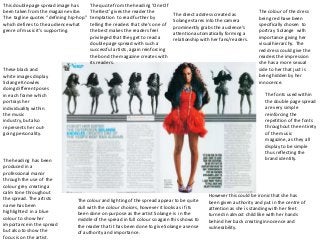
The direct address created as
The tagline quotes “ defining hip-hop” temptation to read further by being red have been
Solange stares into the camera
which defines to the audience what telling the readers that she’s one of specifically chosen to
prominently grabs the audience’s
genre of music it’s supporting. the best makes the readers feel portray Solange with
attention automatically forming a
privileged that they get to read a importance giving her
relationship with her fans/readers.
double page spread with such a visual hierarchy. The
successful artists, again reinforcing red dress could give the
the bond the magazine creates with readers the impression
its readers. she has a more sexual
These black and side to her that just is
white images display being hidden by her
Solange Knowles innocence.
doing different poses
in each frame which The fonts used within
portrays her the double page spread
individuality within are very simple
the music reinforcing the
industry, but also repetition of the fonts
represents her out- throughout the entirety
going personality. of the music
magazine, as they all
display to be simple
thus reflecting the
The heading has been brand identity.
produced in a
professional manor
through the use of the
colour grey creating a
calm tone throughout
However this could be ironic that she has
the spread. The artists The colour and lighting of the spread appear to be quite been given authority and put in the centre of
name has been dull with the colour choices, however it looks as if its attention as she is standing with her feet
highlighted in a blue been done on purpose as the artist Solange is in the turned in almost child like with her hands
colour to show her middle of the spread in full colour so again this shows to behind her back creating innocence and
importance in the spread the reader that it has been done to give Solange a sense vulnerability.
but also to show the of authority and importance.
focus is on the artist.