1. Content page analysis Magazine logo Countinous colour scheme of red black and white Anchor imagine Informational text Promotion offers
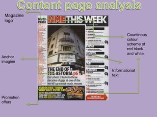
2. The contents page is from the magazine “The NME” the information is clear and simple to read being organised into two main columns. The contents page carries through the simple style of Red: Black and white. The colour scheme is simply and keep attention on it a minimal. The column to the left Is anchor with a mini master head with new story line or aim. The main image ‘” the world greatest music venue”. The imagine represents a gig tribute. It may be to promote the place for more people to guy tickets at the suggested “greatest music venue”. On the right side is an index column. this bring more a realistic feel to the music magazine. Making it more able for the reader to access certain point of the magazine they are interested it The structure of the magazine is in a house style. With it well organized text ready to catch readers attention the language in the content page is punk rock related. Using this terminology help bring more contact with the reader, for example “gig”.