
Recommended
Recommended
More Related Content
Viewers also liked
Viewers also liked (10)
More from Microsoft Mobile Developer
More from Microsoft Mobile Developer (19)
Recently uploaded
Recently uploaded (20)
Build great UIs with LWUIT for Nokia Asha software platform 1.0
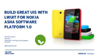
- 1. BUILD GREAT UIS WITH LWUIT FOR NOKIA ASHA SOFTWARE PLATFORM 1.0 Michael Samarin Director, Developer Training and Evangelism Futurice @MichaelSamarin
- 2. LWUIT FOR NOKIA ASHA SOFTWARE PLATFORM 1.0 • New port of LWUIT, targeting specifically the new Nokia Asha software platform • Based on the LWUIT for Series 40 v1.0 • Adds Nokia Asha platform 1.0 theme • Adds 8 new components • Changes and adapts existing components to new platform • Improved performance, especially in theme memory use • 25 examples in the SDK
- 3. LWUIT SDK PLUG-IN AND DEV GUIDES LWUIT plug-in and examples in Nokia Asha SDK 1.0: C:NokiaDevicesNokia_Asha_SDK_1_0pluginslwuit Brand new LWUIT Developer’s Library, covering Nokia Asha, Series 40 and UX: http://www.developer.nokia.com/Resources/Library/LWUIT
- 4. THE NEW LWUIT UI COMPONENTS FOR NOKIA ASHA SOFTWARE PLATFORM: • ContextMenu • DatePicker • FormItem • GroupHeader • HeaderBar • InfiniteProgressIndicator • NotificationBar • PopupChoiceGroup • RefreshLoadBar • TimePicker
- 5. ContextMenu • ContextMenu is similar to the platform menu. It extends Dialog, therefore the API is similar. • To obtain the same behavior as the platform menu, use the LONG_TAP gesture. The easiest way to use the ContextMenu is to call the static show() method, which will return the selected command.
- 6. DatePicker • Displayed in full screen, extends Form and cannot be added as a component to Form. Instead you directly call its show() method. • DatePicker enables setting of date using various interfaces, such as: • Three columns date picker (Day, Month, and Year) • Two columns date picker (Month and Year) • Grid view date picker (Day) • The DatePickerListener can be used to listen for the DatePicker event .
- 7. FormItem • FormItem is a component that consists of one or two rows. It can optionally use a main icon displayed on the left and a smaller action icon displayed on the right. It can be used to trigger up to two actions. • The single line FormItem can receive only one action. The first line in a two-line FormItem is used to display a title and second line is used to display a value. • The main action can be triggered by tapping either a title or a value of the component, while the secondary action is triggered by tapping the action icon. The value row can be highlighted in red, blue, or the default theme color.
- 8. GroupHeader • Enables the creation of a header, which can be added to a Form, and is used to separate a group of items. • GroupHeader has various implementations, such as: • Simple GroupHeader • GroupHeader with separator • GroupHeader with spinner
- 9. HeaderBar • Enables the creation of a custom HeaderBar, which can be added to a Form. It’s used to create informative and interactive header bars with action buttons. • HeaderBar has various implementations, such as: • Static HeaderBar • HeaderBar with spinner • HeaderBar with sub-text • HeaderBar with icon • HeaderBar with icon and spinner • HeaderBar with icon and sub-text • Interactive HeaderBar • HeaderBar should be used with Display.getInstance().setForceFullScreen(true) only and should be added as the first component to a Form.
- 10. InfiniteProgressIndicator • Enables the display of an infinite progress indicator. • InfiniteProgressIndicator has various implementations, such as: • SMALL ProgressIndicator • MEDIUM ProgressIndicator • LARGE ProgressIndicator • CUSTOM ProgressIndicator
- 11. NotificationBar • Displays a user notifications. NotificationBar uses GlassPane to paint on top of a displayable object. • NotificationBar has various implementations, such as: • NotificationBar with and without icon • NotificationBar with single, multiline, or continuous text • Notification bar with the combination of the above
- 12. PopupChoiceGroup • Similar to the platform ChoicePicker. It extends Container, so instances of PopupChoiceGroup can be add to a Form. • PopupChoiceGroup has two implementations: • Single selection ChoicePicker is used to provide the platform look and feel to a MIDlet, and as a replacement for the ComboBox. • Multiple selection ChoicePicker is used for enable selection of multiple items from a list. • When the user presses the PopupChoiceGroup component it opens to show selectable items.
- 13. RefreshLoadBar Enables an interactive UI to be displayed to the user, to refresh a page or screen.
- 14. TimePicker The TimePicker component can be used to launch a 12-hour time selection view. If the time is not explicitly set, TimePicker will read and display the phone’s current time. A custom time can be set, which is displayed when the TimePicker view opens.
- 15. THANK YOU!