Neoito — Typography for the web
•
1 like•219 views

Typography is the visual art of creating written words. It helps conserve reader attention. There is no right way of doing typography. Typography terms include fonts, typefaces, serif, sans serif, baseline, capline, x-height, tracking, kerning, and leading. Readability and legibility are important. A typographic scale controls the pace a reader consumes content and establishes hierarchy. Good fonts include Open Sans, Lato, and Montserrat. Common mistakes include improper leading, orphans and widows, full stop spaces, and not following margins. Tools to use include Google Fonts, a typographic scale calculator, and CSS with vertical rhythm.

Recommended
More Related Content
Similar to Neoito — Typography for the web
Similar to Neoito — Typography for the web (20)
More from Neoito
More from Neoito (14)
Recently uploaded
Recently uploaded (20)
Neoito — Typography for the web
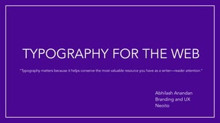
- 1. TYPOGRAPHY FOR THE WEB Abhilash Anandan Branding and UX Neoito “Typography matters because it helps conserve the most valuable resource you have as a writer—reader attention.”
- 2. FIRST AND FOREMOST There is no “right way” of doing typography, and this presentation is a mere guide and at the end of this session, you will not be a typography expert.
- 3. SO HOW TO BECOME AN EXPERT?
- 5. CAN YOU IDENTIFY THESE FONTS? First this one. Now this one. And this one too. This is the last one, I promise.
- 6. CONTENTS • Typography terms • Readability and legibility • Typographic scale • Good fonts • The don’ts of typography • Common typography mistakes • Tools you can use
- 8. Typography is the visual art of creating written words
- 9. TYPOGRAPHY TERMS (A FEW) • Fonts and typefaces • Serif and sans serif • Baseline • Capline • X - height • Tracking / letter spacing • Kerning • Leading / line spacing
- 10. FONTS AND TYPEFACES A font is a grouping of typefaces that have similar characteristics A typeface refers to an individual family member of that font Ex: Gotham is the font and Gotham Light is the typeface
- 11. SERIFAND SANS SERIF FONTS
- 12. BASELINE AND CAPLINE The imaginary line on which most letters and other characters sit. The imaginary line that marks the upper boundary of capital letters and some lowercase letters
- 13. X - HEIGHT Distance between the baseline and the height of the lower case letters
- 14. TRACKING / LETTER SPACING Tracking is the space between groups of letters rather than individual letters. In CSS, letter-spacing is the equivalent property for "tracking"
- 15. KERNING Kerning is the spacing in between individual characters In CSS, font-kerning property controls the usage of the kerning information stored in a font.
- 16. LEADING / LINE SPACING Leading is the spacing between the baselines of type. Adjusting the leading is also a very useful way of saving or using space on a page.
- 17. VERTICAL RHYTHM AND WHITE SPACE “Space in typography is like time in music. It is infinitely divisible, but a few proportional intervals can be much more useful than a limitless choice of arbitrary quantities.” - Robert Bringhurst Vertical Rhythm is simply when a body of text is aligned to evenly spaced horizontal lines (think of your lined paper from grade school), making it more cohesive and easier to read.
- 18. HOW TO DETERMINE VERTICAL RHYTHM?
- 19. READABILITY Readability refers to the way in which words and blocks of type are arranged on a page. When used small, typefaces with larger x-heights are typically more readable. Examples are Roboto, Open Sans, Lato and other Google fonts
- 20. LEGIBILITY Legibility refers to how a typeface is designed and how well one individual character can be distinguished from another In CSS, text-rendering property provides information to the browser about what to optimise for when rendering text. The browser makes trade-offs among speed, legibility, and geometric precision.
- 21. TYPOGRAPHIC SCALE The range of values at which type is sized. The more regular the intervals between each value, the more harmonious the scale. By setting a typographic scale, you can: control the pace at which a reader consumes content; guide the reader through a page; and introduce hierarchy, helping the reader navigate and understand relationships between pieces of content.
- 22. ESTABLISHING A TYPOGRAPHIC SCALE First, choose a font size for the body text (base size) So now, we need to establish a ratio, a value by which we’ll exponentially multiply and divide our base value. The values will provide the H1, H2, … H6 in a harmonic manner It’s that simple!
- 23. SOME KEY CHOICES The most important typographic choices you make in any document are font size, line spacing, line length, and font. Font size should be 15-25 pixels on the web Line spacing should be 120–145% of the font size The average line length should be 45–90 characters (including spaces) Choosing fonts with large x - height for body text is usually a good choice
- 24. GOOD GOOGLE FONTS TO USE For body Open Sans Lato Source Serif PRO PT Serif Lora For headings Montserrat Merriweather Josefin Sans Raleway Roboto Slab
- 25. EASIEST WAY TO FIND GOOD FONT PAIRINGS?
- 26. THE PERFECT FONT MAKES AN IMPACT
- 27. THE DONT’s OF TYPOGRAPHY • Being random with your typography • ALL CAPS for more than one sentence • Using goofy fonts, monospaced fonts, and system fonts • Confuse hyphens and dashes, and don’t use multiple hyphens as a dash. • Use ampersands sparingly, unless in- cluded in a proper name • Confuse the use of straight and curly punctuations • Lorem Ipsum
- 30. COMMON TYPOGRAPHY MISTAKES • Leading Trouble
- 31. COMMON TYPOGRAPHY MISTAKES Orphans and Widows
- 32. COMMON TYPOGRAPHY MISTAKES Full Stop Spaces
- 33. COMMON TYPOGRAPHY MISTAKES Not following margins
- 34. AND MOST IMPORTANTLY Forgetting a Final Check
- 35. TOOLS YOU CAN USE •Google fonts •Typographic scale •Golden height calculator •Drewish CSS with vertical rhythm