
Recomendados
Mais conteúdo relacionado
Mais procurados
Mais procurados (20)
Semelhante a Digipack process
Semelhante a Digipack process (20)
Mais de nataliestephenson97
Último
Último (20)
Digipack process
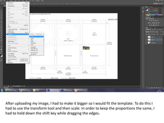
- 1. After uploading my image, I had to make it bigger so I would fit the template. To do this I had to use the transform tool and then scale. In order to keep the proportions the same, I had to hold down the shift key while dragging the edges.
- 2. I used the rectangular marque tool to remove the excess from the photo that I didn’t want. I followed the guidelines of the digipack template to make sure that it all fitted together well.
- 3. As it would be folded to make a cd, the top row of images had to be upside down. To do this, I had to go to transform, then I had to click rotate 180°.
- 4. In order to cut around the tight edges of the CD, I zoomed in closely to the image to make it more precise. I then used the polygon lasso tool which allowed me to erase the sections that I didn’t need.
- 5. Here is the finished result after cutting around the template .
- 6. I then decided to add the text to the front cover. I looked back to my font inspiration and tried it out with the name that I had decided on. However, this is not the font and name that I used in the end as I didn’t think it went well with the theme.
- 7. I decided to cut the image down even further to make the shot closer to her face. I used the scale tool again to achieve this.
- 8. I changed the font colour as black font didn’t show up as well. This also softened the look which is what I was aiming for throughout.
- 9. I added a barcode to my back cover as this is a typical convention of a digipack.
- 10. I added the copyright at the bottom of the back cover as this is also a convention of a digipack. I created my own record label (NS Recordings) to make it more individual however I did use ‘Columbia records’ as the distributer.
- 11. Some of the images seemed fairly warn out and faded so I decided to change the brightness and contrast levels to make them stand out more and look more vibrant.
- 12. I repeated this step for my other images.
- 13. I included a full track list on the back of the album. These are some of the covers that Sofia Karlberg has done in the past.
- 14. I wanted my spines to have the white writing like the front cover so I decided to add a black background by using the rectangle tool.
- 15. I added the text to the spine and I used the same font as I used on the front cover to make sure that it had an element of continuity throughout.
- 16. I decided to change my main image to one that I used on a different part of the album. I think it is more eye catching and has something a bit more interesting about it.