Creating effective presentation
•
7 likes•1,692 views

Here's few tips that one should follow while preparing a PowerPoint presentation.

Recommended
More Related Content
What's hot
What's hot (14)
Viewers also liked
Viewers also liked (12)
Similar to Creating effective presentation
Similar to Creating effective presentation (20)
Recently uploaded
Recently uploaded (20)
Creating effective presentation
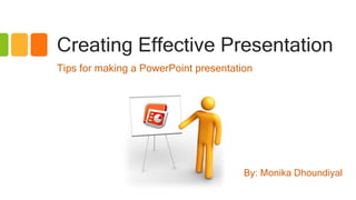
- 1. Creating Effective Presentation Tips for making a PowerPoint presentation By: Monika Dhoundiyal
- 2. Benefits of PowerPoint presentation • Enhances attention and interest of audience • Helps to break complex data. • More structured & systematic. • Produces better visual effects and deeper impression.
- 3. Plan your content • Determine the purpose of the presentation • Determine the audience • Gather your information • Sketch out the slides on paper • Determine the order of your slides • Start creating the presentation
- 4. Composing slides Important Factors for Successful Presentation: • Content & design • No. of slides • Background • Font size & color • Use of image • Use of animation
- 5. Content of a presentation • Do proper research • Organization & transition • Summarize data: – No more than 6 words a line – No more than 6 lines a slide – No paragraph
- 6. Don’t overload your slides with too much text The HI 902C is an automatic titrator that complements our wide range of products dedicated to quick and accurate laboratory analysis. This versatile titrator supports up to 100 methods. When powered on, the instrument initiates an internal diagnostics check and then readies itself for the first titration of the day. A large color LCD screen shows the chosen method and related information. A real-time titration curve can be shown on the display; this feature is useful when new methods are tested or when a procedure needs to be optimized. At the end of the titration, all data, including the graph, are automatically stored in memory and can be copied via the built-in USB drive or through direct connection with a PC.
- 7. Keep it simple • Potentiometric titrator • Supports up to 100 titration methods • Intuitive user interface • Four working modes • Two sensor inputs • Titration graph displayed on-screen
- 8. Font Size & Type • Pick an easy to read font face. • Font size must be large enough to be read. • Consistency in font face and size. • Use contrast: light on dark or dark on light. • Avoid narrow fonts, such as Arial Narrow. • Avoid fonts with fancy edges, such as Times New Roman. • Prefer Sans serifs , Arial, Helvetica, or Calibri. BusyClear
- 9. Example • This is Arial 18 point • This is Arial 20 point • This is Arial 24 point • This is Arial 28 point • This is Arial 32 point This is dark on dark This is light on light This is dark on light This is light on dark
- 10. Background • Make slide backgrounds subtle. • Avoid using default white background. • Avoid eye catching theme. • Use consistent background. • Use background with light / cool colors. • Be sure text contrasts with background.
- 11. Common Mistakes • Dark background image • Too many colours • Font Color “Difficult to see” • Too Many Fonts and Styles • Too small and too big font size • ALL CAPITAL LETTERS ARE DIFFICULT TO READ • Italics are difficult to read on screen
- 12. Use of images & animation • Images must complement your message. • Do not use images to decorate! • Use high-quality graphics. • Use animations and media sparingly. • Too much animation & sound effect are distracting.
- 13. Common Mistakes edge world’s most innovative pH, EC, and DO meter. • Thin, Lightweight Design • Large, easy to read LCD • 3.5mm probe input • Log on Demand • Dual USB ports • Digital smart electrode
- 14. • Plan your content & draw an outline • Summarize your data • Choose appropriate font face & size • Use cool / light background theme • Use image to complement your message • Use animation sparingly
- 15. “The purpose of using visual aids is to enhance your presentation, not upstage it” Lenny Laskowski