
Recomendados
Mais conteúdo relacionado
Mais de monah1
Mais de monah1 (20)
Último
Último (20)
Front cover analysis
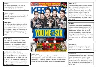
- 1. GENRE The genre of this magazine is rock music, reflected by the broken effect of the masthead and colours in the main image. TARGET AUDIENCE The target audience are teenagers and young adults. Reflected by the bright colours and rebellious feeling. MAIN IMAGE The main image shows the band of the lead article, You Me At Six. It also reflects the genre with the band wearing predominantly black clothing (jackets) and skinny jeans. The Polaroid pictures the band members refer to their “history” as the main articles talking point. MAST HEAD The mast head ‘KERRANG!’ reflects the rock genre portrayed by the cracked writing suggesting music so loud it can shatter glass. This design is iconic for the genre of music, and even through changes colour with different issues, is still extremely recognisable, and the uneven outline to the writing reflects the disordered nature of alt/ rock music. HOUSE STYLE Kerrang use blocks of red and blue, these bright colours mirror the ideas of bold expression related with this genre of music. GUTTENBERG DESIGN PRINCIPLE The primary optical area includes the iconic masthead with the axis of orientation taking you across the image and lead articles to the cover lines. The strong fallow area contains a badge with the chance to win a competition and the weak fallow area contains an image to attract attention. BANNER The banners along the top and bottom are there in entice the audience by giving extra information as to extra articles featuring in the magazine. The top one informs of an interview with Mikey Way and the bottom banner gives you an idea of the contents of an articles without revealing it, so that a consumer would then want to buy to find out more. COVER LINES The cover lines on this front cover help inform the audience as to the other articles that feature in the magazine. All three of these bands/artists are part of the alternative and rock genre and contain images to go with the coverlines. LEAD ARTICLE The lead article “You Me at Six” is in bold yellow on a blue background in the lower third of the cover, therefore immediately shows consumers exactly who the lead article is about as well as who it is in the main image. MODEL CREDIT The model credit, ‘Their secret history revealed’ helps sell the article as ‘secret’ suggests to fans that this article includes exclusive information. The bright red writing attracts attention and highlights its importance as well as contrasting with the bright blue above it.
- 2. TARGET AUDIENCE The target audience of this magazine are people from the ages of 20 to 35. GUTTENBERG DESIGN PRINCIPLE The primary optical area contains the significant mast head, therefore immediately informs the audience exactly what it is and also make the magazine identifiable then leading to the terminal optical area containing cover lines for further articles. The axis of orientation takes you across the main image and takes you to a list of other articles featuring in the magazine, in the terminal optical area. A free CD features in the weak fallow area to attract the reader’s attention. COVER LINES The cover lines, for example “take this festival to Peru” help tell the reader the articles and who is featured in those, which may help persuade a consumer to buy the magazine based on what else is featured. MAST HEAD The mast head is completely in lower case, suggesting informal styles. The rings tittle of the ‘i’ reflects the image of a disc used on decks, and therefore reflects the dance and electronic genre. The word ‘mixmag’ immediately indicated the electronic genre and mixing of music. HOUSE STYLE The greys, whites and chromes reflect the modern styles of music and has connotations of electronics and therefore mirrors the electronic genre. MAIN IMAGE The main image has a theme of sport, indicated with the costumes and props, such as tennis rackets, cricket bat, golf club, and the old fashion nature of these costumes and props –the wooden tennis racket- also reflects and relates to an older generation, that the men in the image are themselves. The image contains 5 different group and solo DJs which have been put together, which also reflects the “mixing” of music. BANNER This helps establish themselves in the genre as well as entice people in that are interested in Dance music but have yet to read this specific magazine; widening their audience. ‘The World’s Biggest’ indicates that it is a very popular magazine, with a large audience. GENRE The genre is indicated as Dance and Clubbing music, by the banner running along the top and the masthead. MODEL CREDIT The model credit of the lead article refers to “The team hit the road” which reflects the theme of the front cover made by the main image, as well giving extra information that they will be going on tour. LEAD ARTICLE The lead article indicated by the large text in the centre on the page of ‘Dirtybird Players’ the word ‘players’ echoing the sporting imagery.
- 3. GENRE The genre of this magazine is indie pop/rock indicated by the artists that feature. TARGET AUDIENCE The simplistic and sophisticated design targets an audience of 16 plus. MAIN IMAGE The main image, takes up the majority of the cover and is of the artist Ed Sheeran as clarified by the main article. The guitar as a prop indicates that this is a music magazine. LEAD ARTICLE The lead article, “Ed Sheeran” is simple yet obvious, the article will be all about the musician, Ed Sheeran. The red hand written font reflects the idea that the magazine is written by “those you made them [stories]”. COVER LINES The cover lines are on either side of the cover creating informal balance this also carries out the house style for each cover line and they help inform the reader on other articles (musicians) that feature through the magazine. GUTTENBERG DESIGN PRINCIPLE The primary optical area contains Q magazine’s iconic masthead, this immediately shows the audience what the magazine is and therefore the types of articles that may appear. MAST HEAD The white ‘Q’ on the red background as the masthead is iconic for Q magazine. It immediately shows the reader what the magazine is. MODEL CREDIT The model credit reflects the main image as it states “one man, his guitar and global superstition” which are the only subjects of the main image. HOUSE STYLE The house style colour scheme of red and white is simplistic yet effective. It’s consistent throughout the cover and inside the magazine and helps create familiarity with the magazines audience. BANNER The large banner along the top shows that this magazine is a special editions containing “The stories of the year” indicating the magazine will be jam packed with lots of articles. The banner running along the bottom shows extra articles that will feature in the magazine that haven’t been mentioned as a cover line.