SlideShare a Scribd company logo
1 of 6
Download to read offline
Run Charts
Adding the element of time will help clarify your understanding of the causes of variation in your
processes. A run chart is a line graph of data points organized in time sequence and centered on the
median data value. The patterns in the run chart can help you find where to look for assignable causes of
variation.


What can it do for you?
Histograms or frequency plots can show you the general distribution or variation among a collection of
data points representing a process, but one histogram or one frequency plot can not show you trends or
help pinpoint unusual events. Sometimes, a normal-looking distribution will hide trends or other unusual
data. To spot those trends, the data must be considered in time order. Plotting data on a run chart can
help you identify trends and relate them to the time they occurred. This will help you in your search for
the special causes that
may be adding variation               Unusual variation can hide in a frequency plot
to your process.

Run charts are especially
valuable in the measure
and analyze phases of
Lean Six Sigma
methodology.
How do you do it?
1. Select a characteristic from one of your processes. This characteristic could be presenting a problem
   because excessive variation often drives it outside of specification limits, or it could be a cause of
   customer complaints.

2. Measure the characteristic over time intervals and record the data. Note the time or the time period
   that is associated with each data point.

3. Find the median data value. To do this, list the data values in numeric order. Include each data point,
   even if it is a repeat value. If the number of data points is odd, the median is the middle value. If the
   number of data points is even, the median is halfway between the two values nearest the middle. For
   example, if the collected data points were: 5, 1, 18, 8, 12, 9, the ordered values would be: 1, 5, 8, 9,
   12, and 18. The middlemost values are 8 and 9. The median is the average of those values, or 8.5.
   (Remember, the numerically-ordered data is only for determining the median. The data must be
   plotted in time order on the run chart to be of any value.)

4. Set up the scales for your run chart. The vertical scale will be the data values, and the horizontal
   scale will be the time. Make the horizontal scale about two to three times the distance of the vertical
   scale.

5. Label the vertical scale so that the values will be centered approximately on the median and so the
   scale is about 1 ½ to 2 times the range of the collected data.

6. Draw a horizontal line representing the median value.

7. Plot the data points in sequence. Connect each point to the next point in the sequence with a line.
                                                   int ta


                                                          ns


                                                          ns

                                                   int ta


                                                          ns


                                                          ns
                                                     of r


                                                     of r
                                                     of r


                                                     of r
                                                er t fo


                                                er t fo
                                                er t fo


                                                er t fo
                                               po f da


                                               po f da
                                                        ru


                                                        ru


                                                        ru


                                                        ru
Some special cause variation reveals
                                                       s


                                                       s
                                              mb mi


                                              mb mi
                                              mb mi


                                              mb mi
                                                      o


                                                      o


itself in unusual run-chart patterns.
                                           nu r li


                                                 r li
                                           nu r li


                                           nu r li
                                                 er


                                                 er


These clues can direct you in your
                                              mb


                                              mb
                                              we


                                              we
                                              pe


                                              pe
                                           Up


                                           Up

search for causes. Count the number
                                           Lo


                                           Lo
                                           Nu


                                           Nu


                                           nu


of runs. Runs are sequences of points       10        3        8        35       13      23
                                            11        3        9        36       13      24
that stay on one side of, either above      12        3       10        37       13      25
or below, the median line. One way          13        4       10        38       14      25
                                            14        4       11        39       14      26
of counting the runs is to circle these     15        4       12        40       15      26
sequences and tally them. Another           16        5       12        41       16      26
                                            17        5       13        42       16      27
way of doing this is to count the           18        6       13        43       17      27
number of times the run-line crosses        19        6       14        44       17      28
                                            20        6       15        45       17      29
the median, and then add one.               21        7       15        46       17      30
                                            22        7       16        47       18      30
                                            23        8       16        48       18      31
Compare the number of runs you              24        8       17        49       19      31
count to the accompanying chart.            25        9       17        50       19      32
                                            26        9       18        60       24      37
                                            27        9       19        70       28      43
Numbers of runs outside the range           28       10       19        80       33      48
shown for the number of data points         29       10       20        90       37      54
                                            30       11       20       100       42      59
are statistically unusual.                  31       11       21       110       46      65
                                            32       11       22       120       51      70
                                            33       11       22
                                            34       12       23
Too few runs (below the lower limit) generally indicate that something cyclic is systematically shifting
the process average.


                             Example of too few runs


Too many runs could point to a problem of consecutive, over-compensating process adjustments or
indicate that the data points actually came from two sources with different process averages.


                            Example of too many runs
Look for sequences of ascending or descending values. Seven or more continuously increasing or
continuously decreasing points indicates a trend that is shifting the process average. When you are
counting points, ignore any points that repeat the previous value. Repeated values neither add to the
length of the run nor break it.


                 Examples of
                seven or more
                ascending and
                 descending
                    points


Search for seven or more consecutive points on the same side of the median line or 10 of 11 points or 12
of 14 or 16 of 20. (Ignore any points that are exactly on the median.) Such a sequence indicates that
something has occurred to shift the process average in that direction.


                                Examples of seven or
                                more ascending and
                                 descending points
A sequence of 14 or more data points alternating up and down suggests a variation related to sampling
(such as one reading early in the day and one reading toward the end) or that the data is coming from
two sources with different process averages (such as from two machines making the same part.) In
looking for up-and-down alternation, ignore any points that are exactly the same as the preceding point.


                                                                        Example of 14 or more
                                                                          alternating points


A sequence of seven or more points with exactly the same value usually should signal you to look for a
special cause. While it is possible that your process has improved to the extent that the existing
measurement technique is no longer sensitive enough to measure variation, it is usually more probable
that a gauge is stuck or broken or that someone is making up the data.


                                                         Example of seven points in a row
                                                              with the same value
Now what?
Run charts can be very valuable in
helping your search for sources of
variation. They are easy to plot and easy
to     interpret.  The     sampling      is
uncomplicated, and there are no statistical
computations to make. They can also be
applied to almost any process or any data.

On the other hand, they are not an instant
indicator. They are best used for spotting
trends; short shifts in the process cannot
always be detected with run charts. In
addition, special causes that produce
general piece-to-piece variation will not
be readily detected on run charts.

Finally, a simple run chart cannot
establish the natural capabilities of a
process, so it isn’t possible to use one to
predict what specifications a process can
actually meet. To do that, you need to
create a control chart, a run chart with
statistical control limits.


                      Steven Bonacorsi is the President of the International Standard for Lean Six
                      Sigma (ISLSS) and Certified Lean Six Sigma Master Black Belt instructor and
                      coach. Steven Bonacorsi has trained hundreds of Master Black Belts, Black
                      Belts, Green Belts, and Project Sponsors and Executive Leaders in Lean Six
                      Sigma DMAIC and Design for Lean Six Sigma process improvement
                      methodologies.
                                                   Author for the Process Excellence Network (PEX
                                                   Network / IQPC).
                                                   FREE Lean Six Sigma and BPM content

                      International Standard for Lean Six Sigma
                      Steven Bonacorsi, President and Lean Six Sigma Master Black Belt
                      47 Seasons Lane, Londonderry, NH 03053, USA
                      Phone: + (1) 603-401-7047
                      Steven Bonacorsi e-mail
                      Steven Bonacorsi LinkedIn
                      Steven Bonacorsi Twitter
                      Lean Six Sigma Group

More Related Content

Recently uploaded

Recently uploaded (20)

[2024]Digital Global Overview Report 2024 Meltwater.pdf
[2024]Digital Global Overview Report 2024 Meltwater.pdf[2024]Digital Global Overview Report 2024 Meltwater.pdf
[2024]Digital Global Overview Report 2024 Meltwater.pdf
 
Tata AIG General Insurance Company - Insurer Innovation Award 2024
Tata AIG General Insurance Company - Insurer Innovation Award 2024Tata AIG General Insurance Company - Insurer Innovation Award 2024
Tata AIG General Insurance Company - Insurer Innovation Award 2024
 
🐬 The future of MySQL is Postgres 🐘
🐬  The future of MySQL is Postgres   🐘🐬  The future of MySQL is Postgres   🐘
🐬 The future of MySQL is Postgres 🐘
 
Workshop - Best of Both Worlds_ Combine KG and Vector search for enhanced R...
Workshop - Best of Both Worlds_ Combine  KG and Vector search for  enhanced R...Workshop - Best of Both Worlds_ Combine  KG and Vector search for  enhanced R...
Workshop - Best of Both Worlds_ Combine KG and Vector search for enhanced R...
 
Data Cloud, More than a CDP by Matt Robison
Data Cloud, More than a CDP by Matt RobisonData Cloud, More than a CDP by Matt Robison
Data Cloud, More than a CDP by Matt Robison
 
Understanding Discord NSFW Servers A Guide for Responsible Users.pdf
Understanding Discord NSFW Servers A Guide for Responsible Users.pdfUnderstanding Discord NSFW Servers A Guide for Responsible Users.pdf
Understanding Discord NSFW Servers A Guide for Responsible Users.pdf
 
What Are The Drone Anti-jamming Systems Technology?
What Are The Drone Anti-jamming Systems Technology?What Are The Drone Anti-jamming Systems Technology?
What Are The Drone Anti-jamming Systems Technology?
 
A Call to Action for Generative AI in 2024
A Call to Action for Generative AI in 2024A Call to Action for Generative AI in 2024
A Call to Action for Generative AI in 2024
 
Strategies for Unlocking Knowledge Management in Microsoft 365 in the Copilot...
Strategies for Unlocking Knowledge Management in Microsoft 365 in the Copilot...Strategies for Unlocking Knowledge Management in Microsoft 365 in the Copilot...
Strategies for Unlocking Knowledge Management in Microsoft 365 in the Copilot...
 
Handwritten Text Recognition for manuscripts and early printed texts
Handwritten Text Recognition for manuscripts and early printed textsHandwritten Text Recognition for manuscripts and early printed texts
Handwritten Text Recognition for manuscripts and early printed texts
 
How to convert PDF to text with Nanonets
How to convert PDF to text with NanonetsHow to convert PDF to text with Nanonets
How to convert PDF to text with Nanonets
 
Boost PC performance: How more available memory can improve productivity
Boost PC performance: How more available memory can improve productivityBoost PC performance: How more available memory can improve productivity
Boost PC performance: How more available memory can improve productivity
 
08448380779 Call Girls In Greater Kailash - I Women Seeking Men
08448380779 Call Girls In Greater Kailash - I Women Seeking Men08448380779 Call Girls In Greater Kailash - I Women Seeking Men
08448380779 Call Girls In Greater Kailash - I Women Seeking Men
 
08448380779 Call Girls In Civil Lines Women Seeking Men
08448380779 Call Girls In Civil Lines Women Seeking Men08448380779 Call Girls In Civil Lines Women Seeking Men
08448380779 Call Girls In Civil Lines Women Seeking Men
 
Bajaj Allianz Life Insurance Company - Insurer Innovation Award 2024
Bajaj Allianz Life Insurance Company - Insurer Innovation Award 2024Bajaj Allianz Life Insurance Company - Insurer Innovation Award 2024
Bajaj Allianz Life Insurance Company - Insurer Innovation Award 2024
 
Real Time Object Detection Using Open CV
Real Time Object Detection Using Open CVReal Time Object Detection Using Open CV
Real Time Object Detection Using Open CV
 
Slack Application Development 101 Slides
Slack Application Development 101 SlidesSlack Application Development 101 Slides
Slack Application Development 101 Slides
 
2024: Domino Containers - The Next Step. News from the Domino Container commu...
2024: Domino Containers - The Next Step. News from the Domino Container commu...2024: Domino Containers - The Next Step. News from the Domino Container commu...
2024: Domino Containers - The Next Step. News from the Domino Container commu...
 
Factors to Consider When Choosing Accounts Payable Services Providers.pptx
Factors to Consider When Choosing Accounts Payable Services Providers.pptxFactors to Consider When Choosing Accounts Payable Services Providers.pptx
Factors to Consider When Choosing Accounts Payable Services Providers.pptx
 
04-2024-HHUG-Sales-and-Marketing-Alignment.pptx
04-2024-HHUG-Sales-and-Marketing-Alignment.pptx04-2024-HHUG-Sales-and-Marketing-Alignment.pptx
04-2024-HHUG-Sales-and-Marketing-Alignment.pptx
 

Featured

How Race, Age and Gender Shape Attitudes Towards Mental Health
How Race, Age and Gender Shape Attitudes Towards Mental HealthHow Race, Age and Gender Shape Attitudes Towards Mental Health
How Race, Age and Gender Shape Attitudes Towards Mental Health
ThinkNow
 
Social Media Marketing Trends 2024 // The Global Indie Insights
Social Media Marketing Trends 2024 // The Global Indie InsightsSocial Media Marketing Trends 2024 // The Global Indie Insights
Social Media Marketing Trends 2024 // The Global Indie Insights
Kurio // The Social Media Age(ncy)
 

Featured (20)

2024 State of Marketing Report – by Hubspot
2024 State of Marketing Report – by Hubspot2024 State of Marketing Report – by Hubspot
2024 State of Marketing Report – by Hubspot
 
Everything You Need To Know About ChatGPT
Everything You Need To Know About ChatGPTEverything You Need To Know About ChatGPT
Everything You Need To Know About ChatGPT
 
Product Design Trends in 2024 | Teenage Engineerings
Product Design Trends in 2024 | Teenage EngineeringsProduct Design Trends in 2024 | Teenage Engineerings
Product Design Trends in 2024 | Teenage Engineerings
 
How Race, Age and Gender Shape Attitudes Towards Mental Health
How Race, Age and Gender Shape Attitudes Towards Mental HealthHow Race, Age and Gender Shape Attitudes Towards Mental Health
How Race, Age and Gender Shape Attitudes Towards Mental Health
 
AI Trends in Creative Operations 2024 by Artwork Flow.pdf
AI Trends in Creative Operations 2024 by Artwork Flow.pdfAI Trends in Creative Operations 2024 by Artwork Flow.pdf
AI Trends in Creative Operations 2024 by Artwork Flow.pdf
 
Skeleton Culture Code
Skeleton Culture CodeSkeleton Culture Code
Skeleton Culture Code
 
PEPSICO Presentation to CAGNY Conference Feb 2024
PEPSICO Presentation to CAGNY Conference Feb 2024PEPSICO Presentation to CAGNY Conference Feb 2024
PEPSICO Presentation to CAGNY Conference Feb 2024
 
Content Methodology: A Best Practices Report (Webinar)
Content Methodology: A Best Practices Report (Webinar)Content Methodology: A Best Practices Report (Webinar)
Content Methodology: A Best Practices Report (Webinar)
 
How to Prepare For a Successful Job Search for 2024
How to Prepare For a Successful Job Search for 2024How to Prepare For a Successful Job Search for 2024
How to Prepare For a Successful Job Search for 2024
 
Social Media Marketing Trends 2024 // The Global Indie Insights
Social Media Marketing Trends 2024 // The Global Indie InsightsSocial Media Marketing Trends 2024 // The Global Indie Insights
Social Media Marketing Trends 2024 // The Global Indie Insights
 
Trends In Paid Search: Navigating The Digital Landscape In 2024
Trends In Paid Search: Navigating The Digital Landscape In 2024Trends In Paid Search: Navigating The Digital Landscape In 2024
Trends In Paid Search: Navigating The Digital Landscape In 2024
 
5 Public speaking tips from TED - Visualized summary
5 Public speaking tips from TED - Visualized summary5 Public speaking tips from TED - Visualized summary
5 Public speaking tips from TED - Visualized summary
 
ChatGPT and the Future of Work - Clark Boyd
ChatGPT and the Future of Work - Clark Boyd ChatGPT and the Future of Work - Clark Boyd
ChatGPT and the Future of Work - Clark Boyd
 
Getting into the tech field. what next
Getting into the tech field. what next Getting into the tech field. what next
Getting into the tech field. what next
 
Google's Just Not That Into You: Understanding Core Updates & Search Intent
Google's Just Not That Into You: Understanding Core Updates & Search IntentGoogle's Just Not That Into You: Understanding Core Updates & Search Intent
Google's Just Not That Into You: Understanding Core Updates & Search Intent
 
How to have difficult conversations
How to have difficult conversations How to have difficult conversations
How to have difficult conversations
 
Introduction to Data Science
Introduction to Data ScienceIntroduction to Data Science
Introduction to Data Science
 
Time Management & Productivity - Best Practices
Time Management & Productivity -  Best PracticesTime Management & Productivity -  Best Practices
Time Management & Productivity - Best Practices
 
The six step guide to practical project management
The six step guide to practical project managementThe six step guide to practical project management
The six step guide to practical project management
 
Beginners Guide to TikTok for Search - Rachel Pearson - We are Tilt __ Bright...
Beginners Guide to TikTok for Search - Rachel Pearson - We are Tilt __ Bright...Beginners Guide to TikTok for Search - Rachel Pearson - We are Tilt __ Bright...
Beginners Guide to TikTok for Search - Rachel Pearson - We are Tilt __ Bright...
 

Run charts

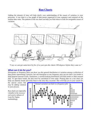
  • 1. Run Charts Adding the element of time will help clarify your understanding of the causes of variation in your processes. A run chart is a line graph of data points organized in time sequence and centered on the median data value. The patterns in the run chart can help you find where to look for assignable causes of variation. What can it do for you? Histograms or frequency plots can show you the general distribution or variation among a collection of data points representing a process, but one histogram or one frequency plot can not show you trends or help pinpoint unusual events. Sometimes, a normal-looking distribution will hide trends or other unusual data. To spot those trends, the data must be considered in time order. Plotting data on a run chart can help you identify trends and relate them to the time they occurred. This will help you in your search for the special causes that may be adding variation Unusual variation can hide in a frequency plot to your process. Run charts are especially valuable in the measure and analyze phases of Lean Six Sigma methodology.
  • 2. How do you do it? 1. Select a characteristic from one of your processes. This characteristic could be presenting a problem because excessive variation often drives it outside of specification limits, or it could be a cause of customer complaints. 2. Measure the characteristic over time intervals and record the data. Note the time or the time period that is associated with each data point. 3. Find the median data value. To do this, list the data values in numeric order. Include each data point, even if it is a repeat value. If the number of data points is odd, the median is the middle value. If the number of data points is even, the median is halfway between the two values nearest the middle. For example, if the collected data points were: 5, 1, 18, 8, 12, 9, the ordered values would be: 1, 5, 8, 9, 12, and 18. The middlemost values are 8 and 9. The median is the average of those values, or 8.5. (Remember, the numerically-ordered data is only for determining the median. The data must be plotted in time order on the run chart to be of any value.) 4. Set up the scales for your run chart. The vertical scale will be the data values, and the horizontal scale will be the time. Make the horizontal scale about two to three times the distance of the vertical scale. 5. Label the vertical scale so that the values will be centered approximately on the median and so the scale is about 1 ½ to 2 times the range of the collected data. 6. Draw a horizontal line representing the median value. 7. Plot the data points in sequence. Connect each point to the next point in the sequence with a line. int ta ns ns int ta ns ns of r of r of r of r er t fo er t fo er t fo er t fo po f da po f da ru ru ru ru Some special cause variation reveals s s mb mi mb mi mb mi mb mi o o itself in unusual run-chart patterns. nu r li r li nu r li nu r li er er These clues can direct you in your mb mb we we pe pe Up Up search for causes. Count the number Lo Lo Nu Nu nu of runs. Runs are sequences of points 10 3 8 35 13 23 11 3 9 36 13 24 that stay on one side of, either above 12 3 10 37 13 25 or below, the median line. One way 13 4 10 38 14 25 14 4 11 39 14 26 of counting the runs is to circle these 15 4 12 40 15 26 sequences and tally them. Another 16 5 12 41 16 26 17 5 13 42 16 27 way of doing this is to count the 18 6 13 43 17 27 number of times the run-line crosses 19 6 14 44 17 28 20 6 15 45 17 29 the median, and then add one. 21 7 15 46 17 30 22 7 16 47 18 30 23 8 16 48 18 31 Compare the number of runs you 24 8 17 49 19 31 count to the accompanying chart. 25 9 17 50 19 32 26 9 18 60 24 37 27 9 19 70 28 43 Numbers of runs outside the range 28 10 19 80 33 48 shown for the number of data points 29 10 20 90 37 54 30 11 20 100 42 59 are statistically unusual. 31 11 21 110 46 65 32 11 22 120 51 70 33 11 22 34 12 23
  • 3. Too few runs (below the lower limit) generally indicate that something cyclic is systematically shifting the process average. Example of too few runs Too many runs could point to a problem of consecutive, over-compensating process adjustments or indicate that the data points actually came from two sources with different process averages. Example of too many runs
  • 4. Look for sequences of ascending or descending values. Seven or more continuously increasing or continuously decreasing points indicates a trend that is shifting the process average. When you are counting points, ignore any points that repeat the previous value. Repeated values neither add to the length of the run nor break it. Examples of seven or more ascending and descending points Search for seven or more consecutive points on the same side of the median line or 10 of 11 points or 12 of 14 or 16 of 20. (Ignore any points that are exactly on the median.) Such a sequence indicates that something has occurred to shift the process average in that direction. Examples of seven or more ascending and descending points
  • 5. A sequence of 14 or more data points alternating up and down suggests a variation related to sampling (such as one reading early in the day and one reading toward the end) or that the data is coming from two sources with different process averages (such as from two machines making the same part.) In looking for up-and-down alternation, ignore any points that are exactly the same as the preceding point. Example of 14 or more alternating points A sequence of seven or more points with exactly the same value usually should signal you to look for a special cause. While it is possible that your process has improved to the extent that the existing measurement technique is no longer sensitive enough to measure variation, it is usually more probable that a gauge is stuck or broken or that someone is making up the data. Example of seven points in a row with the same value
  • 6. Now what? Run charts can be very valuable in helping your search for sources of variation. They are easy to plot and easy to interpret. The sampling is uncomplicated, and there are no statistical computations to make. They can also be applied to almost any process or any data. On the other hand, they are not an instant indicator. They are best used for spotting trends; short shifts in the process cannot always be detected with run charts. In addition, special causes that produce general piece-to-piece variation will not be readily detected on run charts. Finally, a simple run chart cannot establish the natural capabilities of a process, so it isn’t possible to use one to predict what specifications a process can actually meet. To do that, you need to create a control chart, a run chart with statistical control limits. Steven Bonacorsi is the President of the International Standard for Lean Six Sigma (ISLSS) and Certified Lean Six Sigma Master Black Belt instructor and coach. Steven Bonacorsi has trained hundreds of Master Black Belts, Black Belts, Green Belts, and Project Sponsors and Executive Leaders in Lean Six Sigma DMAIC and Design for Lean Six Sigma process improvement methodologies. Author for the Process Excellence Network (PEX Network / IQPC). FREE Lean Six Sigma and BPM content International Standard for Lean Six Sigma Steven Bonacorsi, President and Lean Six Sigma Master Black Belt 47 Seasons Lane, Londonderry, NH 03053, USA Phone: + (1) 603-401-7047 Steven Bonacorsi e-mail Steven Bonacorsi LinkedIn Steven Bonacorsi Twitter Lean Six Sigma Group