1. Magazine Analysis – Kerrang.
The Masthead goes straight across the front
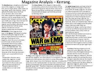
The Colour theme of this magazine is black, white,
The Splash image takes up at least a third of
cover of the magazine, in a large, bold
red and yellow, which is the common theme of Rock
the page, because the image is of the main
font, and in a bright yellow, which stands out
genre based magazines. Because these colours don’t
story within the weekly magazine. The photo
excessively, which is the intention. Along
attract young children, and they have connotations
is a medium long shot of the 3 members of
with all of the other text on the front
of excitement and danger. Last of all they are bold,
the band, which are clearly represented to be
cover, the text is all in a Sons Serif
outstanding colours.
a Rock band, by the stern look on their faces,
font, which implies the magazine’s targeted
along with one of them having blood on his
audience is not for young people, but for
face. Also, they don’t have neat hair, it is
people at least teenagers and over, possibly
messy, because having neat hair is a sign of
up to 30/40 years of age. This is because lots
femininity, which isn’t related to Rock. Next of
of fancy writing is appealing to young
all the colour in the background of the splash
children, and in contrast, dull colours such as
image is black and white. Black has
black and white don’t attract young
connotations of danger, and the two colours
children, but attract in a music
in contrast are effective because they’re not
situation, people who are interested in the
the two prettiest colours, they’re seen as
Rock middle
In thegenre. of the magazine front
fairly evil/scary colours.
cover, is the Banner. The banner is another
Also, the three band members are stood in a
method of selling the magazine to the
triangular shape. The most popular
buyer, as it gives the buyer an incite as to
singer/band member is at the front to attract
what type of articles are in the
more readers/buyers, however, even if a
magazine, and in this case, it also states
minority of people don’t like the main person
one of the main articles which will
on the front of the magazine, there is another
undoubtedly interest many readers.
two band members who people might aspire
The Anchorage magazine’s front
to.
cover is ‘THE WAR ON EMO’. This
The Price of Kerrang magazine is £2.20,
refers to the splash image on the
which isn’t such a high price. This is an
front of the cover. It infers that the
incentive to buy the magazine because it is
favourite of the 3 Rock stars has been
extreme value for money! If it was an
beaten up in a war/conflict of some
expensive magazine, maybe £5+, then the
sort.
The Plug on the magazine’s front cover is another incentive to
purchase the magazine, as in this instance it is a competiton. The plug magazine wouldn’t be purchased by many
The Barcode is found on every
teenagers especially, because the majority
stands out for three reasons. First of all, it is on top of the splash
modern day magazine, in order
image, which shows it has a lot of relevance. Secondly, it is yellow (the of teenager don’t work, so won’t want to
that the person who wants to
same colour as the masthead) which not only shows consistency, but spend, or simply won’t be able to afford an
buy it takes it to the counter, and
stands out dramatically. Last of all the text fills the whole area of the expensive magazine, where as this
gets it scanned, and pays for it.
magazine is affordable to all generations of
plug itself saying ‘Win!’. Therefore it stands out, and makes a buyer
The price, date and issue is
think about firstly purchasing the magazine, and secondly entering the the magazine’s target audience.
usually either on or next to the
competition, to win!
barcode.
2. Magazine Analysis – Kerrang.
The Kerrang magazine’s front cover has a lot
of Coverlines on it, which massively helps
boost the chances of selling the magazine
because it is informing the potential purchaser
of lots of different articles within. If there was
only one coverline on the front cover, and
everyone hated that interview for example,
then lots of people wouldn’t buy the
magazine. In this case, the magazine has lots
of coverline so if people hate on of the articles
within, there is a good chance they will be
interested in the others. Such as they may not
like My Chemical Romance, but might love Fall
Out Boy.
3. Magazine Analysis - Q
The Masthead on the front cover of Q
stands out for a variety of reasons, which
are certainly intended. First of all, the Q is
placed on a large red square, and the Q is
in white, so the contrast makes the Q much
more visible. Also, the Q is a considerably
large size (larger than all the other text on
the front cover), and is in a bold font which
is easily identifiable for people to notice
and hopefully purchase in a shop. It shows
consistency, because all of Q’s magazines
have the Masthead in the same
place, which makes it easily recognisable.
The Cost of the magazine is £3.90. This isn’t extensively
dear, however £3.90 weekly for some children is a large
amount of money, of which they can’t afford, so this
emphasises the fact that the magazine isn’t for/targeted
for young children. On the other hand, for the majority of
the target audience (teenagers to middle aged people)
£3.90 isn’t too much money to spend weekly. The price is
very small (next to the barcode) because the creators
want people to become interested in the magazine first,
and want to buy it, before they’re deterred by the price.
The Plug on the front cover of Q isn’t very
big in comparison to a lot of magazine’s
plugs, however, it still does it’s job! The
plug in this case introduces other articles
within the magazine, such as: FRANZ
FERDINAND ‘WHY WE STOPPED TALKING
FOR A YEAR’. Along with two other
articles. This sells the magazine
more, because if people for example
aren’t interested in the Kings of
Leon, then they might be interested in
Franz Ferdinand, or another artist. Also
the plug yet again stands out, because the
circle is yellow on top of a grey
background, and the text is black on a
yellow background, which shows great
contrast, which is easily visible.
The Splash Image of the magazine is of the Kings of Leon, which is quite obviously linked to the header. In
the splash image, the Kings of Leon are smiling/laughing, and wearing colourful clothing. This represents the
Kings of Leon as a cheerful band really, not heavy metal Rock where they’re dressed in black with
piercings, tattoos and have weapons in there hands. As all magazine front covers should do, this splash
image is a medium long shot. Last of all, the 4 band members aren’t stood in any sort of hierarchy
order, which would imply one band member is more popular than another, it shows equality and content.
The Header of the front cover is vital. On this
front cover, it goes across the magazine, and is
placed fairly centrally. In this case, it says
‘KINGS OF LEON’. This is eye catching for a
potential purchases visually, because it is black
text on a white background, which is an
extremely strong contrast, and also the text is
in a large, sons serif font, which is not only
clear, but shows maturity. Rock magazine’s
target audience is generally not for younger
people, but people of teenager age upwards. If
the text was is a serif font it would look more
child like. The header also sells the magazine,
as it is related to the splash image. The Kings of
Leon are a massively popular Rock band, which
will interest plenty of the target audience.
Without the incite of the header, there would
be less of an incentive to purchase the
magazine.
The Colour theme of the magazine is
following the trend of most of Rock genre
based magazines, because the
predominant colours are red, yellow, black
and white. However, the people in the
splash image are wearing quite bright
colourful clothing.
The Pull Quote on the magazine is in the
centre of the cover, on top of the Kings of
Leon, because it is a quote from their
interview, and is related to their
interview/article within the magazine. It says
“IT’S THE COMEBACK STORY OF A LIFETIME”.
The text is placed in a box, with a
strong/bold red outline, emphasising it’s
importance. This is similar to an Anchorage
because it is related to the splash image.
4. Magazine Analysis -Q
There is 2 Banners on this front cover.
They both do the same job as they both
contain small amount of information
about stories within. The banners are at
the top and bottom of the page, and are
easily visible. The Fleetwood Mac banner
yet again shows good contrast as the
text is in black, placed on the yellow
banner, and it also includes a picture to
interest the purchaser and make the
magazine more visual. The band
Fleetwood Mac are quite an old based
British Rock band, which will not interest
many of the younger generation, and
shows sophistication, and a sense of
tradition, that ‘old’ bands are still
respected in Britain. The Buzz Words
‘rare’ and ‘exclusive’ instantly excite the
reader, and is an incentive for them to
purchase the magazine, and read that
specific article.
The other banner at the bottom of the
page has 3 of the articles within placed
on it. This banner in fact is placed on top
of the splash image of the Kings of Leon,
which shows it’s importance. As with all
of the text on the front cover, the font of
the text is bold and sons serif which is
clear and mature.
The Barcode is found on every modern day magazine,
in order that the person who wants to buy it takes it
to the counter, and gets it scanned, and pays for it.
The price, date and issue is usually either on or next
to the barcode.
5. Magazine Analysis – NME.
The Masthead on the front cover of NME is in
the top left corner, which is the same for lots of
magazines, because it can be seen easily
there, especially considering the size the box
NME is in. Also the box is red, and the text is in
white, which is a strong colour contrast. The
text is large, and in a bold sons serif font, which
is clear and shows maturity, which is consistent
throughout most Rock based genre
magazines, because most people who purchase
Rock magazines, are of a slightly older age.
The Splash Image on NME’s front cover is a
medium long shot of the 4 people in the
photo. All 4 people are pulling different
kinds of faces, which don’t completely relate
to the typical stereotype of what a Rock
star(s) would look like, because they’re not
stern faced, screaming, or covered in blood
for example. However, these 4 people also
don’t fit the stereotype for Pop music for
example, because they’re older, and haven’t
got stylish hair styles, the same goes for the
clothes they’re wearing.
Part of the Splash image goes over the top of
one of the subheadings on the front cover.
This shows the importance of the people on
the front cover, as the splash image takes up
the majority of the page.
The Colour theme is red, black and white, as are most Rock genre based magazines. These colours
don’t appeal to young children, they are more basic colours, which do relate to Rock, because
they’re not childish, they’re exciting/aggressive. Red obviously has connotations of danger, and
black/white are usually used to show scariness. These colours, along with the photo on the front
cover will appeal to the specific target audience. These colours are also good to allow to have text
on top of them, whereas if you had a dark brown on black, it would be hard to see compared to
black and white.
The Price of NME is £1.99, which is extremely
affordable for a weekly magazine – and one of
the main age groups, teenagers, who don’t
earn much money, therefore they can’t afford
paying too much on a music magazine weekly.
Next to/along with the price, is the barcode,
and issue number. On every magazine you
have these 3 things no matter what genre it is.
They are always small so that the potential
buyer looks at the front cover, gets dragged in
and wants to buy it, and therefore isn’t
immediately put off by the price. As for the
barcode, every magazine has one in order to
be able to purchase it at the till, by it being
scanned. Last of all every magazine has an
issue number so that you’re informed of what
issue it is, for people who are rather interested
in the magazine, so that if they miss an issue,
they know which on they’ve missed, and they
might be able to find/buy that issue.
There are 4 small Subheadings next to the masthead
at the top of the front cover. These are an incite on
There is some Anchorage on this front cover. Where is says ‘So Pixies… …. Do we have a
some of the other articles within the
deal?’ This refers to the splash image indefinitely, because when you strike a deal, men
magazine, which are a major selling point. For
traditionally shake hands, which is what the man on the front of the magazine is doing.
example, if some buyers weren’t interested in the 4
This also is as if the hand the man is about to shake is our hand/the buyer’s hand, which
people on the front cover, they might be interested
physically makes us think for a second that he is trying to shake our hand. This is humour,
in one of the named artists in one of the
which also assists in selling any magazine. Younger children also wouldn’t feel as if
subheadings, such as Jake Bugg.
they’re striking a deal, it wouldn’t interest them in the way it is intended, which further
emphasises the fact the magazine is intended for slightly older people.