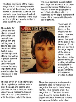
1. The logo and name of the music magazine ‘Q’ has been placed in the corner of the magazine which makes it seem more subtle as the contents page is designed so that the audience is attracted to the logo as it is bright and stands out but is also out of the way. The article for James Blunt is placed second even when the main picture shows him and nothing else. It seems odd that there should be such a large dominant picture of him, and yet he is placed second on the text, usually I would assume the most important article would receive the image as it is the main article. There is a separate section on the contents page for features of the magazine that are in there ‘every month’. This helps to break the magazine up. The black banner over the white writing divides the page and keeps the colour scheme the same whilst also quite plain. The word contents makes it clear what page the audience is on. Also by almost merging 232Contents NOV05, I think the page gains a sort of industrial look which is supported by the sepia background colour of the page and fairly plain colour scheme, The image of James Blunt takes up the majority of the page. However on the left it seems that part of the picture has been cut off but the text leaving a flat edge to part of the picture which could have been better planned through making a text box transparent or redesigning the page so that the hair does not overlap the test. The red arrow on the bottom right of the page helps to show to turn over the page and seems a bit pointless as that is how you would usually use a magazine. It could work as a sort of incentive as it wills the reader to turn the page.
2. The masthead is bold and stands out in contrast with the black, capital font from the white background. It is also bordered which emphasises the title. The target audience is mainly aimed at women this is portrayed by the images as the women are not in a sexual pose which usually refers to a mans magazine but they are in poses which are both refined, classy and has a vintage, jazzy feel. The images are a mixture of black and white and then coloured images which varies the style of images which creates a intrigue to the magazine. There is several camera shots ranging from close up to long shots which also suggests this. The use of group images does make the magazine feel a little crowded but then the images where there is only a singular person illustrates the importance of that one person. The layout of the contents page is very image commanding but has the necessary information to the right and informs the reader of what will be in the magazine. There is little colour used and when it is used it is to highlight key information on the page. Two out of five images are in colour which emphasises the article which the images are based on. The text is clear and easily read, and is not confusing to the reader.
3. The image is commanding as but is partially covered as it is the background as well. It is in black and white which makes the magazine feel more vintage and classy but the outfit the model ‘talyn manning’ is wearing suggests more of a rock genre theme or punk genre theme. The target audience is mainly aimed at woman as this is not just a music magazine but a fashion magazine ‘MF’ (Music and Fashion). But the style of artists would conclude that the magazine is also trying to be aimed at men also, approximately aged 16+. The layout is very simple which makes it very effective, the black and white contrast underneath a little colour, makes the magazine very striking. The masthead is placed in the left hand corner and is coloured which contrasts to the background this makes the masthead stand out and makes sure it is clearly seen to the audience. The text ‘talyn manning’ is covering the model which names the person; this emphasises who the person is and that even with text over them and the text being in colour they can still stand out of the page. The text in the bottom left hand corner is bold and easily readable and states what the magazine will have to offer. The colour used is both vibrant and works well together, orange on blue is a very fresh colour which suggests the music could be new or for younger listeners.