Turner's Watercolour Techniques
•Download as ODP, PDF•
9 likes•4,662 views

This document provides an overview of J.M.W. Turner's career and watercolor techniques from 1775 to 1851. It describes how he mastered watercolors in his late teens and became known as England's greatest watercolor artist. It also details some of Turner's innovative techniques, such as allowing colors to float on saturated paper and using capillary action to lift color. Finally, it discusses how Turner experimented with color combinations and disagreed with Newton and Goethe's rigid primary color frameworks.

Recommended
More Related Content
What's hot
What's hot (20)
Similar to Turner's Watercolour Techniques
Similar to Turner's Watercolour Techniques (20)
More from Marc Hill
More from Marc Hill (20)
Recently uploaded
Recently uploaded (20)
Turner's Watercolour Techniques
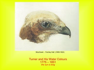
- 1. Turner and His Water Colours 1775 – 1851 the sun is king Moorhawk - Farnley Hall (1808-1824)
- 2. He was born the son of a hairdresser. His father encouraged his painting at an early age, exhibiting his works in the shop window
- 3. At 15 he painted this self portrait
- 4. He mastered water colour in his late teens and is known as Englands greatest water colour artist
- 5. Turner's pigments came from natural sources, Madder root for the reds, Borrowdale bowder stone for beautiful greens Iron blue for the blues – sometimes called Prussian blue if living in France or French blue if living in Germany These were ground down and mixed with gum arabic powder in water with some honey to make it less brittle and a little preservative like vinegar
- 6. Kings College, Oxford Water colour By the time he was 20 he had more commissions than he could handle
- 7. Dark Prison Water colour camera obscura 1790's
- 8. The High Street – water colour
- 9. Kirkshaw Abbey – water colour 1792
- 11. Compositional, Colour and Underpainting Study for `Crickieth Castle, North Wales' ?1836 Watercolour, gouache and pencil on paper
- 12. Crickieth Castle, North Wales 1837 Engraving he that impresses the observation or stimulates the Associate idea of a colour individually is the great artist' JMW Turner
- 13. Turner would often establish more emotional content by inventing a range of techniques Any colour would float in the saturated paper As it dries the work will start to establish harder and harder edges He could then choose a moment to drop another colour and then another colour into that colour This way he can investigate darker areas. Afterwards, by taking a brush he can lift colour out using capilary action. Each time he has to clean the brush out in order to soak up chosen areas. This way he can make positive statements about the lights and darks. It is all about choosing the time to work the colour
- 14. Turner's engravers had to produce complex patterns of black line which, when printed onto white paper, could convey the impression of colour. They used many skilful techniques and tricks to 'translate' colours into a language based on tone. Deep colours such as blue appeared dark, whilst lighter colours such as yellow would be created using white. Mid-tones such as red might be black or white, according to the emphasis placed within Turner's picture.
- 15. Richmond Terrace, Surrey 1838 Etching and engraving on paper
- 16. Head of Lake Windermere JD Pyn
- 18. The Source of the Arveyron 1802 Pencil, watercolour and gouache on paper Watercolour demands a different approach to painting in oil. The artist works from light to dark and has to deal with the unpredictability of wet washes. Turner’s innovative methods and unchallenged mastery of technique raised the status of watercolour, and provide a benchmark which is still admired today.
- 19. Margate circa 1830 Watercolour and pencil on paper
- 20. The print is etched with nitric acid
- 22. The sky is next worked in
- 23. The final result
- 24. The Supervisor
- 25. Sun Rising through Vapour This work qualified him as a full Academy member Through out his life, Turner kept the establishment happy producing classical works as well as producing works for himself and a favoured few
- 26. Plym Estuary 1818
- 27. Farnley Hall - 1818 Body colour and black chalk on buff paper
- 29. Traditionally water colours were seen as live studies to be worked up into full oil paintings in the studio later
- 30. Heron
- 31. Whilst exquisite these water colours followed the practice of the times, In The Peacock we start to observe the movement of expression as opposed to the illustrative technique seen previous
- 32. Farnley Hall Demonstrating Turners study of classical composition and perspective. The servant is entering the dining room
- 33. Norwood castle
- 34. Detail
- 36. Petworth House
- 38. The Blue Rigg
- 39. The Blue Rigg - detail
- 40. First Steamer on Lake Lucerne
- 41. Boats at Sea – 1830 bequethed by the artist These almost calligraphic marks on a wash of yellow represent boats on an expanse of sea. A bold brushstroke leaves a faint horizontal line dividing the composition in two, suggesting the distinction between sky and water. In this loose study Turner uses colour and line economically. Shapes, and areas of light and shade, are roughly suggested as he works out the basic compositional structure in preparation for a finished picture. The simple red and black forms suggest light and shade at sunset.
- 42. Turner visited Germany on several occasions and toured the tributaries of the Rhine, including the river Mosel. From the town of Coblenz, he painted the majestic peaks of Ehrenbreitstein, a formidable mountain topped by a fortress. He loved to paint the same view at different times of the day, recording the changing light conditions.In his perspective lectures, Turner agreed with Goethe’s theory that red was an ‘aerial’ colour, the most commanding of the primaries and the colour of matter itself.
- 43. Turner wanted to represent the harmonies of contrasting colours, but he disagreed with the theories of Newton and Goethe. For Turner, their ideas followed the spectrum and primary colour frameworks too rigidly to suggest the diversity of colours and tonal relationships in nature.He experimented with different colour combinations when painting the solid mass of the mountain of Ehrenbreitstein and the hazy atmosphere of the surrounding landscape and the setting sun.
- 44. ‘ light and darkness ... are necessary to the production of colour. Next to the light, colour appears which we call yellow; another next to the darkness, which we name blue ... but the intensest and purest red ... is produced when the two extremes of the yellow-red and blue-red are united. ... But we can also assume an existing red in addition to the definite existing blue and yellow ... With these three or six colours, which may be conveniently included in a circle, the elementary doctrine of colours is alone concerned.’ Johann Wolfgang von Goethe, Theory of Colours 1810
- 45. Turner used this diagram in a lecture on perspective. He wanted to show his students how to use colour to create the illusion of depth in a flat painting. Using the three primaries, he shows how the colours in light behave when they are represented in watercolour materials. Blue and red stand for degrees of shade, while yellow suggests light itself. Turner’s use of the colour circle is a reference to Goethe’s Theory of Colours.
- 46. Turner relished the Sublime effects of darkness. Its mysterious and elusive charm could stir the emotions in passionate and disquieting ways, for example in his night-time scenes of Venice. While for Newton and Goethe darkness was merely a negation of light, Turner expressed it positively in his works using colour. Intense, matt pigments applied to paper with a reddish ground could be dramatically offset by touches of bright white.
- 47. Venice by day was transformed by its unique combination of light and water. Turner used white paper to enhance the clarity of his transparent watercolour washes. His Venetian watercolours are saturated with warm yellows and browns and limpid green or blue to suggest the dazzling intensity of the sun and a sense of healthy serenity.
- 48. This exhibit at the Turner Gallery shows the timeline of how he introduced his colours
- 49. Rome, from the Vatican _ exhibited 1820
- 50. Rain steam speed
- 51. The Slave Ship
- 53. Burning of the Houses of Parliament
- 54. Detail
- 56. Varnishing Day
- 57. Fin