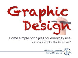
Gregynog cw
•Transferir como PPT, PDF•
3 gostaram•1,211 visualizações

University of Glamorgan's presentation at Gregynog on Graphic Design.

Recomendados
Mais conteúdo relacionado
Destaque
Mais de gregynog
Mais de gregynog (20)
Último
Último (20)
Gregynog cw
- 2. “… is the art or profession of visual communication that combines images, words and ideas to convey information to an audience.” Dictionary.com
- 4. Editorial
- 7. information
- 8. promotion
- 9. promotion
- 11. Branding/logo design Aerospace Centre Annual Repot Website
- 12. Packaging
- 13. C ontrast A lignment R epetition P roximity CARP
- 14. Contrast Alignment Repetition Proximity CARP
- 15. Contrast Make your reader want to look at the page
- 16. Size
- 17. Size
- 18. Size
- 19. Read me first! Read me next Then, if you have some time and are interested, would you please read me?
- 20. Anita Read Information Librarian Learning Resources Centre University of Glamorgan 01443 480480
- 21. Contrast Value
- 22. Anita Read Information Librarian Learning Resources Centre University of Glamorgan 01443 480480
- 23. Anita Read Information Librarian Learning Resources Centre University of Glamorgan 01443 480480
- 24. Anita Read • Information Librarian Learning Resources Centre • University of Glamorgan 01443 480480
- 25. Colour
- 26. Anita Read Information Librarian Learning Resources Centre University of Glamorgan 01443 480480
- 27. Contrast fonts Heavy with light Contrast fonts Light with heavy Contrast fonts Serif with sans serif
- 28. Sans serif Decorative Script Slab serif
- 29. Contrast Alignment Repetition Proximity CARP
- 30. Alignment Alignment Alignment Nothing should be placed at random on the page
- 31. Anita Read Information Librarian Learning Resources Centre University of Glamorgan 01443 480480
- 32. Anita Read Information Librarian Learning Resources Centre University of Glamorgan 01443 480480
- 33. Anita Read Information Librarian Learning Resources Centre University of Glamorgan 01443 480480
- 36. Source: The Non-Designers Design Book by Robin Williams
- 37. Contrast Alignment Repetition Proximity CARP
- 38. Repetition Be consistent and repeat elements to add visual interest repeat for visual interest • repeat for visual interest • repeat for visual interest • repeat for visual interest
- 39. A nita R ead Information Librarian Learning Resources Centre University of Glamorgan 01443 480480
- 40. Anita Read Information Librarian Learning Resources Centre University of Glamorgan 01443 480480
- 41. Anita Read Information Librarian Learning Resources Centre University of Glamorgan 01443 480480
- 42. Contrast Alignment Repetition Proximity CARP
- 43. Proximity Items relating to each other should be grouped together
- 44. Anita Read Information Librarian 01443 480480 Learning Resources Centre University of Glamorgan
- 45. Anita Read Information Librarian Learning Resources Centre University of Glamorgan 01443 480480
- 46. Source: The Non-Designers Design Book by Robin Williams
- 47. Source: The Non-Designers Design Book by Robin Williams
- 48. White Space Why is it important in design?
- 49. Anita Read Information Librarian Learning Resources Centre University of Glamorgan 01443 480480
- 50. Anita Read Information Librarian Learning Resources Centre University of Glamorgan 01443 480480
- 51. Anita Read Information Librarian Learning Resources Centre University of Glamorgan 01443 480480
- 52. Contrast Alignment Repetition Proximity And last but not least – white space CARP
- 63. Pet Hates Things you should try to avoid…
- 64. L I B R A R Y LIBRARY LIBRARY
- 65. If you use borders around your text make sure you include enough white space
- 66. The same rule applies to coloured boxes (even if your ‘white’ space is actually blue!) The same rule applies to coloured boxes…
- 67. Avoid underlining headings. (Unless you’re using a typewriter.) Avoid underlining headings (Unless you’re using a typewriter)
- 68. DO NOT TYPE MORE THAN A FEW WORDS IN UPPER CASE BECAUSE IT IS RATHER DIFFICULT TO READ AND LOOKS AS IF YOU ARE SHOUTING AT ME!
- 69. A SHORT UPPER CASE HEADING IS OK Please do not type more than a few words in upper case because it is rather difficult to read and looks as if you are shouting at me!
- 70. Avoid using Comic Sans a b c 1 2 3 And by the way, using too many colours is not a good idea either
- 71. NEVER, EVER, EVER USE A COMBINATION OF ANY OF THESE! And finally…
- 72. Cath Wright-Jones Visual Communicator [email_address] The Non-Designer ’ s Design Book by Robin Williams
Notas do Editor
- Today I’m going to talk a little bit about graphic design, what it is and where you can find it. I’ll show you some examples of the different types of graphic design and then go on to demonstrate some very simple rules that you can apply to your own work. Finally I’ll show you some more examples of graphic and how these rules have been applied to each piece. Of course I haven’t forgotten that this is a LIBRARY conference so I’ve attempted to make everything as relevant to HE libraries as possible!
- When I started to research what exactly graphic design is, I found dozens of descriptions, in fact there are blogs and websites dedicated to describing it. The description shown here is probably the one that for me comes closest to it. One thing it isn’t is just a prettification of information. It’s purpose is to attract the viewer, to draw them in, to explain to impart information, to entertain
- On the surface that would appear to be a very odd statement but let me explain OK, I’m going to make you think a bit now. Which department in your institution would you say was the biggest user of graphic design skills? Any ideas? Well actually, it’s the library! Why do I say this? Think about book and journal collections for example. Every book and journal has to have a cover. And the cover has a purpose, that is to attract your attention and give you information about the contents . In additions there are literally millions of pages that have been carefully and thoughtfully laid out so the contents are easy to read, guide you effortlessly through the publication. When done through the medium of design than just getting someone in the back room of the Publisher to layout the cover and contents of the the book as a WORD document. Of course it’s not just the printed stuff that graphic designers would have had a hand in most online resources for example, particularly is likely to have involved graphic design skills. Of course then there are the posters on the notice boards, the leaflets about what’s on in Cardiff or Swansea, the bus timetables, the newspapers, the logos that are displayed on most of these have to be designed. Once I get going I can go on and on.. Credit cards, tickets, skateboards, birthday cards, the work of the visual communicator is everywhere! But the strange thing is until you start thinking about it you don’t see it.
- One of the most important elements of design - If you get the contrast right then you will attract attention. Contrast is the element that gives your page a focal point and visual interest. Without contrast the viewer doesn’t know what is important or where to look first.
- One of the most important elements of design - If you get the contrast right then you will attract attention. Contrast is the element that gives your page a focal point and visual interest. Without contrast the viewer doesn’t know what is important or where to look first.
- There should be an invisible grid that links the elements of your page The eye searches for straight lines
- Repetion also helps with visual organisation. For example readers expect to see page numbers in the same place on each page. Repeat colour themesand imagery and stick to the same font choices.