SlideShare a Scribd company logo
1 of 28
Download to read offline
Media Visualization. 1/28


Visualizing image and
video collections:
examples
In this document we illustrate three key techniques used in our lab
(softwarestudies.com) to explore large image and video sets:
montage, slice, image plot.
Media Visualization. 2/28


Montage

Since media collections usually contain some metadata such as creation dates or subject categories, we
can organize the display of the images in a collection using this metadata.

This technique can be seen as an extension of the most basic intellectual operations of humanities –
comparing a set of related items. However, if 20th century technologies only allowed for a comparison
between a small number of artifacts at the same time – for example, the standard lecturing method in art
history was to use two slide projectors to show and discuss two images side by side – we can now
compare hundreds of thousands of images by displaying them simultaneously in different layouts.

The following examples illustrate different uses of a montage technique – visualizing 4535 Time
magazine covers, 100 hours of video game play, a feature film, and a collection of 113 video weekly
addresses.
Media Visualization. 3/28
Media Visualization. 4/28
1. (Previous page.)
Montage of 4535 covers of Time magazine (1923 – 2009) organized by publication date (left to right, and
top to bottom). Jeremy Douglass and Lev Manovich, 2009.

Note: Most covers of Time include a signature red border. We have cropped these borders and scaled
the covers to the same size to more clearly see the temporal patterns across all covers.

High-resolution version:
http://www.flickr.com/photos/culturevis/4038907270/in/set-72157624959121129/	


Arranging 4535 Time covers into a grid organized by publication date reveals a number of historical
patterns. Visualization shows the pre-color printing era in the 1920s, a cluster of brief early experiments in
color printing (with left-margin colors), and then the gradual shift from black and white to full color covers,
with both types coexisting for a number of years.
         In the 1930s Time covers use mostly photography. After 1941, the magazine switches to
paintings. In later decades the photography gradually comes to dominate again. In the 1990s we see an
emergence of the contemporary software-based visual language, which combines manipulated
photography, graphic and typographic elements. We also see how contrast and saturation of covers
gradually increase throughout the 20th century. However, since the end of the 1990s, this trend is
reversed: recent covers have less saturation.
         The visualization also reveals an important “meta-pattern”: almost all changes are gradual. Each
of the new communication strategies emerges slowly over a number of months, years or even decades.
Media Visualization. 5/28


2.
Montage of Kingdom Hearts (2002, Square Co., Ltd.) video game play.
William Huber, 2010.

Kingdom Hearts game play: 62.5 hours of game play, in 29 sessions over 20 days.

High-resolution version:
http://www.flickr.com/photos/culturevis/4039126932/in/set-72157624959121129/	


Media Visualization. 6/28


3.
Montage of Kingdom Hearts II (2005, Square-Enix, Inc.).
William Huber, 2010.

Kingdom Hearts II game play: 37 hours of game play, in 16 sessions over 18 days.

High-resolution version:
http://www.flickr.com/photos/culturevis/4038975476/in/set-72157624959121129/ 	


These two montages visualize 100 hours of video game play. Each game was played from the beginning
to the end over a number of sessions. The video recordings captured from all game sessions of each
game were assembled into a single visual sequence. The sequences were sampled at 6 frames per
second. This resulted in 225,000 frames for Kingdom Hearts and 133,000 frames for Kingdom Hearts II.
The visualizations use every 10th frame from these sets. Frames are organized in a grid arrangement in
order of game play (left to right, top to bottom).

Kingdom Hearts is a franchise of video games and other media properties created in 2002 via a
collaboration between Tokyo-based videogame publisher Square (now Square-Enix) and The Walt
Disney Company. The game presents original characters created by Square who travel through worlds
representing Disney-owned media properties (e.g., Tarzan, Alice in Wonderland, The Nightmare before
Christmas, etc.) Each world has its distinct characters derived from the respective Disney-produced films.
Each world also features specific color palettes and rendering styles, which are reflective of the
corresponding Disney film’s visual style. Our visualizations reveal the structure of the game play, which
cycles between progressing through the story and visiting various Disney worlds.
Media Visualization. 7/28


4.
Montage of the film The Eleventh Year (Dziga Vertov, 1928).
Lev Manovich, 2009.
Film digitization: Austrian Film Institute. Shot tagging: Adelheid Heftberger.
Every shot in the film is represented by its first frame. Frames are organized left to right and top to
bottom, following the order of shots in the film.

High-resolution version:
http://www.flickr.com/photos/culturevis/3988919869/in/set-72157622608431194


This montage uses a semantically and visually important segmentation of the film – the shots sequence.
Each shot is represented by its first frame. We can think of this visualization as a “reverse engineered”
imaginary storyboard of the film – a reconstructed plan of its cinematography, editing, and content.


Media Visualization. 8/28


5.
Montage of the film The Eleventh Year (Vertov, 1928).
Lev Manovich, 2010.
Each column represents one shot in the film using its first frame (top row) and last frame (bottom row).
The shots are organized left to right following their order in the film.
First image: a part of the complete visualization of the whole film.
Second image: a close-up of the visualization.

Complete high-resolution visualization:
http://www.flickr.com/photos/culturevis/4117658480/in/set-72157622608431194/	


To create this visualization, I selected the first and last frame of every shot in The Eleventh Year and
placed them together in the order of shots (first frames are on the top, corresponding last frames are on
the bottom.)

”Vertov” is a neologism invented by the film director who adapted it as his last name early in his career. It
comes from the Russian verb vertet, which means “to rotate.” “Vertov” may refer to the basic motion
involved in filming in the 1920s – rotating the handle of a camera – and also the dynamism of film
language developed by Vertov who, along with a number of other Russian and European filmmakers,
designers and photographs working in that decade, wanted to “defamiliarize” familiar reality by using
dynamic diagonal compositions and shooting from unusual points of view. However, our visualization
suggests a very different picture of Vertov. Almost every shot of The Eleventh Year starts and ends with
practically the same composition and subject. In other words, the shots are largely static.
         Going back to the actual film and studying these shots further, we find that some of them are
indeed completely static – such as the close-ups of faces looking in various directions without moving.
Other shots employ a static camera, which frames some movement – such as working machines, or
workers at work – but the movement is localized completely inside the frame (the objects and human
figures do not cross the view framed by the camera.) Of course, we may recall that a number of shots in
Vertov’s most famous film Man with A Movie Camera (1929) were specifically designed as opposites:
shooting from a moving car meant that the subjects were constantly crossing the camera view. But even
in this most experimental of Vertov’s film, such shots constitute a very small part of a film.
Media Visualization. 9/28


6.
Montage of The Eleventh Year (Vertov, 1928) with a bar graph representing average amount of
movement per shot.
Lev Manovich, 2010.
Each bar represents one shot in the film. The length of a bar corresponds to the average amount of
movement in the shot. The first frames of the shots are placed above the bars.
First image: a part of the complete visualization of the whole film.
Second image: a close-up of the visualization.

Complete high-resolution visualization:
http://www.flickr.com/photos/culturevis/4117658480/in/set-72157622608431194    	


We measured frame differences between two consecutive frames of every shot, averaged these
measurements per shot and graphed these averaged values over time. This visualization revealed the
presence of a number of patterns that until now have not been discussed by film scholars – such as a
temporal structure where the amount of movement at first gradually decreases and then gradually
increases over a large number of shots.
Media Visualization. 10/28


7-8. (Next two pages)
Montage of 113 President Barack Obama weekly video addresses (2009 through the middle of 2011).

First image: A close-up of the visualization.
Second image: Full visualization.

Research: Elizabeth Losh and Tara Zepel.
Visualization: Jeremy Douglass, 2011.
Video source: http://www.whitehouse.gov/briefing-room/weekly-address.

Complete high-resolution visualization:
http://www.flickr.com/photos/culturevis/5932288633/in/set-72157627058543885


This visualization shows how montage technique can be used to represent a video collection. It also
shows that montages do not need to fit into a square format.
         The data is from the weekly White House video addresses by President Barack Obama (2009 -
middle of 2011.) Each week’s video is represented as a row of still images. These still images are the
last frames of every shot in a video. The rows are organized top to bottom to follow the order of video
releases. This visualization layout allows us to quickly notice that in contrast to shorter videos, where
Obama addresses the viewers from various rooms inside the White House, the longer videos also show
other locations and subjects.


To create this visualization, we first used the free application shotdetect to automatically separate each
video into shots. Unix scripts were used to organize the frames representing the shots. The final
visualization was rendered using the free software ImageMagic:

Shotdetect: http://shotdetect.nonutc.fr/

ImageMagic: http://www.imagemagick.org/script/index.php
Media Visualization. 11/28
Media Visualization. 12/28


Media Visualization. 13/28
	
  
Slice
If montage visualization shows complete images, a slice visualization uses only small sample strips from
each image.
Media Visualization. 14/28


Full visualization.


Close-up.


9.
Slice of 4535 covers of Time magazine organized by publication date from 1923 to 2009 (left to right).
Jeremy Douglass and Lev Manovich, 2009.
Every one-pixel vertical column is sampled from a corresponding cover.

High-resolution version:
http://www.flickr.com/photos/culturevis/4040690842/in/set-72157622525012841


Often more dramatic sampling that uses only a small part of an image can be quite effective in revealing
patterns, which a full image montage may not show as well. This slice visualization shows historically
changing patterns in the layout of covers, placement and size of the word “Time,” and the size of images
in the center in relation to the whole covers.
Media Visualization. 15/28


Image Plots
An image plot shows all images in a collection organized by their visual features and metadata. It is
similar to a scatter plot technique. However, if a scatter plot represents the data by points, an image plot
shows the actual images.


All the visualizations shown below were created with ImagePlot software developed by Software Studies
Initiative:

http://lab.softwarestudies.com/p/imageplot.html
Media Visualization. 16/28


10.
Left: 128 paintings by Piet Mondrian (1905-1917). Right: 123 paintings by Mark Rothko (1938-1953).
In each visualization: X-axis: brightness mean; Y-axis: saturation mean.
Top two visualizations: image plots.
Bottom two visualization: the same data represented as color circles.

High-resolution versions:
http://www.flickr.com/photos/culturevis/6074400716/in/set-72157627389144448/
http://www.flickr.com/photos/culturevis/6073859925/in/set-72157627389144448

This example demonstrates how image plot visualizations (scatter plots with images superimposed over
points) can be used to compare multiple cultural image sets. In this case, the goal is to compare a similar
number of paintings by Piet Mondrian and Mark Rothko produced over comparable time periods.
Media Visualization. 17/28


Projecting sets of paintings of the two artists into the same coordinate space reveals their comparative
"footprints" - the parts of the space of visual possibilities they explored. We can see the relative
distributions of their works - the more dense and the more sparse areas, the presence or absence of
clusters, the outliers, and other patterns.

To see the evolution of Mondrian and Rothko in brightness/saturation space, we can visualize the
paintings as color circles. The colors indicate the position of each set of paintings within the time period,
running from blue to red. To make the patterns even easier to view, we also vary the size of circles from
smallest to largest. (Both types of visualizations are created with ImagePlot.)
Media Visualization. 18/28


11.
Image plot of 776 Vincent van Gogh’s paintings (1881-1890). Tara Zepel, 2011.
X-axis = date (year and month). Y-axis = median brightness.
High-resolution version:
http://www.flickr.com/photos/culturevis/5910819865/in/set-72157627135422710.


12.
Image plots of van Gogh paintings created in Paris and in Arles. Tara Zepel, 2011.
Media Visualization. 19/28

Paris period (4/1886 - 3/1886): 199 paintings. Arles period (3/1888 - 3/1889): 161 paintings.
X-axis = median brightness; Y-axis = median saturation.
High res version: http://www.flickr.com/photos/culturevis/6279358698/in/photostream.


Being able to see most of the paintings van Gogh created during his life organized by their visual
properties gives us new ways to think about his art career. We can see how brightness and saturation
values across 776 paintings change from 1881 through 1890. We can also see which paintings follow the
general trend and those that stand out as exceptions. We can also discover other patterns running
through his career that are not visible than only selected paintings are considered.

For example, here is how the Vincent van Gogh Museum in Amsterdam describes the changes in van
Gogh’s style after he moves to Paris in 1886: “Soon after arriving in Paris, Van Gogh senses how
outmoded his dark-hued palette has become... His palette gradually lightens, and his sensitivity to color in
the landscape intensifies.” (Paris, 1886-1888, vangoghmuseum.nl, accessed July 31, 2011).

The image plot shows that, in fact, van Gogh’s palette already starts getting lighter in 1885, before he
moves to Paris. The visualization also shows that average brightness values of the paintings shift over
time in a gradual manner not only in this but also in all periods of the artist’s life. This means that in any
new period we find not only paintings in “a new style” but also paintings in “old styles” of the previous
periods.

For instance, if you look at the bottom horizontal band of images in the visualization above (no. 11), you
will notice that between 8/1884 and 9/1885 van Gogh produced many dark paintings. You may expect
that after he moves to Paris, where, according to the van Gogh museum web site, "His palette becomes
brighter," these dark works will disappear, but this is not true. Along with very light paintings that are
similar in values to impressionists’ works produced around the same time, van Gogh still occasionally
makes the paintings which are as dark as the ones he favored in 1884-1885. And then later, in Arles
(1886-1888), he will still sometimes "regress" to his dark style. The same pattern can be seen in the top
horizontal band that contains van Gogh's lightest paintings. While most of these works were done after
1886, a few are also found in earlier periods.

The image plots of van Gogh paintings created in Paris and Arles (no. 12) that plot the paintings
according to their average brightness and saturation allow us compare these two periods in a different
way. They clearly show that the difference between the two periods is relative rather than absolute. The
center of the "cloud" of Arles paintings is displaced to the left (lighter paintings), and to the top (more
saturated paintings) in comparison to the "cloud" of Paris paintings; it is also smaller, indicating less
variability in Arles paintings. But the larger parts of the two clouds overlap, i.e. they cover the same area
of the brightness/saturation space visualized in these image plots.
Media Visualization. 20/28


13.

Image plot of 4535 covers of Time magazine published between 1923 and 2009.
Jeremy Douglass and Lev Manovich, 2009.

X-axis: publication dates. Y-axis: saturation mean (for full cover covers) or brightness mean (for early
black and white covers).

High-resolution version:
http://www.flickr.com/photos/culturevis/4347477551/in/set-72157623414034532/


This visualization shows that brightness and saturation of Time covers published over 86 years follow a
cyclical pattern of rising and falling, with dramatic peaks and valleys only becoming apparent over periods
of a decade or more. Standing apart from the overall curve are extreme exceptions: glowing bright
images and pale designs that float above or below the cloud of covers typical of an era. The most
saturated covers tun out to correspond to Cold War Era – they use lots of pure red to represent the
Communis threat.

We can compare the last decade (2000s) to the entire eighty-six year magazine history. The drop in
saturation since the end of the 1990s echoes a somewhat similar period of unsaturated covers during the
mid-1960s.
Media Visualization. 21/28


Two close-ups of the Time covers image plot shown on the previous page.
Media Visualization. 22/28


14 – 15 (Next page.)
Two additional visualizations of the Time covers collection illustrate some of the new visualization
functions implemented in an experimental version of ImagePlot currently in use in our lab. (This version
does not have Graphical User Interface.)

1) Highlighting selected images in visualization. A researcher can add content tags to the file containing
image filenames and image features. All the images that have particular tags will be highlighted using
color borders. This example shows a close-up of the image plot of Time covers with blue borders around
the covers that were given “female” tag (i.e. covers representing women.)

2) Rendering trend lines. ImagePlot calculates trend lines and renders them on top of a visualization to
aid its interpretation.
Media Visualization. 23/28


Media Visualization. 24/28


16.
Image plot of 1,074,790 manga pages.
Lev Manovich and Jeremy Douglass, 2010.
X-axis: standard deviation. Y-axis: entropy.
Original visualization size: 44,000 x 44,000 pixels.

High-resolution version:
http://www.flickr.com/photos/culturevis/5109394222/in/set-72157625291139783/

Next page:

Top image: a close-up of the top part of the image plot.
Bottom image: a close-up of the bottom left corner of the image plot.
Media Visualization. 25/28


Media Visualization. 26/28


The visualization arranges one million manga pages according to their selected visual features. The
pages in the bottom part of the image plot are the most graphic and have the least amount of detail and
texture. The pages in the upper right have lots of detail and texture. The pages with the highest contrast
are on the right, while pages with the least contrast are on the left. In between these four extremes, we
find every possible intermediate graphic variation.

This visualization suggests that the very concept of style, as it is normally used, may become problematic
when we consider very large cultural data sets. The concept assumes that we can partition a set of works
into a small number of discrete categories. However, the space of graphical variations in manga does not
have any distinct clusters, so if we try to divide this space into discrete categories, any such attempt will
be arbitrary. Instead, it is better to use visualization and mathematical descriptions to characterize the
space of possible and realized variations.
Media Visualization. 27/28


17.
1,074,790 manga pages rendered as points. X-axis: standard deviation. Y-axis: entropy.
Lev Manovich and Jeremy Douglass, 2010.

To better understand the distribution of the data, we can render it using points. The lightest parts of the
plot represent most frequently occurring graphical choices in our manga sample; the parts of the plot
which remains black represent the graphical possibilities which were not realized in this sample. The blue
points correspond to the pages from three most popular manga titles (One Piece, Bleach, Naruto.)
Media Visualization. 28/28


18.
Image plot of 393 Mark Rothko’s paintings (1927-1970). Hao Wang and Mayra Vasquez, 2011.
X-axis = date (year). Y-axis = mean brightness.

Writings about Mark Rothko often emphasize the dark paintings created in the last years of his life.
However, visualizing 393 paintings created by the artist between 1927 and 1970 according to their
average brightness shows that this period represents a culmination of almost linear trend that starts in the
middle of the 1940s.

The visualization was created by the students in Lev Manovich undergraduate class at UCSD.

More Related Content

Similar to William HuberThis visualization displays every frame of 113 weekly video addresses delivered by President BarackObama between 2009 and mid-2011. Each video address is represented by a single column of framessampled at a rate of one frame per second. The columns are organized chronologically from left to right.The visualization reveals patterns in the visual language and production techniques used across theseaddresses over time. For example, the early addresses rely more heavily on static camera angles andclose-up shots of the president at a podium or desk. Later addresses incorporate more location shootingand variation in camera angles, lighting, and framing. We also see the president's appearance evolvefrom the early days of his first term

Editing introduction and history support
Editing introduction and history support Editing introduction and history support
Editing introduction and history support Louise Sands
 
2 Introduction to Animation.pptx
2 Introduction to Animation.pptx2 Introduction to Animation.pptx
2 Introduction to Animation.pptxSioMairice11
 
Film Production Industry And Its Recording Process
Film Production Industry And Its Recording ProcessFilm Production Industry And Its Recording Process
Film Production Industry And Its Recording ProcessGina Buck
 
New Media Projects
New  Media ProjectsNew  Media Projects
New Media Projectstrchambers
 
Session 10 the art of film editing: Film Appreciation Course
Session 10 the art of film editing: Film Appreciation CourseSession 10 the art of film editing: Film Appreciation Course
Session 10 the art of film editing: Film Appreciation CourseJeremy Eliab
 
Unit 16 Writing Essay
Unit 16 Writing EssayUnit 16 Writing Essay
Unit 16 Writing EssayMulkacE147
 
Dr Sommerer: Interactive Installation; Filmteractive 2013
Dr Sommerer: Interactive Installation; Filmteractive 2013Dr Sommerer: Interactive Installation; Filmteractive 2013
Dr Sommerer: Interactive Installation; Filmteractive 2013Filmteractive
 
Ghost In The Machine: The Soul of Design Artifacts, v2.0
Ghost In The Machine: The Soul of Design Artifacts, v2.0Ghost In The Machine: The Soul of Design Artifacts, v2.0
Ghost In The Machine: The Soul of Design Artifacts, v2.0Jeffrey Ryan Pass
 
Lesson 3) Parallel editing & montage
Lesson 3) Parallel editing & montageLesson 3) Parallel editing & montage
Lesson 3) Parallel editing & montageiain bruce
 
QUESTION Research Nam June Paiks video work TV Buddha. Thi.docx
QUESTION Research Nam June Paiks video work TV Buddha. Thi.docxQUESTION Research Nam June Paiks video work TV Buddha. Thi.docx
QUESTION Research Nam June Paiks video work TV Buddha. Thi.docxtemplestewart19
 
Assignment 1 task 1
Assignment 1 task 1Assignment 1 task 1
Assignment 1 task 1LewisAnders
 
Stop motion production
Stop motion productionStop motion production
Stop motion productionHICKMAN98
 
Stop motion production
Stop motion productionStop motion production
Stop motion productionHICKMAN98
 
Photosynth - a 3d photo experience!
Photosynth - a 3d photo experience!Photosynth - a 3d photo experience!
Photosynth - a 3d photo experience!hewie
 
Lecture 1 History of Animation.pptx
Lecture 1 History of Animation.pptxLecture 1 History of Animation.pptx
Lecture 1 History of Animation.pptxDeodatusKalekona1
 
[Pro forma] - mographics - case study finished
[Pro forma] - mographics - case study finished[Pro forma] - mographics - case study finished
[Pro forma] - mographics - case study finishedJoe Hill
 

Similar to William HuberThis visualization displays every frame of 113 weekly video addresses delivered by President BarackObama between 2009 and mid-2011. Each video address is represented by a single column of framessampled at a rate of one frame per second. The columns are organized chronologically from left to right.The visualization reveals patterns in the visual language and production techniques used across theseaddresses over time. For example, the early addresses rely more heavily on static camera angles andclose-up shots of the president at a podium or desk. Later addresses incorporate more location shootingand variation in camera angles, lighting, and framing. We also see the president's appearance evolvefrom the early days of his first term (20)

Editing introduction and history support
Editing introduction and history support Editing introduction and history support
Editing introduction and history support
 
2 Introduction to Animation.pptx
2 Introduction to Animation.pptx2 Introduction to Animation.pptx
2 Introduction to Animation.pptx
 
Film Production Industry And Its Recording Process
Film Production Industry And Its Recording ProcessFilm Production Industry And Its Recording Process
Film Production Industry And Its Recording Process
 
1.animation
1.animation1.animation
1.animation
 
New Media Projects
New  Media ProjectsNew  Media Projects
New Media Projects
 
Session 10 the art of film editing: Film Appreciation Course
Session 10 the art of film editing: Film Appreciation CourseSession 10 the art of film editing: Film Appreciation Course
Session 10 the art of film editing: Film Appreciation Course
 
Unit 16 Writing Essay
Unit 16 Writing EssayUnit 16 Writing Essay
Unit 16 Writing Essay
 
Dr Sommerer: Interactive Installation; Filmteractive 2013
Dr Sommerer: Interactive Installation; Filmteractive 2013Dr Sommerer: Interactive Installation; Filmteractive 2013
Dr Sommerer: Interactive Installation; Filmteractive 2013
 
Ghost In The Machine: The Soul of Design Artifacts, v2.0
Ghost In The Machine: The Soul of Design Artifacts, v2.0Ghost In The Machine: The Soul of Design Artifacts, v2.0
Ghost In The Machine: The Soul of Design Artifacts, v2.0
 
Lesson 3) Parallel editing & montage
Lesson 3) Parallel editing & montageLesson 3) Parallel editing & montage
Lesson 3) Parallel editing & montage
 
QUESTION Research Nam June Paiks video work TV Buddha. Thi.docx
QUESTION Research Nam June Paiks video work TV Buddha. Thi.docxQUESTION Research Nam June Paiks video work TV Buddha. Thi.docx
QUESTION Research Nam June Paiks video work TV Buddha. Thi.docx
 
Tv journalism notes
Tv journalism notesTv journalism notes
Tv journalism notes
 
Annotated Bibliography
Annotated BibliographyAnnotated Bibliography
Annotated Bibliography
 
Assignment 1 task 1
Assignment 1 task 1Assignment 1 task 1
Assignment 1 task 1
 
Stop motion production
Stop motion productionStop motion production
Stop motion production
 
Stop motion production
Stop motion productionStop motion production
Stop motion production
 
Photosynth - a 3d photo experience!
Photosynth - a 3d photo experience!Photosynth - a 3d photo experience!
Photosynth - a 3d photo experience!
 
Lecture 1 History of Animation.pptx
Lecture 1 History of Animation.pptxLecture 1 History of Animation.pptx
Lecture 1 History of Animation.pptx
 
Surveillance in film
Surveillance in filmSurveillance in film
Surveillance in film
 
[Pro forma] - mographics - case study finished
[Pro forma] - mographics - case study finished[Pro forma] - mographics - case study finished
[Pro forma] - mographics - case study finished
 

Recently uploaded

ENGLISH6-Q4-W3.pptxqurter our high choom
ENGLISH6-Q4-W3.pptxqurter our high choomENGLISH6-Q4-W3.pptxqurter our high choom
ENGLISH6-Q4-W3.pptxqurter our high choomnelietumpap1
 
Earth Day Presentation wow hello nice great
Earth Day Presentation wow hello nice greatEarth Day Presentation wow hello nice great
Earth Day Presentation wow hello nice greatYousafMalik24
 
MULTIDISCIPLINRY NATURE OF THE ENVIRONMENTAL STUDIES.pptx
MULTIDISCIPLINRY NATURE OF THE ENVIRONMENTAL STUDIES.pptxMULTIDISCIPLINRY NATURE OF THE ENVIRONMENTAL STUDIES.pptx
MULTIDISCIPLINRY NATURE OF THE ENVIRONMENTAL STUDIES.pptxAnupkumar Sharma
 
ACC 2024 Chronicles. Cardiology. Exam.pdf
ACC 2024 Chronicles. Cardiology. Exam.pdfACC 2024 Chronicles. Cardiology. Exam.pdf
ACC 2024 Chronicles. Cardiology. Exam.pdfSpandanaRallapalli
 
Student Profile Sample - We help schools to connect the data they have, with ...
Student Profile Sample - We help schools to connect the data they have, with ...Student Profile Sample - We help schools to connect the data they have, with ...
Student Profile Sample - We help schools to connect the data they have, with ...Seán Kennedy
 
Transaction Management in Database Management System
Transaction Management in Database Management SystemTransaction Management in Database Management System
Transaction Management in Database Management SystemChristalin Nelson
 
Difference Between Search & Browse Methods in Odoo 17
Difference Between Search & Browse Methods in Odoo 17Difference Between Search & Browse Methods in Odoo 17
Difference Between Search & Browse Methods in Odoo 17Celine George
 
What is Model Inheritance in Odoo 17 ERP
What is Model Inheritance in Odoo 17 ERPWhat is Model Inheritance in Odoo 17 ERP
What is Model Inheritance in Odoo 17 ERPCeline George
 
Inclusivity Essentials_ Creating Accessible Websites for Nonprofits .pdf
Inclusivity Essentials_ Creating Accessible Websites for Nonprofits .pdfInclusivity Essentials_ Creating Accessible Websites for Nonprofits .pdf
Inclusivity Essentials_ Creating Accessible Websites for Nonprofits .pdfTechSoup
 
How to do quick user assign in kanban in Odoo 17 ERP
How to do quick user assign in kanban in Odoo 17 ERPHow to do quick user assign in kanban in Odoo 17 ERP
How to do quick user assign in kanban in Odoo 17 ERPCeline George
 
How to Add Barcode on PDF Report in Odoo 17
How to Add Barcode on PDF Report in Odoo 17How to Add Barcode on PDF Report in Odoo 17
How to Add Barcode on PDF Report in Odoo 17Celine George
 
Science 7 Quarter 4 Module 2: Natural Resources.pptx
Science 7 Quarter 4 Module 2: Natural Resources.pptxScience 7 Quarter 4 Module 2: Natural Resources.pptx
Science 7 Quarter 4 Module 2: Natural Resources.pptxMaryGraceBautista27
 
HỌC TỐT TIẾNG ANH 11 THEO CHƯƠNG TRÌNH GLOBAL SUCCESS ĐÁP ÁN CHI TIẾT - CẢ NĂ...
HỌC TỐT TIẾNG ANH 11 THEO CHƯƠNG TRÌNH GLOBAL SUCCESS ĐÁP ÁN CHI TIẾT - CẢ NĂ...HỌC TỐT TIẾNG ANH 11 THEO CHƯƠNG TRÌNH GLOBAL SUCCESS ĐÁP ÁN CHI TIẾT - CẢ NĂ...
HỌC TỐT TIẾNG ANH 11 THEO CHƯƠNG TRÌNH GLOBAL SUCCESS ĐÁP ÁN CHI TIẾT - CẢ NĂ...Nguyen Thanh Tu Collection
 
FILIPINO PSYCHology sikolohiyang pilipino
FILIPINO PSYCHology sikolohiyang pilipinoFILIPINO PSYCHology sikolohiyang pilipino
FILIPINO PSYCHology sikolohiyang pilipinojohnmickonozaleda
 
Keynote by Prof. Wurzer at Nordex about IP-design
Keynote by Prof. Wurzer at Nordex about IP-designKeynote by Prof. Wurzer at Nordex about IP-design
Keynote by Prof. Wurzer at Nordex about IP-designMIPLM
 
ANG SEKTOR NG agrikultura.pptx QUARTER 4
ANG SEKTOR NG agrikultura.pptx QUARTER 4ANG SEKTOR NG agrikultura.pptx QUARTER 4
ANG SEKTOR NG agrikultura.pptx QUARTER 4MiaBumagat1
 
Grade 9 Quarter 4 Dll Grade 9 Quarter 4 DLL.pdf
Grade 9 Quarter 4 Dll Grade 9 Quarter 4 DLL.pdfGrade 9 Quarter 4 Dll Grade 9 Quarter 4 DLL.pdf
Grade 9 Quarter 4 Dll Grade 9 Quarter 4 DLL.pdfJemuel Francisco
 
USPS® Forced Meter Migration - How to Know if Your Postage Meter Will Soon be...
USPS® Forced Meter Migration - How to Know if Your Postage Meter Will Soon be...USPS® Forced Meter Migration - How to Know if Your Postage Meter Will Soon be...
USPS® Forced Meter Migration - How to Know if Your Postage Meter Will Soon be...Postal Advocate Inc.
 

Recently uploaded (20)

ENGLISH6-Q4-W3.pptxqurter our high choom
ENGLISH6-Q4-W3.pptxqurter our high choomENGLISH6-Q4-W3.pptxqurter our high choom
ENGLISH6-Q4-W3.pptxqurter our high choom
 
Earth Day Presentation wow hello nice great
Earth Day Presentation wow hello nice greatEarth Day Presentation wow hello nice great
Earth Day Presentation wow hello nice great
 
MULTIDISCIPLINRY NATURE OF THE ENVIRONMENTAL STUDIES.pptx
MULTIDISCIPLINRY NATURE OF THE ENVIRONMENTAL STUDIES.pptxMULTIDISCIPLINRY NATURE OF THE ENVIRONMENTAL STUDIES.pptx
MULTIDISCIPLINRY NATURE OF THE ENVIRONMENTAL STUDIES.pptx
 
ACC 2024 Chronicles. Cardiology. Exam.pdf
ACC 2024 Chronicles. Cardiology. Exam.pdfACC 2024 Chronicles. Cardiology. Exam.pdf
ACC 2024 Chronicles. Cardiology. Exam.pdf
 
Student Profile Sample - We help schools to connect the data they have, with ...
Student Profile Sample - We help schools to connect the data they have, with ...Student Profile Sample - We help schools to connect the data they have, with ...
Student Profile Sample - We help schools to connect the data they have, with ...
 
Transaction Management in Database Management System
Transaction Management in Database Management SystemTransaction Management in Database Management System
Transaction Management in Database Management System
 
Difference Between Search & Browse Methods in Odoo 17
Difference Between Search & Browse Methods in Odoo 17Difference Between Search & Browse Methods in Odoo 17
Difference Between Search & Browse Methods in Odoo 17
 
What is Model Inheritance in Odoo 17 ERP
What is Model Inheritance in Odoo 17 ERPWhat is Model Inheritance in Odoo 17 ERP
What is Model Inheritance in Odoo 17 ERP
 
Inclusivity Essentials_ Creating Accessible Websites for Nonprofits .pdf
Inclusivity Essentials_ Creating Accessible Websites for Nonprofits .pdfInclusivity Essentials_ Creating Accessible Websites for Nonprofits .pdf
Inclusivity Essentials_ Creating Accessible Websites for Nonprofits .pdf
 
How to do quick user assign in kanban in Odoo 17 ERP
How to do quick user assign in kanban in Odoo 17 ERPHow to do quick user assign in kanban in Odoo 17 ERP
How to do quick user assign in kanban in Odoo 17 ERP
 
How to Add Barcode on PDF Report in Odoo 17
How to Add Barcode on PDF Report in Odoo 17How to Add Barcode on PDF Report in Odoo 17
How to Add Barcode on PDF Report in Odoo 17
 
Science 7 Quarter 4 Module 2: Natural Resources.pptx
Science 7 Quarter 4 Module 2: Natural Resources.pptxScience 7 Quarter 4 Module 2: Natural Resources.pptx
Science 7 Quarter 4 Module 2: Natural Resources.pptx
 
HỌC TỐT TIẾNG ANH 11 THEO CHƯƠNG TRÌNH GLOBAL SUCCESS ĐÁP ÁN CHI TIẾT - CẢ NĂ...
HỌC TỐT TIẾNG ANH 11 THEO CHƯƠNG TRÌNH GLOBAL SUCCESS ĐÁP ÁN CHI TIẾT - CẢ NĂ...HỌC TỐT TIẾNG ANH 11 THEO CHƯƠNG TRÌNH GLOBAL SUCCESS ĐÁP ÁN CHI TIẾT - CẢ NĂ...
HỌC TỐT TIẾNG ANH 11 THEO CHƯƠNG TRÌNH GLOBAL SUCCESS ĐÁP ÁN CHI TIẾT - CẢ NĂ...
 
FILIPINO PSYCHology sikolohiyang pilipino
FILIPINO PSYCHology sikolohiyang pilipinoFILIPINO PSYCHology sikolohiyang pilipino
FILIPINO PSYCHology sikolohiyang pilipino
 
Raw materials used in Herbal Cosmetics.pptx
Raw materials used in Herbal Cosmetics.pptxRaw materials used in Herbal Cosmetics.pptx
Raw materials used in Herbal Cosmetics.pptx
 
Keynote by Prof. Wurzer at Nordex about IP-design
Keynote by Prof. Wurzer at Nordex about IP-designKeynote by Prof. Wurzer at Nordex about IP-design
Keynote by Prof. Wurzer at Nordex about IP-design
 
ANG SEKTOR NG agrikultura.pptx QUARTER 4
ANG SEKTOR NG agrikultura.pptx QUARTER 4ANG SEKTOR NG agrikultura.pptx QUARTER 4
ANG SEKTOR NG agrikultura.pptx QUARTER 4
 
Grade 9 Quarter 4 Dll Grade 9 Quarter 4 DLL.pdf
Grade 9 Quarter 4 Dll Grade 9 Quarter 4 DLL.pdfGrade 9 Quarter 4 Dll Grade 9 Quarter 4 DLL.pdf
Grade 9 Quarter 4 Dll Grade 9 Quarter 4 DLL.pdf
 
USPS® Forced Meter Migration - How to Know if Your Postage Meter Will Soon be...
USPS® Forced Meter Migration - How to Know if Your Postage Meter Will Soon be...USPS® Forced Meter Migration - How to Know if Your Postage Meter Will Soon be...
USPS® Forced Meter Migration - How to Know if Your Postage Meter Will Soon be...
 
Model Call Girl in Tilak Nagar Delhi reach out to us at 🔝9953056974🔝
Model Call Girl in Tilak Nagar Delhi reach out to us at 🔝9953056974🔝Model Call Girl in Tilak Nagar Delhi reach out to us at 🔝9953056974🔝
Model Call Girl in Tilak Nagar Delhi reach out to us at 🔝9953056974🔝
 

William HuberThis visualization displays every frame of 113 weekly video addresses delivered by President BarackObama between 2009 and mid-2011. Each video address is represented by a single column of framessampled at a rate of one frame per second. The columns are organized chronologically from left to right.The visualization reveals patterns in the visual language and production techniques used across theseaddresses over time. For example, the early addresses rely more heavily on static camera angles andclose-up shots of the president at a podium or desk. Later addresses incorporate more location shootingand variation in camera angles, lighting, and framing. We also see the president's appearance evolvefrom the early days of his first term

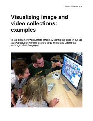
  • 1. Media Visualization. 1/28   Visualizing image and video collections: examples In this document we illustrate three key techniques used in our lab (softwarestudies.com) to explore large image and video sets: montage, slice, image plot.
  • 2. Media Visualization. 2/28 Montage Since media collections usually contain some metadata such as creation dates or subject categories, we can organize the display of the images in a collection using this metadata. This technique can be seen as an extension of the most basic intellectual operations of humanities – comparing a set of related items. However, if 20th century technologies only allowed for a comparison between a small number of artifacts at the same time – for example, the standard lecturing method in art history was to use two slide projectors to show and discuss two images side by side – we can now compare hundreds of thousands of images by displaying them simultaneously in different layouts. The following examples illustrate different uses of a montage technique – visualizing 4535 Time magazine covers, 100 hours of video game play, a feature film, and a collection of 113 video weekly addresses.
  • 4. Media Visualization. 4/28 1. (Previous page.) Montage of 4535 covers of Time magazine (1923 – 2009) organized by publication date (left to right, and top to bottom). Jeremy Douglass and Lev Manovich, 2009. Note: Most covers of Time include a signature red border. We have cropped these borders and scaled the covers to the same size to more clearly see the temporal patterns across all covers. High-resolution version: http://www.flickr.com/photos/culturevis/4038907270/in/set-72157624959121129/   Arranging 4535 Time covers into a grid organized by publication date reveals a number of historical patterns. Visualization shows the pre-color printing era in the 1920s, a cluster of brief early experiments in color printing (with left-margin colors), and then the gradual shift from black and white to full color covers, with both types coexisting for a number of years. In the 1930s Time covers use mostly photography. After 1941, the magazine switches to paintings. In later decades the photography gradually comes to dominate again. In the 1990s we see an emergence of the contemporary software-based visual language, which combines manipulated photography, graphic and typographic elements. We also see how contrast and saturation of covers gradually increase throughout the 20th century. However, since the end of the 1990s, this trend is reversed: recent covers have less saturation. The visualization also reveals an important “meta-pattern”: almost all changes are gradual. Each of the new communication strategies emerges slowly over a number of months, years or even decades.
  • 5. Media Visualization. 5/28 2. Montage of Kingdom Hearts (2002, Square Co., Ltd.) video game play. William Huber, 2010. Kingdom Hearts game play: 62.5 hours of game play, in 29 sessions over 20 days. High-resolution version: http://www.flickr.com/photos/culturevis/4039126932/in/set-72157624959121129/      
  • 6. Media Visualization. 6/28   3. Montage of Kingdom Hearts II (2005, Square-Enix, Inc.). William Huber, 2010. Kingdom Hearts II game play: 37 hours of game play, in 16 sessions over 18 days. High-resolution version: http://www.flickr.com/photos/culturevis/4038975476/in/set-72157624959121129/     These two montages visualize 100 hours of video game play. Each game was played from the beginning to the end over a number of sessions. The video recordings captured from all game sessions of each game were assembled into a single visual sequence. The sequences were sampled at 6 frames per second. This resulted in 225,000 frames for Kingdom Hearts and 133,000 frames for Kingdom Hearts II. The visualizations use every 10th frame from these sets. Frames are organized in a grid arrangement in order of game play (left to right, top to bottom). Kingdom Hearts is a franchise of video games and other media properties created in 2002 via a collaboration between Tokyo-based videogame publisher Square (now Square-Enix) and The Walt Disney Company. The game presents original characters created by Square who travel through worlds representing Disney-owned media properties (e.g., Tarzan, Alice in Wonderland, The Nightmare before Christmas, etc.) Each world has its distinct characters derived from the respective Disney-produced films. Each world also features specific color palettes and rendering styles, which are reflective of the corresponding Disney film’s visual style. Our visualizations reveal the structure of the game play, which cycles between progressing through the story and visiting various Disney worlds.
  • 7. Media Visualization. 7/28 4. Montage of the film The Eleventh Year (Dziga Vertov, 1928). Lev Manovich, 2009. Film digitization: Austrian Film Institute. Shot tagging: Adelheid Heftberger. Every shot in the film is represented by its first frame. Frames are organized left to right and top to bottom, following the order of shots in the film. High-resolution version: http://www.flickr.com/photos/culturevis/3988919869/in/set-72157622608431194 This montage uses a semantically and visually important segmentation of the film – the shots sequence. Each shot is represented by its first frame. We can think of this visualization as a “reverse engineered” imaginary storyboard of the film – a reconstructed plan of its cinematography, editing, and content.  
  • 8. Media Visualization. 8/28 5. Montage of the film The Eleventh Year (Vertov, 1928). Lev Manovich, 2010. Each column represents one shot in the film using its first frame (top row) and last frame (bottom row). The shots are organized left to right following their order in the film. First image: a part of the complete visualization of the whole film. Second image: a close-up of the visualization. Complete high-resolution visualization: http://www.flickr.com/photos/culturevis/4117658480/in/set-72157622608431194/   To create this visualization, I selected the first and last frame of every shot in The Eleventh Year and placed them together in the order of shots (first frames are on the top, corresponding last frames are on the bottom.) ”Vertov” is a neologism invented by the film director who adapted it as his last name early in his career. It comes from the Russian verb vertet, which means “to rotate.” “Vertov” may refer to the basic motion involved in filming in the 1920s – rotating the handle of a camera – and also the dynamism of film language developed by Vertov who, along with a number of other Russian and European filmmakers, designers and photographs working in that decade, wanted to “defamiliarize” familiar reality by using dynamic diagonal compositions and shooting from unusual points of view. However, our visualization suggests a very different picture of Vertov. Almost every shot of The Eleventh Year starts and ends with practically the same composition and subject. In other words, the shots are largely static. Going back to the actual film and studying these shots further, we find that some of them are indeed completely static – such as the close-ups of faces looking in various directions without moving. Other shots employ a static camera, which frames some movement – such as working machines, or workers at work – but the movement is localized completely inside the frame (the objects and human figures do not cross the view framed by the camera.) Of course, we may recall that a number of shots in Vertov’s most famous film Man with A Movie Camera (1929) were specifically designed as opposites: shooting from a moving car meant that the subjects were constantly crossing the camera view. But even in this most experimental of Vertov’s film, such shots constitute a very small part of a film.
  • 9. Media Visualization. 9/28 6. Montage of The Eleventh Year (Vertov, 1928) with a bar graph representing average amount of movement per shot. Lev Manovich, 2010. Each bar represents one shot in the film. The length of a bar corresponds to the average amount of movement in the shot. The first frames of the shots are placed above the bars. First image: a part of the complete visualization of the whole film. Second image: a close-up of the visualization. Complete high-resolution visualization: http://www.flickr.com/photos/culturevis/4117658480/in/set-72157622608431194   We measured frame differences between two consecutive frames of every shot, averaged these measurements per shot and graphed these averaged values over time. This visualization revealed the presence of a number of patterns that until now have not been discussed by film scholars – such as a temporal structure where the amount of movement at first gradually decreases and then gradually increases over a large number of shots.
  • 10. Media Visualization. 10/28 7-8. (Next two pages) Montage of 113 President Barack Obama weekly video addresses (2009 through the middle of 2011). First image: A close-up of the visualization. Second image: Full visualization. Research: Elizabeth Losh and Tara Zepel. Visualization: Jeremy Douglass, 2011. Video source: http://www.whitehouse.gov/briefing-room/weekly-address. Complete high-resolution visualization: http://www.flickr.com/photos/culturevis/5932288633/in/set-72157627058543885     This visualization shows how montage technique can be used to represent a video collection. It also shows that montages do not need to fit into a square format. The data is from the weekly White House video addresses by President Barack Obama (2009 - middle of 2011.) Each week’s video is represented as a row of still images. These still images are the last frames of every shot in a video. The rows are organized top to bottom to follow the order of video releases. This visualization layout allows us to quickly notice that in contrast to shorter videos, where Obama addresses the viewers from various rooms inside the White House, the longer videos also show other locations and subjects. To create this visualization, we first used the free application shotdetect to automatically separate each video into shots. Unix scripts were used to organize the frames representing the shots. The final visualization was rendered using the free software ImageMagic: Shotdetect: http://shotdetect.nonutc.fr/ ImageMagic: http://www.imagemagick.org/script/index.php
  • 13. Media Visualization. 13/28   Slice If montage visualization shows complete images, a slice visualization uses only small sample strips from each image.
  • 14. Media Visualization. 14/28 Full visualization. Close-up. 9. Slice of 4535 covers of Time magazine organized by publication date from 1923 to 2009 (left to right). Jeremy Douglass and Lev Manovich, 2009. Every one-pixel vertical column is sampled from a corresponding cover. High-resolution version: http://www.flickr.com/photos/culturevis/4040690842/in/set-72157622525012841   Often more dramatic sampling that uses only a small part of an image can be quite effective in revealing patterns, which a full image montage may not show as well. This slice visualization shows historically changing patterns in the layout of covers, placement and size of the word “Time,” and the size of images in the center in relation to the whole covers.
  • 15. Media Visualization. 15/28 Image Plots An image plot shows all images in a collection organized by their visual features and metadata. It is similar to a scatter plot technique. However, if a scatter plot represents the data by points, an image plot shows the actual images. All the visualizations shown below were created with ImagePlot software developed by Software Studies Initiative: http://lab.softwarestudies.com/p/imageplot.html
  • 16. Media Visualization. 16/28 10. Left: 128 paintings by Piet Mondrian (1905-1917). Right: 123 paintings by Mark Rothko (1938-1953). In each visualization: X-axis: brightness mean; Y-axis: saturation mean. Top two visualizations: image plots. Bottom two visualization: the same data represented as color circles. High-resolution versions: http://www.flickr.com/photos/culturevis/6074400716/in/set-72157627389144448/ http://www.flickr.com/photos/culturevis/6073859925/in/set-72157627389144448 This example demonstrates how image plot visualizations (scatter plots with images superimposed over points) can be used to compare multiple cultural image sets. In this case, the goal is to compare a similar number of paintings by Piet Mondrian and Mark Rothko produced over comparable time periods.
  • 17. Media Visualization. 17/28 Projecting sets of paintings of the two artists into the same coordinate space reveals their comparative "footprints" - the parts of the space of visual possibilities they explored. We can see the relative distributions of their works - the more dense and the more sparse areas, the presence or absence of clusters, the outliers, and other patterns. To see the evolution of Mondrian and Rothko in brightness/saturation space, we can visualize the paintings as color circles. The colors indicate the position of each set of paintings within the time period, running from blue to red. To make the patterns even easier to view, we also vary the size of circles from smallest to largest. (Both types of visualizations are created with ImagePlot.)
  • 18. Media Visualization. 18/28 11. Image plot of 776 Vincent van Gogh’s paintings (1881-1890). Tara Zepel, 2011. X-axis = date (year and month). Y-axis = median brightness. High-resolution version: http://www.flickr.com/photos/culturevis/5910819865/in/set-72157627135422710. 12. Image plots of van Gogh paintings created in Paris and in Arles. Tara Zepel, 2011.
  • 19. Media Visualization. 19/28 Paris period (4/1886 - 3/1886): 199 paintings. Arles period (3/1888 - 3/1889): 161 paintings. X-axis = median brightness; Y-axis = median saturation. High res version: http://www.flickr.com/photos/culturevis/6279358698/in/photostream. Being able to see most of the paintings van Gogh created during his life organized by their visual properties gives us new ways to think about his art career. We can see how brightness and saturation values across 776 paintings change from 1881 through 1890. We can also see which paintings follow the general trend and those that stand out as exceptions. We can also discover other patterns running through his career that are not visible than only selected paintings are considered. For example, here is how the Vincent van Gogh Museum in Amsterdam describes the changes in van Gogh’s style after he moves to Paris in 1886: “Soon after arriving in Paris, Van Gogh senses how outmoded his dark-hued palette has become... His palette gradually lightens, and his sensitivity to color in the landscape intensifies.” (Paris, 1886-1888, vangoghmuseum.nl, accessed July 31, 2011). The image plot shows that, in fact, van Gogh’s palette already starts getting lighter in 1885, before he moves to Paris. The visualization also shows that average brightness values of the paintings shift over time in a gradual manner not only in this but also in all periods of the artist’s life. This means that in any new period we find not only paintings in “a new style” but also paintings in “old styles” of the previous periods. For instance, if you look at the bottom horizontal band of images in the visualization above (no. 11), you will notice that between 8/1884 and 9/1885 van Gogh produced many dark paintings. You may expect that after he moves to Paris, where, according to the van Gogh museum web site, "His palette becomes brighter," these dark works will disappear, but this is not true. Along with very light paintings that are similar in values to impressionists’ works produced around the same time, van Gogh still occasionally makes the paintings which are as dark as the ones he favored in 1884-1885. And then later, in Arles (1886-1888), he will still sometimes "regress" to his dark style. The same pattern can be seen in the top horizontal band that contains van Gogh's lightest paintings. While most of these works were done after 1886, a few are also found in earlier periods. The image plots of van Gogh paintings created in Paris and Arles (no. 12) that plot the paintings according to their average brightness and saturation allow us compare these two periods in a different way. They clearly show that the difference between the two periods is relative rather than absolute. The center of the "cloud" of Arles paintings is displaced to the left (lighter paintings), and to the top (more saturated paintings) in comparison to the "cloud" of Paris paintings; it is also smaller, indicating less variability in Arles paintings. But the larger parts of the two clouds overlap, i.e. they cover the same area of the brightness/saturation space visualized in these image plots.
  • 20. Media Visualization. 20/28 13. Image plot of 4535 covers of Time magazine published between 1923 and 2009. Jeremy Douglass and Lev Manovich, 2009. X-axis: publication dates. Y-axis: saturation mean (for full cover covers) or brightness mean (for early black and white covers). High-resolution version: http://www.flickr.com/photos/culturevis/4347477551/in/set-72157623414034532/ This visualization shows that brightness and saturation of Time covers published over 86 years follow a cyclical pattern of rising and falling, with dramatic peaks and valleys only becoming apparent over periods of a decade or more. Standing apart from the overall curve are extreme exceptions: glowing bright images and pale designs that float above or below the cloud of covers typical of an era. The most saturated covers tun out to correspond to Cold War Era – they use lots of pure red to represent the Communis threat. We can compare the last decade (2000s) to the entire eighty-six year magazine history. The drop in saturation since the end of the 1990s echoes a somewhat similar period of unsaturated covers during the mid-1960s.
  • 21. Media Visualization. 21/28 Two close-ups of the Time covers image plot shown on the previous page.
  • 22. Media Visualization. 22/28 14 – 15 (Next page.) Two additional visualizations of the Time covers collection illustrate some of the new visualization functions implemented in an experimental version of ImagePlot currently in use in our lab. (This version does not have Graphical User Interface.) 1) Highlighting selected images in visualization. A researcher can add content tags to the file containing image filenames and image features. All the images that have particular tags will be highlighted using color borders. This example shows a close-up of the image plot of Time covers with blue borders around the covers that were given “female” tag (i.e. covers representing women.) 2) Rendering trend lines. ImagePlot calculates trend lines and renders them on top of a visualization to aid its interpretation.
  • 24. Media Visualization. 24/28     16. Image plot of 1,074,790 manga pages. Lev Manovich and Jeremy Douglass, 2010. X-axis: standard deviation. Y-axis: entropy. Original visualization size: 44,000 x 44,000 pixels. High-resolution version: http://www.flickr.com/photos/culturevis/5109394222/in/set-72157625291139783/ Next page: Top image: a close-up of the top part of the image plot. Bottom image: a close-up of the bottom left corner of the image plot.
  • 26. Media Visualization. 26/28 The visualization arranges one million manga pages according to their selected visual features. The pages in the bottom part of the image plot are the most graphic and have the least amount of detail and texture. The pages in the upper right have lots of detail and texture. The pages with the highest contrast are on the right, while pages with the least contrast are on the left. In between these four extremes, we find every possible intermediate graphic variation. This visualization suggests that the very concept of style, as it is normally used, may become problematic when we consider very large cultural data sets. The concept assumes that we can partition a set of works into a small number of discrete categories. However, the space of graphical variations in manga does not have any distinct clusters, so if we try to divide this space into discrete categories, any such attempt will be arbitrary. Instead, it is better to use visualization and mathematical descriptions to characterize the space of possible and realized variations.
  • 27. Media Visualization. 27/28 17. 1,074,790 manga pages rendered as points. X-axis: standard deviation. Y-axis: entropy. Lev Manovich and Jeremy Douglass, 2010. To better understand the distribution of the data, we can render it using points. The lightest parts of the plot represent most frequently occurring graphical choices in our manga sample; the parts of the plot which remains black represent the graphical possibilities which were not realized in this sample. The blue points correspond to the pages from three most popular manga titles (One Piece, Bleach, Naruto.)
  • 28. Media Visualization. 28/28 18. Image plot of 393 Mark Rothko’s paintings (1927-1970). Hao Wang and Mayra Vasquez, 2011. X-axis = date (year). Y-axis = mean brightness. Writings about Mark Rothko often emphasize the dark paintings created in the last years of his life. However, visualizing 393 paintings created by the artist between 1927 and 1970 according to their average brightness shows that this period represents a culmination of almost linear trend that starts in the middle of the 1940s. The visualization was created by the students in Lev Manovich undergraduate class at UCSD.