
Recomendados
Mais conteúdo relacionado
Destaque
Destaque (12)
Último
Último (20)
Media - Magazine Deconstruction 'REEL NEWS'
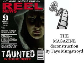
- 1. THE MAGAZINE deconstruction By Faye Murgatroyd
- 2. ‘Ultimate’ aims to be ‘Horror’ informs the target eye-catching and audience of the particular The background colour is enticing the word itself genre that this months black as it conveys elements gives a sense that this magazine will be focusing of death and misery, which edition of REEL NEWS on, which may add to the are often themes seen within magazine is magazines appeal and horror films. unmissable! perhaps even broaden the target audience demographic.
- 3. Film Reel used within the text ‘REEL’ makes a direct link with film therefore, making the By including a website audience aware that ‘WWW.REELNEWS.COM’ similar to Empire’s this is a filmic website (see image above) adds authenticity to magazine. the magazine. It shows that REEL NEWS ‘NEWS’ suggests magazine is embracing new technology by information in this case including a website therefore, they could entice the audience would link to their passive readers and perhaps paste trailers the ‘REEL’ within the title onto their website to gain opinions or perhaps and assume that this other peoples reviews of different films, thus magazine is about news allowing their target audience to be more active within the film world. by employing Web 2.0.
- 4. ‘GREATEST’ suggests this idea that the magazine will include the biggest horror films of all time ,which aims to spark curiosity in the audience making them ask questions as to what films are the greatest horror films therefore successfully enticing the target audience demographic. Numbers are frequently used within magazines I chose to include a number as it is bold and enticing once again aims to appeal to the target audience with reference to the horror genre of film.
- 5. ‘PLUS’ given in the form of a list is intended to clearly display other articles within the magazine. A new horror film ‘The devil inside me’ clearly fits into the horror genre. ‘Behind the scenes’ is meant to hook the reader/audience in as they may be curious as to how the film itself is constructed. I used a well known director who is now directing a Sci-Fi/ Thriller which, links to the horror edition of the magazine therefore, will be aimed at roughly the same audience demographic. Franchises are very popular within the horror genre for example Final Destination and Saw which, have been recently released in 3D. I felt that this was important as it shows how technology is becoming more dominant within the filmic world.
- 6. The title of our film is bold and stands out along the ‘EXCLUSIVE’ suggests that the black/dark background this magazine is showing restricted can be seen across all of our information exclusive to their products. It aims to be magazine only in effect making the appealing and intriguing audience feel more inclined to but making the audience ask this magazine. questions for example who or what is taunting who? The font is worn and looks like it has been taunted in someway itself resulting in a distressed font which represents the
- 7. A monthly magazine Halloween is in October generally contains therefore, the ‘horror more information than edition’ related to when a weekly magazine the magazine is therefore, monthly published. magazines are often dearer. I included a barcode as it adds a sense of authenticity to the magazine allowing it to be scanned when brought.
- 8. A close-up of the main character (the villain) within ‘TAUNTED’ clearly conveys elements of the horror genre. It may lead to the target audience questioning who this demonic/dark figure therefore, enticing them to view the film.
- 9. I used a very useful website ‘CBS OUTDOOR’ where I found a very useful advert visualizer which I think will effectively market our magazine to our target audience. Please click on the link below: http://www.cbsoutdoor.co.uk/Our- Media/Visualiser/Bus-Rear/Bus- Rear/?AdvertId=en_GB_uk- 04_dc7a11a91c67304503d84a55bc98fb 86 Thank you for watching!