The New UI - Staying Strong with Flexbox, SASS, and {{Mustache.js}}
•Transferir como PPTX, PDF•
1 gostou•2,612 visualizações

The document discusses a presentation on using Flexbox, SASS, and Mustache templating for building user interfaces. The presentation covers general best practices, using SASS for variables, nesting, mixins and extends, Flexbox for responsive design, and Mustache templating. The presenter is Eric Carlisle, a UI/UX architect who will demonstrate coding techniques with these tools.

Recomendados
Recomendados
Mais conteúdo relacionado
Mais procurados
Mais procurados (20)
Destaque
Destaque (20)
Semelhante a The New UI - Staying Strong with Flexbox, SASS, and {{Mustache.js}}
Semelhante a The New UI - Staying Strong with Flexbox, SASS, and {{Mustache.js}} (20)
Último
Último (20)
The New UI - Staying Strong with Flexbox, SASS, and {{Mustache.js}}
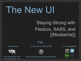
- 1. The New UI Staying Strong with Flexbox, SASS, and {{Mustache}} 1. Install Koala. http://koala-app.com/ (for Windows, Mac, Linux) Prep: 2. Get source code zip file. https://github.com/ecarlisle/TheNewUI 3. Pick any editor.
- 2. Who’s This Guy? Name: Craft: Crew: Locale: XP: Eric Carlisle UI / UX Architect Lookingglass - http://www.lgscout.com Baltimore, MD
- 3. Agenda ∙ General Best Practices ∙ SASS – variables, nesting, mixins, extensions ∙ CSS Flexible Box Layout & responsive design ∙ {{ mustache }} templating ∙ Q/A
- 4. General Best Practices K I S S (Not quite what you think it means)
- 5. General Best Practices Keep It Stunningly Simple
- 6. General Best Practices K I S S Projects assets can be: ∙ Approachable ∙ Reusable ∙ Maintainable ∙ Self Documenting
- 7. General Best Practices K I S S Projects assets can be: Cost Saving! (Simple doesn’t have to be boring)
- 8. General Best Practices Ideal Project Execution
- 9. General Best Practices Ideal Project Execution Bare Necessity Comprehensiveness
- 10. General Best Practices Ideal Project Execution Mediocrity? Indulgence?
- 11. General Best Practices Ideal Project Execution Hacking Architecture
- 12. General Best Practices The right tool for the job.
- 14. SASS Stands for: Syntactically Awesome Style Sheets
- 15. SASS Stands for: Syntactically Awesome Style Sheets It is a: CSS Extension Language (a.k.a. CSS Preprocessor)
- 16. SASS Stands for: Syntactically Awesome Style Sheets It is a: CSS Extension Language (a.k.a. CSS Preprocessor) Ultimately: Keeps CSS Maintainable
- 17. Why do we need SASS? CSS Can Be: ∙ Repetitive ∙ Verbose ∙ Inconsistently supported ∙ A precedence nightmare ∙ Not scalable
- 18. Why do we need SASS? SASS can make CSS: ∙ DRY (don’t repeat yourself) ∙ Modular ∙ Reusable ∙ Scalable Also see CSS frameworks like SMACSS (https://smacss.com)
- 19. SASS or SCSS Formatting? We will be using SCSS More Info: http://thesassway.com/editorial/sass-vs-scss-which-syntax-is-better
- 20. SASS Variables Name, value pairs. Examples: $font-stack: Lato, Helvetica, sans-serif; $blue: #369; $light-blue: lighten($blue, 40); // #b3cce6 $font-size: 10px; $big-font-size: $font-size + 8px; // 18px Fun Color Function Tool: http://sassme.arc90.com/
- 21. SASS Nesting Source: nav { ul { list-style: none; li { display: inline-block; } } } Compiled: nav ul { list-style: none; } nav ul li { display: inline-block; } Creating a visual hierarchy
- 22. SASS Mixins For dynamic selector attributes Source: @mixin border-radius ($radius) { - webkit-border-radius: $radius; - moz-border-radius: $radius; -ms-border-radius: $radius; border-radius: $radius; } nav { border: solid 1px black; @include border-radius(5px); } Compiled: nav { border: solid 1px black; - webkit-border-radius: 5px; - moz-border-radius: 5px; -ms-border-radius: 5px; border-radius: 5px; }
- 23. SASS Extends Assigning inheritance (and keeping it clean) Source: .message { border: solid 1px #333; color: #FFFF; } .confirmation { @extend .message; background: #0F0; } .error { @extend .message; background: #F00; } Compiled: .message, .confirmation, .error { border: solid 1px #333; color: #FFFF; } .confirmation { background: #0F0; } .error{ background: #F00; }
- 24. Let’s Code!
- 25. Flexbox Layout
- 26. Flexbox Layout // Old version display: box; // Oldish version display: flexbox; // Today... display: flex;
- 27. Flexbox Layout // Old version display: box; // Oldish version display: flexbox; WC3 Working Draft http://dev.w3.org/csswg/css-flexbox/ // Today... display: flex; Browser Support http://caniuse.com/#feat=flexbox
- 28. What is Flexbox? “Aims at providing a more efficient way to lay out, align and distribute space among items in a container, even when their size is unknown and/or dynamic” http://css-tricks.com/snippets/css/a-guide-to-flexbox/
- 29. Why Flexbox? How can our content flow? <!– Block elements flow Vertically. --> <div></div> <div></div> <div></div> <!– Inline elements flow horizontally. --> <span></span> <span></span> <span></span> <!-- Flex elements flow... Well, it depends! :-) --> <container style=“display: flex”> <item></item> <item></item> <item></item> </container> *drumroll* ? ?
- 30. Why Flexbox? What about dimension? Space distribution? Alignment? <!– Things can get complicated pretty fast with CSS! --> <div> <div style=“float: left; margin: 10px; width: 200px”></div> <div style=“float: left: margin: 20px; padding: 10px; width: 4em”></div> <div style=“float: right; margin: 0; width: 50%></div> <div style=“clear: both”></div> </div>
- 31. Why Flexbox? Floats? Clears? Padding? Margins? What happens when... <!– Things can get chaotic in a hurry... --> <div> <div style=“float: left; margin: 10px; width: 200px”></div> <div style=“float: ∙ left: Different margin: 20px; padding: Screens? 10px; width: 4em”></div> <div style=“float: right; margin: 0; width: 50%></div> <div style=“clear: both”></div> </div> ∙ Different (dynamic) content? ∙ Design Changes?
- 32. Why Flexbox? Responsive Frameworks to the rescue?
- 33. Why Flexbox? Responsive Frameworks to the rescue? BRILLIANT but… …Still pretty complicated!!!
- 34. The Flexbox Layout Box Model Dual axis flow!
- 35. The Flexbox Layout Box Model http://css-tricks.com/snippets/css/a-guide-to-flexbox/
- 36. Let’s Code!
- 37. {{Mustache}} {
- 38. Mustache.js Logicless Templating <!-- Example --> <script> data = {“name”: “Guy Incognito”, “company”: “Horizons Unlimited Ltd.”} output = Mustache.render(“Hello {{name}} from {{Company}}!”,data); </script>
- 39. Mustache.js Using an HTML script template <div id=“greeting”></div> <script> $template = $(“#template”).html(); data = {“name”: “Guy Incognito”, “company”: “Horizons Unlimited Ltd.”} output = Mustache.render($template ,data); </script> <script id=“template” type=“x-tmpl-mustache”> <p>Hello {{name}} from {{Company}}!</p> </script>
- 40. Let’s Code!
- 41. Q&A eric@ericcarlisle.com http://www.twitter.com/eric_carlisle http://www.slideshare.net/ericcarlisle