
Recommended
More Related Content
What's hot
What's hot (20)
Similar to Website analysis
Similar to Website analysis (20)
More from er180044
More from er180044 (17)
Recently uploaded
Recently uploaded (20)
Website analysis
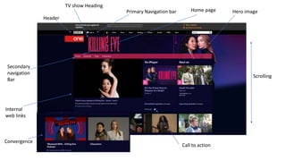
- 1. Header Primary Navigation bar Secondary navigation Bar Scrolling Hero image Internal web links Call to action Convergence TV show Heading Home page
- 2. The reason I chose to analyze the web page for killing eve was because I liked the concept of the tv drama, and it is a genre I am considering for my own TV drama, however it would be a less explicit style of the genre to fit in with the before watershed project brief. created a clear sense of branding with the Name of the drama clearly positioned at the top of the page, with the font that is recognizable. Furthermore, there is a clear colour scheme running through the Page, with the pink from the TV show heading being used throughout the page. From the use of the deep pink colour, the media language suggests that the show itself is thrilling and could involve danger. The dark colours In the hero image and the background of the page suggests a sense of mystery and also makes the links to other pages within the website stand out more to the viewer. Not only do they have the episodes to the TV drama linked on the website, they also have range of different elements of convergence that will interest their target audience. Firstly, you can watch it on BBC iplayer which will interest slightly younger viewers as it means that it can be viewed on the go and not just on tv when it is showing. Furthermore, there is a podcast available to listen to which is a more interactive element that allows people who really enjoy the drama to ask questions and talk about their views on the show. There are also interviews with the main characters that can be viewed, this may appeal to slightly older audiences. On this websites, there are elements that with interest a range of different ages with will help the success of the TV drama. Through this website they are successfully promoting the show because of all the different elements available, there are clips from epsiodes, also they are showing the new series that has come out.
- 3. Primary navigation bar Scrolling Hero Image Dropdown menu TV Show Heading Internal web links
- 4. I chose to analyze this website page for the teen tv drama series 90210 because the genre interested me. This genre is one that would be more suitable for before water shed as it would appeal to the demographic we were given in our brief. On this page they have created a less clear sense of branding that the 'Killing eve' page did. However, the hero image has a clear indication of the drama. This is the large picture wit a picture of the cast. This show was really successful so maybe channel 4, which is the channel that is showing the series currently. The fact they have just used a hero image for the website to indicate the brand is significant in showing the success of the drama . Furthermore, the shows heading is quite small in contrast to the killing eve heading. The media language used shows that the show is successful. Furthermore, the body language of the characters and also the clothing suggests it’s a teen drama. There is a lack of media language on this website. When looking at teen TV dramas, in noticed that a lot of them don’t actually have websites. I found this quite interesting in contrast to Killing eve, which had a really interesting web page. After looking at the web page, there isn't much other than the large hero page to engage the audience into watching it. This made me think about the target audience and how the younger generation watch dramas. A lot of the shows they watch have been advertised on social media or they have heard about it from peers, therefore, new teen TV dramas, and teen dramas generally, don’t have to create a website because there are other ways of reaching out to the younger generation online.
- 5. TV show Heading Primary Navigation bar Header Home page Hero image Secondary navigation Bar Internal web links Call to action Scrolling
- 6. I chose to analyze this website as it is an ITV2 show. I wanted to look at this as it is in the brief and I wanted to see how a website from the channel differes to the different channel's website. On this page there is a clear sense of branding, with a large hero image and also the heading in the centre. There is also a clear colour scheme throughout this which creates a sense of unity ad also continuity. The light blue, beach themed background creates this isea of a holiday and an escape from reality, which is what the show is all about, other than finding love. This use of colour creates a good mood for the website and creates a relaxed atmosphere as the website isn't chaotic. There are also links within the website to different elements within tha will interest a wider audience and create more attention and more reason to watch the show. Firstly, the show can be vewed online on the itv hub as well as the tv, which will interest more veiwers as it will mean people can catch up on missed episodes. There are also options on the website to watch clips of the islandrs bestbits and other unseen clips,which creates a better relationship between the veiwer and the islander sas they feel as though they know them better. You canalso acsess the show on on a sunday ' aftersun' to see interviews not only with the islanders but also with othercelebrities and see their opinoin on the show, creating more talking points for the audience. The shop and also a link to the game are available, allowing people to feel part of the experienced with their personalised waterbottles and thir own chance to have a go at bing on the show. They are successfully promoting the show as they have included many different elements to allo the audience to interact.