
Recomendados
Mais conteúdo relacionado
Mais procurados
Mais procurados (19)
Semelhante a Front Cover Analysis
Semelhante a Front Cover Analysis (20)
Mais de emilyshep
Mais de emilyshep (19)
Último
Último (14)
Front Cover Analysis
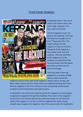
- 1. Front Cover Analysis Guttenberg theory, “the rule of thirds” hasn’t been used in the main image. However it has been used in the whole The first magazine cover I am going to be analysing is Kerrang! This issue was brought out on the 5th November 2011. The target audience for this magazine is Teens to mid 20’s. The genre of the magazine is rock, metal, punk, emo and screamo. The main attraction to the magazine is so the audience can read about their favourite bands, find new bands and artists and find out of if there are any gigs. The house style of Kerrang magazine is a variation of bold colours, which attract the audience’s eyes to every part of the magazine. Theses colours include; red, black, white, yellow and blue. These colours are bold and exciting, this shows that the magazine is full of fun articles to read, entertaining and the bands involved are full of adrenaline and ready to party. A masthead is one of the most important parts of a magazine, as most people recognise the magazine through the masthead. The creator of the magazine has put this in the primary optical area so that the reader can see what the name of the magazine is. As this is a famous magazine the reader should straight away recognise the magazine. One of the reasons why this masthead is
- 2. well know is because of the cracks within the bold block text, this emphasises the slogan “life is loud” as it portrays that the music and people are so loud that it has left cracks the in masthead. The main image on the front cover is a band that is the main cover line. They are a band which consists of six people who are males in their mid to late 20’s. They are positioned where there are two main singers at the front and the rest of the band are behind, distant, apart; this creates a hierarchy, as it shows who are the most important in the group, as well this is also proven as the two front singers have their own props and posing whilst the rest of the group are standing behind them. They are placed on a white background, so the stylist has put the band in black so that is contrasting, and makes them stand out more as an image. The band overlaps each other; this enhances the images as it makes the band look more 3-D. The Guttenberg Design principle, “the rule of thirds”, doesn’t apply in this image, as there aren’t no distinct focal area, where the line intercept, however the audience is attracted to one of the main singers of the band, who is situated at the end, lending outwards, on the other hand where the image is positioned on the front cover, the singer is just off the centre of the front cover therefore leading the audiences eyes towards him. As the front cover doesn’t apply to the rule of thirds, one of the principles to this is that the eye is meant to be attracted to an image where the main focus is just off the centre. Side images have been in placed on the cover so that the magazine can attract more people in as it shows different bands; this attracts the reader as it shows who else is in the magazine, as it could a band they like. It has also been added so that people recognise the band that are going to be featured and gives the reader an insight to what the magazine is like and what genre the magazine is, as people will stereotype the type of people who are placed on the cover. The main article text is the second biggest text inserted on the cover as it represents that the main article is important to the issue. It shows who the main feature is, so for this to be effective the text has to bold, big and stand out which it does as the text is placed on top of the band photo. It contrast to them in black, the colour of the text is white. This gets people to read it as it catches the target market eye of the magazine. The creator has put a red block
- 3. behind the lettering so that it stands out more; the positioning of the band members on the main image and the text together makes a layer effect as it looks like it’s coming out towards the audience. Pull quotes are an effective way to draw people in to read more of article, as it gives a teaser to what the people who have been interviewed are saying. The colours are a connation of danger and warning as the colours yellow and black say stay away from these; however it also says these are “bad boys”, which teenage girls fall for (which is one of the target audiences for the magazine), so this exaggerates to encourages teenage girls to read the article. The way the editor has constructed the text with black as the box and yellow as the text, makes the pull quote stand out more, as it wouldn’t work if it was the other way round. This is effective as it attracts more people to read it. The placing of the text has made it nowhere near anything else yellow therefore enhancing the text. Cover lines are there so readers get a little insight to what else is in the magazine. In this magazine, the cover lines are at the top of the pages in the skyline. This is an effective way of getting the audience the look all round the magazine and analyse it themselves to see whether they want to buy it. Freebies have been included within the magazine so that the reader is attracted to buying the magazine as it contains something they don’t have to pay for plus it’s the magazine’s unique selling point. It has a value added to the product. The freebie is a collection of posters, the image could be specialised and only released in this magazine of Kerrang! So the company may have special rights where they are the only place where you can get theses images. This makes the reader want them as they are images where you can’t find anywhere else, therefore making the reader buy the magazine. Extra information has been added at the bottom of the pages so that is gives the reader more knowledge to what genre the magazine is and who else is going to be featuring in the magazine. This part has been placed at the bottom of the cover as it isn’t as important as the rest of the cover as it solely lists bands. However this is a useful place to insert extra information, as it gets the reader to look all over the cover to see what else is included in the magazine.
- 4. The second magazine cover I am going to be analysing is called Mixmag, which was released in September 2011. The target audience for this magazine is 18 to mid 20’s of both genders. The genre of the magazine is dance, electro, drum and bass and dub step. The main attraction of the magazine is so the audience can; find out new sounds, find the best places to party and read interviews with the DJs. The house style consists of 3 colours which contrast well together. The first colour is coral, which is a vibrant bold colour. This colour is also exotic as it reminds the reader of places aboard as it reminds them of the sun. The next colour is black, which is a harsh colour and distracts the eyes away from the image. The final colour white, this lightens and balances the cover. All three colours work well together as they connect well, creating an energising seductive vibe, this resembles to the type of music as it is sexy and fun. Guttenberg’s rule of third theory has worked well in this magazine, as the main image has been placed so it is across the whole cover. The woman in the image has been placed where both of the focal areas are on the left, just off the centre. The image is of a women posing/ dancing with people around her, who appear to be dancing as they also have their hands up (bottom left). With what the women is wearing we creates stereotype thoughts, this shows that she likes to look sexy and likes to dance, which is the stereotype of dance music.
- 5. The masthead for Mixmag has a style of text which is modern, so it appeals to its target audience as they are young adults. As well, the text is also bold therefore it stands out to the reader and makes it easy to read. The main article stands out as it is the second biggest text therefore portraying that it is important, as it is the main feature to the magazine. The main article is different text to the rest, therefore making it project more within the cover. The text looks fun but sophisticated as “hotel” is an organised business, and “Ibiza” is a fun and exciting place. The colours also stand out as both words have different colours, especially the colour black, which has only been used once in the cover, therefore this attracts the readers’ eye straight to the text, so we can read the rest of the cover This is done so the reader is distracted away from the image of an half naked beautiful women. A strap line has been added in the skyline of the cover so that the customers know that the magazine is the “world’s biggest dance music and clubbing magazine”. This reassures the reader that they are buying the best out of all dance magazines, gives customer pride to the reader. As well it gives the magazine company pride to put it on their magazine as it not the best in the country; it’s the best in world. The cover lines on this cover are placed at the side. This shows that they are less important as they are near the bottom of the page. There are two different types of covers line on this cover. The first set is coral and bold, as they are the same colour as the masthead this conveys that they are more important to than the others. The second set are white, they are over powered by the first set so they are not noticeable as the others however the way the cover lines are set out, we still see them as the second set are tucked in- between the first set which stand out more. Extra information has been added to this front cover. It tells the reader who else is going to be in the magazine, therefore telling the audience; the genre of music, gives people more artists or bands to look into and listen to, and more publicity of the band or artist.
- 6. Now I am going to compare the two front cover together. Firstly Kerrang front cover is more chaotic and all over the place, this is portrays that the genre of music is full on, which it is as it is rock and metal, this also shows what the bands are like live as they are also like this. This is also shown through the house style as it uses a variation of colours as this is eyes catching. However Mixmag is the total opposite as it is simple, sophisticated and stylish, this also portrays the genre of music, which is dance as it is simple beats, this is also shown though the house style which simple colour scheme of 3 colours.