Messaging, Communication & Fearless Rebranding

This document summarizes a workshop on crafting messages and building resources for a rural sustainable development initiative. It outlines the consultant team and project overview, focusing on jobs and economic growth through existing plans, public involvement, and new ideas. It discusses ensuring the initiative's branding targets the right audience and conveys the right message clearly. The presentation evaluates the original branding's logo and message and proposes a new collaborative, regional, and positive message centered on jobs and economic development. It introduces a new versatile logo using the letter "O" to represent different facets of development. It emphasizes the importance of brand integrity, management, and readiness to adapt the branding approach.

Recommended
Recommended
More Related Content
Similar to Messaging, Communication & Fearless Rebranding
Similar to Messaging, Communication & Fearless Rebranding (20)
More from Erica Allison
Recently uploaded
Recently uploaded (20)
Messaging, Communication & Fearless Rebranding
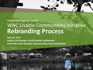
- 1. Land-of-Sky Regional Council WNC Livable Communities Initiative Rebranding Process April 26, 2012 RURAL SUSTAINABLE DEVELOPMENT WORKSHOP: CRAFTING YOUR MESSAGE AND BUILDING YOUR RESOURCES
- 2. Consultant Team • LandDesign, Lead Consultant • Allison Development Group, Public Engagement & Outreach • UNC Asheville’s National Environmental Modeling & Analysis Center, Scenario Modeling & Outreach • The Little John Group, Housing • BBP, Economic Development & Job Growth • Martin Alexiou Bryson, Multimodal Transportation • BBP, Energy & Natural Resources
- 3. Project Overview WHAT • Economic prosperity >> JOBS HOW • Existing plans and strategies • Extensive public involvement • New ideas and real solutions WHO • Consortium to guide and facilitate • Community to lead WHY • So that Together, We Create Our Future.
- 4. Who are we talking to here? What are we saying?!?
- 6. Are we hitting our target? What’s in a Brand ?
- 8. Or, are we even on the board?
- 9. Original Brand: Message • Missing one target in particular • Jumbled Message • Initiative and Livable out of step with region • Lacking context
- 10. Original Brand: Logo • Busy, Complicated • Multiple, competing colors • Trying to be all things to all people • The T-Shirt test
- 13. Who are we talking to here? What are we saying?!?
- 14. New Brand: Message • Collaborative • Regional • Contextual • Positive • We Mean Business! • Jobs & Economic Development
- 15. New Brand: Logo •Colors = growth, prosperity, hope, optimism • Passes the T-Shirt test! •Clear & Concise •Flexibility in Design & Use >> the O
- 16. The many facets of the ‘O’ • Representative of each core study area • Instant logo for the workgroups • Versatile in collateral materials
- 18. Housing
- 20. Natural & Cultural Resources Natural & Cultural Resources
- 21. Energy Energy
- 22. Health Health
- 24. When you pivot… STAY ON POINT COVER YOUR BASES DON’T IGNORE THE ELEPHANTS
- 25. Brand Integrity Brand Integrity • Messaging & Talking Points • Frequently Asked Questions • Meeting Protocols • Communication Tools • Templates • Graphic Standards
- 26. minding the elephants… minding the elephants…
- 27. Brand Collateral Brand Collateral www.gro-wnc.org
- 30. Bottom Line It For Me Bottom Line it for Me Re-think your message through a Marketing Lens. Understand Context, Content and how it drives Communication. Be fearless in changing what isn’t working, BEFORE it doesn’t work. ALWAYS be ready to ADAPT and PIVOT and when you do… Stay on POINT. gro-wnc.org
- 31. erica@allisondevelopmentgroup.com ericaallison ericamallison AllisonDevGroup
Editor's Notes
- http://www.flickr.com/photos/timothymorgan/75288771/
- We actually were not hitting the mark with this logo; we were excluding some folks and confusing others. We weren’t even close to hitting an economic development mark.
- The word initiative doesn’t result in positive sentiment…is it an effort? A process? General public weary of its use.Livable is a hot button term in our conservative neck of the woods. While it may “play” well in one spot (Asheville) it does not in the rest of the region. We had to create a new brand that would clearly convey overarching goals of economic development and jobs and that did NOT look like a government led effort.
- May prove difficult to place onto a t-shirt, letterheadRule of thumb in logo creation: avoid using more than 2 colorsLooks busy.
- Time to get focused and on target
- http://www.flickr.com/photos/timothymorgan/75288771/
- Two colors of blue and green represent growth, prosperity, hope and optimism.Simple, text driven logo.The O in Gro can convey topic areas.All about jobs and econ development
- Two colors of blue and green represent growth, prosperity, hope and optimism.Simple, text driven logo.Looked at a LOT of econ development agencies and groups, as well as more conservative or traditional groups (i.e., Republican party)
- The O creates an enormous amount of flexibility and relevance.Easily transferable and understood.Not too liberal or conservative – just iconic.
- http://www.flickr.com/photos/mobilestreetlife/4179063482/
- Comm and Outreach Strategy is our rule book for brand integrity, particularly with regards to message and talking points.We address hot items (mind the elephants) and we provide guidance on how to use the logo, which colors to use, and how we’ll convey the message.
- Goes beyond logo to website, collateral materials like postcards, and invitations.
- Facebook is our social hub where we post updates, meeting dates and times, and relevant news articles to create CONTEXT and RELEVANCE for the project.
- New Belgium BrewerySierra NevadaGreat examples of economic development that is unique to our region and that touches on health, energy, transportation, land use, housing, all elements of the Livability Principles.