Mumbai ] Call Girls Service Mumbai ₹7.5k Pick Up & Drop With Cash Payment 983...
Super-Bad Poster Analysis
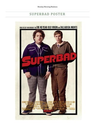
1. Superbad poster 755650172085 Due to our genre being comedy, we decided to analyse posters that would correspond to this genre as well. The recent release of the highly comical film Super-bad is our starting point in our research on the techniques used by the film companies today. Although this is not a short film it still matches with the genre. The poster shows two teenagers standing next to each other, with a blank facial expression. The fact that they are teenagers already suggests that this comedy film may be aimed at a younger audience, and the humour may be leaning towards the “rude” side of things. They both display shocked facial expressions which convey to the audience they’ve just seen something they can’t believe and this could correspond to the type of reaction this film will give the audience. Having not seen the film we can develop an idea that this story will follow the lives of these two characters, and give us the reaction they are showing. They are both seen to be wearing reasonably fashionable clothing, but however the character on the left is wearing them in a rather large size. This suggests he’s trying to fit in to the modern style but is held back by his figure, the top he’s wearing along with the trousers are in fashion in most clothing retail stores today. His shoes also match his top so it looks like he’s gone all out to try and improve his image, but we can see from the way he looks that he doesn’t really know how to look modern. From this we can get an idea that maybe he’s trying to be cool and hang around with “popular” kids and be “trendy” by getting invited to parties which have lots of girls etc. The facial expressions do give off a sense that one of them is the stereotypical “stupid” one and the other isn’t the brightest but at least has a little common sense. The story may derive its humour from the way these two characters act and what mischief they get into hence the name “Super-bad”. But it could be the complete opposite as both characters could be very intelligent i.e. “nerds” and are trying to have a complete lifestyle change as they realise what they are “missing” out on. The poster also indirectly reveals the producer and his previous film-releases which we, the audience, can relate to and link the stories together. 40 Year Old Virgin clearly explains the story line through the title and involved “rude” comedy and many sex references whilst Talladega nights involves racing yet also includes romance. So from this we can assume that it involves the opposite gender of the main characters and the story will develop from this. Another look at the clothing of the character on the left, suggests he may be “bad” because purple is to be known and a valid semiotic that is evil. But this film may be a turn of events and this guy is very bad, but step to another level of “super-bad”, whilst his friend on the left isn’t as bad as him and doesn’t count himself towards parties and the like. This poster can give a lot of detail of the film without actually revealing much, as it is simply a picture of two characters (presumably main) with no setting, nor background. We can depict each denotation and turn it into an idea that may link to the story/plot, but cleverly it leaves the audience guessing at what happens. I believe we should use techniques like this, where the audience are left guessing on how the characters act and their personalities, but show enough detail to keep them interested. Our short film is all about the audience being interactive by relating their lives with the routines of our characters. So we should display the characters that depict humour and also leaving the audience guessing on what it can be about. I thought the “super-bad” poster was slightly too empty without a background or setting, but I imagine from this they are trying to say that these characters are the sole importance in this film, whilst our film, the setting plays an important role.