
Recomendados
Mais conteúdo relacionado
Mais procurados
Mais procurados (20)
Destaque
Destaque (20)
Semelhante a Evaluating my music magazine
Semelhante a Evaluating my music magazine (20)
Mais de carolinebirksatwork
Mais de carolinebirksatwork (20)
Último
Último (20)
Evaluating my music magazine
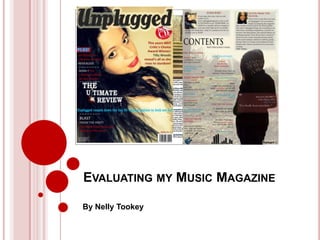
- 1. EVALUATING MY MUSIC MAGAZINE By Nelly Tookey
- 2. IN WHAT WAYS DOES YOUR MEDIA PRODUCT USE, DEVELOP OR CHALLENGE FORMS AND CONVENTIONS OF REAL MEDIA PRODUCTS? The key conventions to a music magazine front cover are: • a background image • a masthead • cover lines • a headline • a barcode Many include other graphics such as stickers as well however these conventions are almost necessary for a typical front cover. I have used these typical conventions to create my front cover (top left), and modelled it after an actual front cover from Mojo Magazine (bottom left). However, I have challenged the typical rock vibe by creating a more vintage tone to my magazine through the main cover image, the style of my masthead and the subject of my headlines “Blast from the past”. I believe my magazine appeals visually to the audience as it is not as cluttered as Mojo which makes it easier to see the main cover lines. I decided to include a sticker graphic stating „Free CD‟ to reel my audience in just as Mojo have, yet I stuck with my style of magazine by using a vintage sticker that is half peeled off.
- 3. IN WHAT WAYS DOES YOUR MEDIA PRODUCT USE, DEVELOP OR CHALLENGE FORMS AND CONVENTIONS OF REAL MEDIA PRODUCTS? Continued… The typical contents page includes: • multiple images • cover lines + lures to reel in the reader in • a heading usually stating "contents” • a letter from the editor • a mini masthead of your magazine name somewhere My contents page includes all these conventions, although I have differed from „multiple images‟ because I chose to have a main background image for my page, and therefore too many images over the top would ruin the effect I was aiming for. I have included small images such as a picture of myself in „Letter from the editor‟, an image of the magazine in „subscribe‟ and a small image of a guitar by one of the main cover lines, so I could still count those as multiple images; just not as many as some contents pages.
- 4. IN WHAT WAYS DOES YOUR MEDIA PRODUCT USE, DEVELOP OR CHALLENGE FORMS AND CONVENTIONS OF REAL MEDIA PRODUCTS? Continued… A main image showing the A quotation from the interviewee interviewee in her own A heading which that reels the reader in. surroundings; a photo-shoot image. tells the reader that this is the main This image is cover story. untypical of those usually used in DPS A small introduction because it is stating some horizontal information about across the the interviewee. page rather than using one full page. The main text: A byline, in this case, an stating who interview with took the the subject of picture. my front cover. I have included page Another image to numbers with my go with the magazine masthead on interview. my page.
- 5. HOW DOESOUR MEDIA PRODUCT REPRESENT PARTICULAR SOCIAL GROUPS? At the start of this project I created a questionnaire which showed that people wanted to see a music magazine that appealed to 16 – 23 year olds. I have represented teens-young adults in my music magazine through the main cover image of a teenage girl who is famous, has style, and appeals to both male and female readers. She is wearing make-up but not so much that would be classed as Rock, so she is represented to be fairly normal and down-to earth. She is half smiling half pouting to portray some attitude and give the magazine a bit of an edge, however she is in no way a stereotypical representation of my target audience. My magazine represents a few genre‟s of music but mainly mainstream pop which would attract those types of fans. The language I have used is colloquial/informal, which makes it easy for people to understand even if they‟re not familiar with musical terms. “Unplugged counts down the top 50 vintage guitars to look out for!” The text:picture ratio shows an equal spread on my double page spread, contents page and front cover; this is something that the target audience wanted to see when I conducted my research earlier on in the year. I have represented my target audience to be fun and free-willed: the text is in bright colours and the artists represented are free-spirited as well, e.g. Jessie J, Ed Sheeran, Rizzle Kicks.
- 6. WHAT KIND OF MEDIA INSTITUTION MIGHT DISTRIBUTE YOUR MEDIA PRODUCT AND WHY? I think that an institution like Bauer Media Group would want to publish my magazine because it is something different to music magazines which are already published by this group (such as Q). There are not many vintage style music magazines in circulation currently and so I believe there is a gap in the market just for us. Unplugged is focussed on the music, not gossip like other music magazines are becoming about these days. It gives readers a chance to remember past hits with our „Blast From the Past‟ feature and gear up for the future with our range of „Ultimate Reviews‟. We publish interviews with upcoming artists as well as well established artists that give our readers the best news on the music industry. Most issues contain a free gift such as a CD or an Audio book which is likely to reel the customers in and persuade them to buy our magazine.
- 7. WHO WOULD BE THE AUDIENCE FOR YOUR MEDIA PRODUCT? As stated in my treatment sheet, the typical Unplugged reader is aged between 16 and 21 years old and has a passion for music. Parents of readers will fall into the C1/C2 socioeconomic group, most readers will rely on their parents for finance. Although those who are older readers may be living away from home, they would still be middle class because they can afford to go to university and would be also quite reliant on their parents who would be C1/C2. Some readers may have part time jobs, most probably in retail however would still be reliant on their parents. The typical Unplugged reader could be male or female, and would enjoy playing and or listening to music and going to festivals.
- 8. HOW DID YOU ATTRACT/ADDRESS YOUR AUDIENCE? I believe i attracted this audience by representing them on the cover through a teen star and also keeping the design quite lively and interesting to look at. There was not too much going on in the front cover so it doesn‟t seem overcrowded. The cover lines are large and stand out with catchy titles – “Jessie J has a domino effect on the charts” (Domino is her latest single) so the audience would be urged to buy the magazine with the fun features. The overall view of my magazine is generally quite different to others on the shelf and that would stand out to my audience in the first place. The magazine cover is quite impersonal yet the cover lines state what they are so simply that the audience would either want to read them or not – which is good because it tells them how it is. My questionnaire showed that celebrity features and images were vital to reeling in my audience, so I included them on the cover to make sure the audience would see.
- 9. WHAT HAVE YOU LEARNT ABOUT TECHNOLOGIES FROM THE PROCESS OF CONSTRUCTING THIS PRODUCT? To create this magazine, I have used Photoshop, InDesign, Blogger and PowerPoint. I have learned a lot about each of these technologies; although i already knew how to use Photoshop, Blogger and PowerPoint; i have now used them for new reasons therefore discovering new gadgets and ways to create designs. In Photoshop, i learned how to use the smudge and blur tool when i needed to tidy up the edges of my model on my contents page and also to give a blending affect to my text boxes. I also learned how to adjust lighting and contrast colours through photoshop to give my images a better complexion.
- 10. WHAT HAVE YOU LEARNT ABOUT TECHNOLOGIES FROM THE PROCESS OF CONSTRUCTING THIS PRODUCT? Continued… I had never really used InDesign before this project and it has definitely made the work a lot easier, the tools on InDesign are so easy to work with and allow you to do things like „Drop cap‟ and „Text Wrap‟ which lets you wrap the text around another object. I used this for my DPS and itlet me create a creative and professional finish to my design which I was extremely happy with.
- 11. LOOKING BACK AT YOUR PRELIMINARY TASK, WHAT DO YOU FEEL YOU HAVE LEARNT IN THE PROGRESSION FROM IT TO THE FULL PRODUCT? I feel I have learnt a lot more about the magazine industry, companies like Bauer Media Group and just how many magazines are in circulation. It has also given me a chance to use different ideas when taking pictures – For my front cover I wanted a studio background however I don‟t have a studio, so I improvised with a bed sheet and it worked really well. I have learnt how to better use the technology such as Indesign and Blogger to create and communicate my work. I have learnt what appeals to specific target audiences and how to utilize that in my work.