Trump Subsidies in Context: States
•
0 likes•88 views

Which states are winners and losers when it comes to Net Farm Income, under Trump, Obama, and earlier periods? How much do farm subsidies, which are bigger with Trump, affect the results? What does the data show, as opposed to popular opinions and the media? This slide show gives answers for all 50 states.

Recommended
Recommended
More Related Content
What's hot
What's hot (10)
Similar to Trump Subsidies in Context: States
Similar to Trump Subsidies in Context: States (20)
More from Brad Wilson
More from Brad Wilson (10)
Recently uploaded
Recently uploaded (20)
Trump Subsidies in Context: States
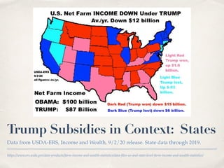
- 1. https://www.ers.usda.gov/data-products/farm-income-and-wealth-statistics/data-files-us-and-state-level-farm-income-and-wealth-statistics/ Trump Subsidies in Context: States Data from USDA-ERS, Income and Wealth, 9/2/20 release. State data through 2019.
- 2. U.S. data is available through 2020, where it’s a forecast as of 9/2/20. U.S. Net Farm Income is down withTrump. With Trump, Farm SUBSIDIES are UP a lot from Obama.
- 3. This measure of the rate of return to equity is simpler than USDA’s method and allows me to compute a true average. It’s similar to USDA’s ROE from current income, which shows a similar trend. Profitability Down UnderTrump Return on Equity is a measure of profitability. Assets - Debt = Equity.
- 4. Date Farm Debt is Up withTrump. Interest costs are also up.
- 5. Farmers are making large investments and making very little on them. Rate of Return on Assets: Down withTrump. Return on Assets is a measure of profitability.
- 6. See map on next slide. 33 States: WORSE withTrump. 20 Red states and 13 blue states have lower Net Farm Income with Trump.
- 7. Red states are those that voted for Trump in 2016. 20 RED states DOWN withTrump. The next 20 Charts below are for individual red states where Net Farm Income is down with Trump.
- 8. See another slide show of Net Farm Income, Obama vs. Trump, featuring regional averages. https://www.slideshare.net/bradwilson581525/farming-regions-obama-vs-trump Iowa: Worse All cornbelt states are worse with Trump. 4 are red states.
- 10. Date Ohio: Worse
- 11. Date Without Subsides, Ohio Returns to Operators: Below $0 in 2019. Returns to Operators is similar to Net Farm Income, (income minus expenses).
- 16. This starts charts for states of the northern and southern plains. North Dakota: Worse Here are more states, down under Trump.
- 22. Date Louisiana: Worse This starts a region of southern & delta states.
- 29. Blue states are those that voted for Clinton in 2016. 13 BLUE states, DOWN withTrump. The next 13 Charts below are for individual blue states where Net Farm Income is down with Trump.
- 30. Date Illinois: Worse Even with big subsidies, Illinois is down with Trump.
- 31. Date Minnesota: Worse Here are some dairy states, some connected to the cornbelt.
- 43. Date 17 States: BETTER withTrump. 9 Red states and 8 blue states have lower Net Farm Income with Trump.
- 44. Date 9 RED states, UP withTrump The next 9 Charts below are for individual red states where Net Farm Income is up with Trump.
- 45. Regions: North High Plains, South High Plains, Rolling Plains, Gulf Coast. Texas: Better Texas has at least 4 farming regions.
- 54. Date 8 BLUE States UP withTrump. The next 8 Charts below are for individual blue states where Net Farm Income is up with Trump.
- 55. Date Washington: Better This starts a series of coastal &/or Fruit & Vegetable States.
- 62. Date Alaska: Better Net Farm Income for Alaska was below zero for Obama and Trump.
- 63. Explanation of State Differences. ✤ There are a number of reasons for state differences on these charts, shorter term and over the long haul. ✤ Fruit and vegetable prices have not been fallen as much as prices for grains, soybeans and cotton. They’re higher even if subsidies are added on top of grain/soy/cotton prices. Big fruit and vegetable states tend to differ from big grain states in both net farm income and subsidies. ✤ Growth of urban population can affect farm income, up and down, as it provides markets but also can relate to big losses in farmland over the decades. ✤ Some states get much more income from livestock vs crops. ✤ Some states are closer to export markets and have higher farm prices. ✤ Increased irrigation may be a factor in some plains states. ✤ Some states have droughts, while other states benefit from higher prices from droughts elsewhere.
- 64. Choosing between ARC & PLC increases risk. It’s gambling, not “risk management.” 97% of Iowa farmers made the wrong choice. USDA’s Farm Service Agency offices strongly recommended ARC. As corn & soybean prices fell, corn & soy ARC ALSO fell! Regular ARC & PLC Subsidies: Not Much! Not shown in the other slides, ARC subsidies, (yellow,) have shrunk! 97% chose ARC in Iowa.
- 65. While Iowa has a tiny yellow & invisible blue area under Trump for 97% of corn farmers (similar for soybeans), Arkansas gets lots of regular farm subsidies. See next slides. Like Georgia,Arkansas got more “regular” subsidies than Iowa! Like Georgia peanut farms, unlike Iowa corn/soy farms, Arkansas rice farms chose PLC.
- 66. PLC was much better for peanuts & rice than for corn, soybeans, wheat, oats, barley and grain sorghum. See next slides. Most Georgia peanut farmers chose PLC. PLC subsidies pay you more when you need more. ARC subsidies often don’t. Irrational “risk management.”
- 68. Explanation of previous slide of 4 charts. ✤ “Reference Prices” are subsidy triggers. If market prices fall below Reference Prices, farmers get a fraction of the amount below in subsidies. ✤ “Reference Price” levels were not adjusted for inflation under 2014 & 2018 Farm Bills, so they go down every year (if adjusted for inflation, in 2013 dollars). (See the 2 charts on the left in the previous slide.) ✤ So the corn subsidy trigger falls from $3.70 (as chosen in 2013,) to just $3.09 by 2023, (when adjusted for inflation in 2013 dollars, GDP deflator). The soybean reference price falls from $8.40 to just $7.02 by 2023, (But it’s still called “$8.40.”) ✤ Peanut and rice reference prices were set above 2015 full costs. Corn, wheat, soybean, oat, barley and grain sorghum reference prices were set below 2015 full costs. (See the 2 charts on the right in the previous slide. The top chart shows percent of full costs. The bottom chart shows 2015 full costs in red, subsidy triggers [Reference Prices] in blue.)