1. AS Media Unit G321
Preliminary Task
Cover and Contents
Page of a College
Magazine
Preliminary Task
Evaluation
1. In what way does your media product use, develop or challenge forms and
conventions of real media products?
2. What have you learnt about the technologies from the process of
constructing this product?
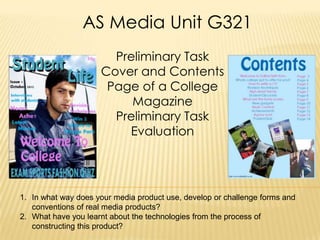
2. My Front and Contents Page
Of My Magazine
For my coursework I had to create a front cover
and contents page of a college magazine. This is
my finished product.
3. In what way does your media product use, develop or challenge forms and
conventions of real media products?
The Front Cover Similarities
Price
Issue Date
Masthead
Coverlines
Header
Central Image
Similar colour schemes, my magazine
colour scheme is blue and pink and
so is Glamour magazines
4. Differences With The Front Cover
I have used a male on the
cover of my magazine,
whilst Glamour magazine
have used Eva Longoria
who is a female.
Although we both have a
header my header is at
the bottom of the page
whilst Glamour
magazines is at the top.
My image is of Nikesh facing
the camera, whilst Eva
Longoria is facing sideward.
Glamour magazine has
the name of the celebrity
on the front cover at the
bottom but my magazine
doesn’t.
Glamour magazine has the website
I have got a barcode
of the magazine on the front cover.
on the front cover of my
However my magazine doesn’t have the
magazine.
website on the front cover.
5. 1. In what way does your media product use, develop or challenge forms
and conventions of real media products?
The Contents Page Similarities
Both of the mastheads
are very big and bold,
so that catch the
audiences attention.
Both of the contents
pages have the
website on the bottom
of the page
Both magazines have
a colour scheme, my
magazines colour
scheme is blue and
pink, the blue in the
title matches the
background. The red
from Vogues title
matches the colour
the girls dresses.
6. Differences With The Contents Page
My title is in blue, however
Vogues title is in red.
I have four images on my
contents page whilst Vogue
only have one image on
their contents page.
Vogue has the date of the
issue on the contents page but
I have it on the front cover.
On Vogues contents page
they have a little caption of
what is going to be on each
page whilst my contents page
just says what is going to be on
each page.
The images on my contents
page are slanted and on
edge , but Vogues image is
straight.
7. Software and Resources Used
2. What have you learnt about the technologies from the
process of constructing this product?
8. Software and Resources Used
Photoshop
This is my original image and This is the image after it had been
using Photoshop I edited it so edited, and you can see the
that it is brighter. I took this image difference I didn’t really add any
and the other images form the other effect because I liked the
contents page with a camera. original image itself.
9. How I used the Resources and Software
This was my original main coverline,
but I didn’t think that It would stand
out from the rest of the magazine so
I thought that I should edit it, it using
Photoshop.
I used Photoshop to add a drop shadow
so that there is a bit of a shadow to add
affect and make it stand out. I also
added a thick border so that it stands out
from the rest of the magazine.
This was my original masthead and I liked it
because of the font and the colour. However I
thought that I needed to change it a bit, so that
you can tell that its the masthead because the
masthead needs to be the thing that catches
the audiences attention straight away.
So this is what I did to my masthead to make it
stand out from the rest of the magazine. I
then added and inner glow, inner shadow
and drop shadow, so that it stands out and
looks more appealing.
10. How I used the Resources and
Software InDesign
This was my second draft of Then I started creating my This is my final magazine
the contents page and I did it actual contents page on contents page, I then added
on Photoshop, I added all of InDesign, so first I added the all of the images onto the
the images that I wanted on it background colour and I page, and added all of the
and I added the things that chose blue. I then added the things that were going to be in
were going to be in the title and chose the font and the magazine and changes
magazine. the colour of it the colour, font and size of it.