1. Music Magazine Analysis NME
I am going to analyse the way
in which an Indie band is
portrayed in the MNE music
magazine and then apply this to
my own magazine target at my
bands audience.
2. ‘NME’ is a music magazine that has been published weekly since 1952. Although
its sales have been in decline since 2003, NME has a cult following and is known
to promote new bands that might not be interviewed or celebrated anywhere else.
Generally the covers of NME feature a group of men, as their main interviews are
usually with prominent male-fronted bands. Indie bands tend to be photographed
together or just their lead singer on their own, these images can be in either
colour or black and white depending on the design of that spread.
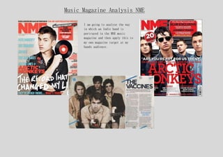
This cover features Liam Gallagher, formerly of Oasis.
There are many teasers and plugs along the left and
right of the cover, recalling the way NME looked several
years ago in a look that younger rather than older
readers would prefer. However, it is still
sophisticated: the colour scheme is a classical black,
white following the indie bands conventions and red
standing out and making words pop. The font is plain and
easy to read similar to Indie bands album covers. The
NME Tour, which is known throughout the country, is
discussed on the right side of the cover, which would
attract an audience of potential concert-goers something
my target audience are.
Basic Analysis
3. Albums that show full bands like this
Arctic Monkeys cover show the leads
singer at the front of the album, the
band stand in the layout they would
on a stage when performing as Indie
bands always want to relate back to
their music. Unlike the other cover
this one is in colour however the
band still wear very plain causal
clothing relating back to their
genre. The righting similar to the
other cover is in white and red
making text stand out against the
background. The sign at the top
mentions another indie band ‘blur’
that will feature in the next
addition.
4. Detailed analysis
The title of the magazine ‘MNE’ is written in block capitals, is the biggest writing on
the page and is bright red making it stand out to the audience. It is positioned in the
left corner and is on every addition making it recognizable. The ‘E’ in the title is
covered by the subjects head possible stating that the magazine is so known that it
doesn’t have to be on full view. (As this is a more modern magazine it could be aimed
towards collectors and the magazine is now a cult classic)
The subject is lead singer of Indie Band ‘Arctic Monkeys’. The eye contact of the model
will attract the female gaze as Arctic Monkeys have many female and male fans. The shot
only shows the top half of the member making it more intimate to its audience, he wears
smart casual black clothing linking in with his genre, and the record he holds matches
the colour scheme of the cover.
The writing on the album cover – the main headline is ‘The record that changed my life’
showing in white different font to the rest of the album making it stand out. The writing
underneath this address the audience directly making them want to read on. As this
addition is targeted at fans of Indie Rock other indie rock bands like ‘The Cribs’ are
mentioned on the album. The use of white, reds and blues in text show an idea of
continuation throughout. The header of the magazine states exclusive interviews with hip
hop artist inside, because this magazine is based at all music lovers and not just indie
bands the magazine includes things from other genres attracting a bigger audience. The
colours of the magazine will mainly attract a male audience however the eye contact from
the subject and red colours could also attract a female as these are linked with sexual
attraction.