
Recomendados
Mais conteúdo relacionado
Mais procurados
Mais procurados (20)
Destaque
Destaque (20)
Semelhante a Evaultion of my bsg
Semelhante a Evaultion of my bsg (20)
Mais de aigmu
Mais de aigmu (20)
Evaultion of my bsg
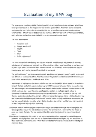
- 1. Evaluation of my HMV bag The programme I used was Adobe Photo shop which is very good, easy to use software which has a lot of good point such as the magic wand tool and the gradient tool. Also there is a lot bad points such as cutting out a select of a picture and trying not to get of the background into the picture which can be a difficult task to do because you could use different tool such as the magic wand tool, quick selection tool and the lasso tool which can be confusing to understand. The tools we use were: Gradient tool Magic wand tool Layers Text Blur Paint colour tool The skills I have learnt while doing this task are that I am able to change the gradient of pictures, select a part of a picture and putting it in a different picture. Also I have learnt how to use layer and to place layer with a picture to make it stand out more. The blur effect is an easy effective way to improve your work and to give a different look to your work. The tool that Ihaven’t use before was the magic wand tool and because I haven’t used it before so it was difficult to understand at first. Also I haven’tuse the gradient tool before so the first time I used it the colour was wrong but I now know what to do. My strength of my bag was that it was colorful and eye catching which would appeal to an audience. Itmatch the task well which was to make a bag for HMV. I decided to have a theme of popular male and female singers which link to HMV because they are a well known company that sell music to the British audience also I used the union jack flag at the bottom of my flag in a pink colour to symbolizes that HMV are a British company and I think the pink gave a nice tone to the bag. I felt that the gradient worked well by giving it a different look and sharpness .What I dislike about my bag was that I constructed wrong because I did not fold the side in so they are see able which make the bag less appealing to the eye. Also what I dislike about my bag is that I could of tried more gradient to see if they made my bag more appealing. Overall I am pleased with my bag because I like the way it look and even though the final bag does not look as good as I would like it to be because I make the folds to small. I believe that the design is good and meets the task. The bag is colourful and the attention to detail to makes it stand out more. What I would change doing this task is to add more creative ideas into my work.Such as adding more gradients and trying more tools out and to take more time while making my bag and don’t rush so that I look more professional. Also I think that I could of done more research as that would of given me more ideas.
- 2. Step by step guide of my bag: 1) First when you have decided what picture you want and how you would like to arrange It you click on the rectangle with a black and white background 2) After that you need to select what gradient you want. To choose what gradient you want click on the gradient tool and in the top left corner there is a rectangle which has different gradients that you could choose from such as the rainbow effect.
- 3. Then after you have select a gradient you draw a line diagonal across your work. When you have drawn a line across your work it should colour the work but then you need click on the normal bar and change it to one you like.
- 4. And this is want is should look like with the different effects to the pictures.