
Recommended
More Related Content
What's hot
What's hot (15)
Similar to Double page spread analysis
Similar to Double page spread analysis (20)
More from adinabredenthorpe
More from adinabredenthorpe (20)
Recently uploaded
Recently uploaded (20)
Double page spread analysis
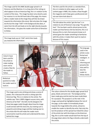
- 1. The image used for this NME double page spread is of The font used for the article is a standard font, Florence and the Machine. It is a long shot of her sitting on this is in relation to other pages such as the what appears to be an American flag, this is in relation to the content page in NME, this creates a flow thought content of the story. This image has been very cleverly used, the magazine and it helps give a professional and for instance it is to the left hand side of the page, this means not over done look about it. when a reader looks to the image they will then be drawn towards the information (the story). Not only does the image The title above the article “got the love” is in do this but the singe “USA” in the background also does, it relation to one of Florence’s top songs “You got the starts from the left and leads on to the right directly towards love”. This has been used to almost prove to the the information, this gives the reader some form of direction reader just how famous she has become, this is so to follow. because this is a lyric that everyone knows so it almost gives the reader something to familiarise with this article, it makes them want to read on The image leads you to “USA” which then leads because of this reason. you towards the information. The language used in the article is very Colum’s have formal and been used for intelligent . It the article to is very make reading informing and easer and to presents the create a flow for story well to the reader to aloe the follow. reader to follow clearly. Rhetorical question to make the reader want to read on. The image used is very striking and shows a sense of The colour scheme for this double page spread id of power, this is because the artist is sitting upon the greys, blacks and some red. The background has American flag. This is in relation to the article. The been made grey and the text has been made black subtitle says “She’s 2009’s biggest success story, with for a purpose. This purpose is so the reds in the America at her feet” this tells me the designers for image used would be highlighted above the rest of these two pages really thought about how the image the page, so the reader id immediately drawn could connect with the story line, by creating such a towards the image before the article, almost to powerful and striking image and then looking over to enable the reader to identify the artist. Not only this the article title this will make the reader more but the producer of this spread has linked the colour convinced to read the article and understand the story of the artists hair with the stripes on the American behind the image. flag, this is so the reader would look from the top of the page down where the flag is directly underneath the article.
- 2. This double page spread is of My Chemical Romance in a The red used in the quotation and the world Karrang magazine. The main large image is off the lead exclusive singe is the first thing I’m drawn to on singer, this image is taken in black and white to give the this double page spread. I think this may have sense of rock music. All the photos are of live concerts and been done on purpose, because even though this studio practise. This will drew in readers because it is should be distracting me from the images it still informative as to how the artist work behind the curtains. leads me towards them, they do this by spreading The larger image is used to drew the audience down the quotation across both pages towards the main towards the other photos leading to the page containing image which then leads me to the smaller images the article, so the main image creates a sense of direction to the bottom of the page. between the two pages. It may also be like this because the article may be The world exclusive singe pointing towards the article considered as more important then the images. will drew in readers because it makes the reader feel like they are one of the few people who will be able The images back up the article explaining behind the to view this article. scenes with MCR ( My chemical romance). Give reader insight to some of MCR’s new The sub title tracks, this is may attract informative readers and provides because it the reader makes them with more. feel special to share this one in a million opportunity to get behind the scenes with MCR. The quotation “WERE BEING THE BEST MCR WE CAN BE!” The article is very well written in formal language, makes it seem like the band them selves are giving informing the reader. The font used for the article is something to their audience, this is so it makes the reader a standard font to make it easy to read and follow. feel invited to read and gain this gift the band is giving to The article has been set up in column’s again to them with their exclusive article. This quotation also make reading the article easer . highlights the band to be generous to their fans. The font used for the head line follows the font The part of the quotation that says “MCR” shows that this generally used in the contents page and front cover band must be popular and well recognised, this is so of Karrang magazine, this font is made to look because if they weren’t popular the initials MCR would be bashed and warn to make the theme of rock more unrecognisable. The use of using MCR instead of My prominent. Chemical Romance makes the reader feel like they have good knowledge about this band in particular, it is a way of flattering the reader and making them want to read on.